Contents
This shortcode allows adding a section with different contents to the page.
Templates:
Here you can choose the template style for your Contents shortcode (Faq, Text with Icon, Acacio Modern, Acacio Creative Slider, Djo Content, Ewo Faq, Ewo gallery filter, Famulus Accordion, Famulus Creative slider, Famulus Accordion Simple, Famulus Accordion Modern, Famulus Icon, Famulus Simple with link, HR Consult FAQ's, HR Consult Creative slider, HR Modern, HR Simple Text with icon, Moovit Modern, Moovit Creative slider, Moovit Faq, Moovit Custom link with image, Ninedok Faq, Noize Contents, Noize Simple Text, Outsourceo Creative slider, Outsourceo Faq, Outsourceo Custom Text, Rela Faq, Soapy Accordion, Vestry Faqs or Vestry FAQs Arrow)
Faq Style:

Content Settings:

Faqs:
Add item - Please, click on the button to add a new item.
Item settings:
- Title - Here you can add the title to the current item.
- Description - Here you can add the description for the current item.
First element is opened? - Turn on the switcher if you want to make the first element opened.
Multi active items? - Turn on the switcher if you want to make the elements multi-active.
Title Typography:

Alignment - - Here you can select the title alignment.
- Family - Here you can select the typography for the title;
- Size - Here you can set up the title size;
- Weight - Please, select the weight for the title;
- Transform - This option allows to change the case of the text;
- Style - Please, select text style for the title;
- Decoration - Please, select style for the title decoration;
- Line-Height - Here you can enter a line height for the title;
- Letter Spacing - Here you can enter a letter spacing for the title.
Content Typography:

Alignment - - Here you can select the content alignment.
Text Color - Here you can select a content color from the palette.
- Family - Here you can select the typography for the content;
- Size - Here you can set up the content size;
- Weight - Please, select the weight for the content;
- Transform - This option allows to change the case of the text;
- Style - Please, select text style for the content;
- Decoration - Please, select a style for the content decoration;
- Line-Height - Here you can enter a line height for the content;
- Letter Spacing - Here you can enter a letter spacing for the content.
Text with Icon Style:

Content Settings:

Text - Add your text here, please.
Align - Please, select the text alignment.
Icon Settings:
 Icon library - Please, select the icon library from the list.
Icon color - Please, choose the icon color from the color palette.
Icon font size - Enter icon font size with units.
Acacio Modern Style:

Content Settings:

Faqs:
Add item - Please, click on the button to add a new item.
Item settings:
- Title - Here you can add the title to the current item.
- Description - Here you can add the description for the current item.
First element is opened? - Turn on the switcher if you want to make the first element opened.
Multi active items? - Turn on the switcher if you want to make the elements multi-active.
Size icon - Set font size for icons. Just write a number.
Title Typography:
Alignment - - Here you can select the title alignment.
- Family - Here you can select the typography for the title;
- Size - Here you can set up the title size;
- Weight - Please, select the weight for the title;
- Transform - This option allows to change the case of the text;
- Style - Please, select text style for the title;
- Decoration - Please, select style for the title decoration;
- Line-Height - Here you can enter a line height for the title;
- Letter Spacing - Here you can enter a letter spacing for the title.
Content Typography:
Alignment - - Here you can select the content alignment.
Text Color - Here you can select a content color from the palette.
- Family - Here you can select the typography for the content;
- Size - Here you can set up the content size;
- Weight - Please, select the weight for the content;
- Transform - This option allows to change the case of the text;
- Style - Please, select text style for the content;
- Decoration - Please, select a style for the content decoration;
- Line-Height - Here you can enter a line height for the content;
- Letter Spacing - Here you can enter a letter spacing for the content.
Icon Settings:
Icon library - Please, select the icon library from the list.
Icon color - Please, choose the icon color from the color palette.
Icon font size - Enter icon font size with units.
Acacio Creative slider Style:

Content Settings:

Slides:
Add item - Please, click on the button to add a new item.

- Image - Choose an image for the current slide here.
- Title - Here you can add the title to the current item.
- Use dot at the end of the title? - Turn on the switcher if you want to add a dot at the end of the title.
- Color for dot - Please, select the dot style here.
- Description - Here you can add the description for the current item.
- Buttons direction - Please, select horizontal or vertical buttons direction.
- Add button? - Turn on the switcher to add the button for the current slide. If you turn on the switcher, there are the next items.
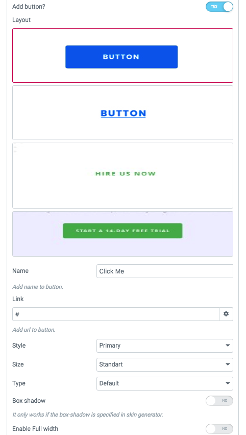
Button items:
- Layout - Please, select the button layout.
- Name - Please, enter the button text.
- Link - Please, add a URL to the button.
- Style - Here you can select the button style (dark or light).
- Size - Here you can select button size (small or large).
- Type - Here you can select the button type (reverse or transparent).
- Box shadow - This option allows you to add the box-shadow to the button. It only works if the box-shadow is specified in the skin generator.
- Enable Full width - Turn on the switcher if you want to enable full width to the current button.
- Add icon? - Turn on the switcher to add the icon for the current button.If you turn on the switcher, there are the next items:
Icon items:

- Icon library - Please, select the icon library.
- Icon font size - Enter icon font size with units. just use the number.
- Icon position - Please, select the icon alignment.
- Add additional button? - Turn on the switcher to add the additional button for the current slide. If you turn on the switcher, there are the next items.
 Additional button items:
- Layout - Please, select the button layout.
- Name - Please, enter the button text.
- Link - Please, add a URL to the button.
- Style - Here you can select the button style (dark or light).
- Size - Here you can select button size (small or large).
- Type - Here you can select the button type (reverse or transparent).
- Box shadow - This option allows you to add the box-shadow to the button. It only works if the box-shadow is specified in skin generator.
- Enable Full width - Turn on the switcher if you want to enable full width to the current button.
- Add icon? - Turn on the switcher to add the icon for the current button. If you turn on the switcher, there are the next items:
Icon items:
- Icon library - Please, select the icon library.
- Icon font size - Enter icon font size with units. just use the number.
- Icon position - Please, select the icon alignment.
Enable creative version? - Turn on the switcher to enable creative version of the current sliders.
Use custom font for description? - Turn on the switcher if you want to customize the font for the description text.
Acacio Description Typography:

If you turn on the switcher "Use custom font for description?" in Content Settings you can customize font for the description.
Alignment - - Here you can select the description alignment.
Text Color - Here you can select description color from the palette.
- Family - Here you can select the typography for the description;
- Size - Here you can set up the description size;
- Weight - Please, select the weight for the description;
- Transform - This option allows to change the case of the text;
- Style - Please, select the text style for the description;
- Decoration - Please, select a style for the description decoration;
- Line-Height - Here you can enter a line height for the description;
- Letter Spacing - Here you can enter a letter spacing for the description.
Swiper Settings:

Change swiper options? - Turn on switcher if you want to change the following swiper options:
- Arrows - Turn on the switcher to display swiper in arrows style.
- Pagination - Turn on the switcher to display pagination.
- Effect Type - Here you can select from the list the effect type for swiper (Slide, Fade, Cube, Flip, Coverflow).
- Loop - Turn on the switcher to display the loop effect.
- Simulate Touch - Turn on the switcher to add the simulate touch.
- Autoplay - Please, enter autoplay speed(in ms). 0 - autoplay off.
- Speed - Please, enter speed(in ms).
- Lazy load image - Amount of next/prev slides to preload lazy images in. (if 0 - lazy load off).
Images size for contents:

Image original size - Select the image size here.
Djo Content Layout: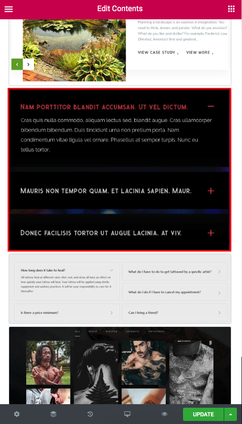

Content Settings:
Faqs:
Add item - Please, add the item to create and edit the faq.

Item settings:
- Title - Here you can add the title the current item.
- Description - Here you can add the description for the current item.
First element is opened? - Turn on the switcher if you want to make the first element opened.
Multi active items? - Turn on the switch if you want to display multi-active items.
Enable light version? - Turn on the switcher if you want to enable the light version of the content section.
Use custom font for description? - Turn on the switcher if you want to customize the de.
Link color - Here you can choose the link color from the color palette.
Link color hover - Here you can choose the link color hover from the color palette.
How to customize typography you can check in Typography Settings Category:
Ewo Faq Style:

Content Settings:
Faqs:
Add item - Please, add the item to create and edit the faq.

Item settings:
- Title - Here you can add the title the current item.
- Description - Here you can add the description for the current item.
First element is opened? - Turn on the switcher if you want to make the first element opened.
Multi active items? - Turn on the switch if you want to display multi-active items.
Use custom font for arrow? - Turn on the switcher if you want to customize the font for the arrow.
Title Typography:
Alignment - - Here you can select the title alignment.
- Family - Here you can select the typography for the title;
- Size - Here you can set up the title size;
- Weight - Please, select the weight for the title;
- Transform - This option allows to change the case of the text;
- Style - Please, select text style for the title;
- Decoration - Please, select style for the title decoration;
- Line-Height - Here you can enter a line height for the title;
- Letter Spacing - Here you can enter a letter spacing for the title.
Content Typography:
Alignment - - Here you can select the content alignment.
Text Color - Here you can select a content color from the palette.
- Family - Here you can select the typography for the content;
- Size - Here you can set up the content size;
- Weight - Please, select the weight for the content;
- Transform - This option allows to change the case of the text;
- Style - Please, select text style for the content;
- Decoration - Please, select a style for the content decoration;
- Line-Height - Here you can enter a line height for the content;
- Letter Spacing - Here you can enter a letter spacing for the content.
Ewo Arrow Typography:

If you turn on the switcher "Use custom font for arrow?" in Content Settings you can customize font for the arrow.
Text Color - Here you can select arrow color from the palette.
Typography items:
- Family - Here you can select the typography for the arrow.
- Size - Here you can set up the arrow size.
- Weight - Please, select the weight for the arrow.
- Transform - This option allows to change the case of the text.
- Style - Please, select a text style for the arrow.
- Decoration - Please, select a style for the arrow decoration.
- Line-Height - Here you can enter a line height for the arrow.
- Letter Spacing - Here you can enter a letter spacing for the arrow.
Ewo gallery filter Style:

Content Settings:
Add item - Please, add the item to create and edit the faq.

Ewo Consult Gallery Items:
- Category - Enter the text for the category here.
- Item Image - Choose the image for the gallery item here.
- Double width or height - Please, select the double-width or double-height.
Use custom font for category? - Turn on the switcher if you want to customize the font for the category.
Ewo Category Typography:

If you turn on the switcher "Use custom font for category?" in Content Settings you can customize font for the category.
Text Color - Here you can select category color from the palette.
Typography items:
- Family - Here you can select the typography for the category.
- Size - Here you can set up the category size.
- Weight - Please, select the weight for the category.
- Transform - This option allows to change the case of the text.
- Style - Please, select text style for the category.
- Decoration - Please, select style for the category decoration.
- Line-Height - Here you can enter a line height for the category.
- Letter Spacing - Here you can enter a letter spacing for the category.
Famulus Accordion Style:

Content Settings:
Faqs:
Add item - Please, click on the button to add a new item.

Item settings:
- Title - Here you can add the title the current item.
- Description - Here you can add the description for the current item.
First element is opened? - Turn on the switcher if you want to make the first element opened.
Multi active items? - Turn on the switch if you want to display multi-active items.
Title Typography:
Alignment - - Here you can select the title alignment.
- Family - Here you can select the typography for the title;
- Size - Here you can set up the title size;
- Weight - Please, select the weight for the title;
- Transform - This option allows to change the case of the text;
- Style - Please, select text style for the title;
- Decoration - Please, select style for the title decoration;
- Line-Height - Here you can enter a line height for the title;
- Letter Spacing - Here you can enter a letter spacing for the title.
Content Typography:
Alignment - - Here you can select the content alignment.
Text Color - Here you can select a content color from the palette.
- Family - Here you can select the typography for the content;
- Size - Here you can set up the content size;
- Weight - Please, select the weight for the content;
- Transform - This option allows to change the case of the text;
- Style - Please, select text style for the content;
- Decoration - Please, select a style for the content decoration;
- Line-Height - Here you can enter a line height for the content;
- Letter Spacing - Here you can enter a letter spacing for the content.
Famulus Creative slider Style:

Content Settings:
Slides:
Add item - Please, click on the button to add a new item.

Item Settings:
- Image - Choose an image for the current slide here.
- Title - Here you can add the title to the current item.
- Description - Here you can add the description for the current item.
- Buttons direction - Please, select horizontal or vertical buttons direction.
- Add button? - Turn on the switcher to add the button for the current slide. If you turn on the switcher, there are the next items.
Button items:
- Layout - Please, select the button layout.
- Name - Please, enter the button text.
- Link - Please, add a URL to the button.
- Style - Here you can select the button style (dark or light).
- Size - Here you can select button size (small or large).
- Type - Here you can select the button type (reverse or transparent).
- Box shadow - This option allows you to add the box-shadow to the button. It only works if the box-shadow is specified in the skin generator.
- Enable Full width - Turn on the switcher if you want to enable full width to the current button.
- Add icon? - Turn on the switcher to add the icon for the current button.If you turn on the switcher, there are the next items:
Icon items:
- Icon library - Please, select the icon library.
- Icon font size - Enter icon font size with units. just use the number.
- Icon position - Please, select the icon alignment.
- Add additional button? - Turn on the switcher to add the additional button for the current slide. If you turn on the switcher, there are the next items.
Additional button items:
- Layout - Please, select the button layout.
- Name - Please, enter the button text.
- Link - Please, add a URL to the button.
- Style - Here you can select the button style (dark or light).
- Size - Here you can select button size (small or large).
- Type - Here you can select the button type (reverse or transparent).
- Box shadow - This option allows you to add the box-shadow to the button. It only works if the box-shadow is specified in skin generator.
- Enable Full width - Turn on the switcher if you want to enable full width to the current button.
- Add icon? - Turn on the switcher to add the icon for the current button. If you turn on the switcher, there are the next items:
Icon items:
- Icon library - Please, select the icon library.
- Icon font size - Enter icon font size with units. just use the number.
- Icon position - Please, select the icon alignment.
Use custom font for highlight? - Turn on the switcher if you want to customize the font for the highlight text.
Use custom font for link? - Turn on the switcher if you want to customize the font for the link text.
Use custom font for link arrow? - Turn on the switcher if you want to customize the font for the link arrow text.
Title Typography:
Alignment - - Here you can select the title alignment.
- Family - Here you can select the typography for the title;
- Size - Here you can set up the title size;
- Weight - Please, select the weight for the title;
- Transform - This option allows to change the case of the text;
- Style - Please, select text style for the title;
- Decoration - Please, select a style for the title decoration;
- Line-Height - Here you can enter a line height for the title;
- Letter Spacing - Here you can enter a letter spacing for the title.
Swiper Settings:

Change swiper options? - Turn on switcher if you want to change the following swiper options:
- Arrows - Turn on the switcher to display swiper in arrows style
- Loop - Turn on the switcher to display the loop effect
- Autoplay - Please, enter autoplay speed(in ms). 0 - autoplay off.
- Speed - Please, enter speed(in ms).
- Lazy load image - Amount of next/prev slides to preload lazy images in. (if 0 - lazy load off)
Famulus Highlight Typography:

If you turn on the switcher "Use custom font for highlight?" in Content Settings you can customize font for the highlight.
Text Color - Here you can select highlight color from the palette.
Typography items:
- Family - Here you can select the typography for the highlight.
- Size - Here you can set up the highlight size.
- Weight - Please, select the weight for the highlight.
- Transform - This option allows to change the case of the text.
- Style - Please, select text style for the highlight.
- Decoration - Please, select style for the highlight decoration.
- Line-Height - Here you can enter a line height for the highlight.
- Letter Spacing - Here you can enter a letter spacing for the highlight.
Famulus Link Typography:

If you turn on the switcher "Use custom font for link?" in Content Settings you can customize font for the link text.
Text Color - Here you can select link text color from the palette.
Typography items:
- Family - Here you can select the typography for the link text.
- Size - Here you can set up the link text size.
- Weight - Please, select the weight for the link text.
- Transform - This option allows to change the case of the text.
- Style - Please, select text style for the link text.
- Decoration - Please, select style for the link text decoration.
- Line-Height - Here you can enter a line height for the link text.
- Letter Spacing - Here you can enter a letter spacing for the link text.
Famulus Link Arrow Typography:

If you turn on the switcher "Use custom font for link arrow?" in Content Settings you can customize font for the link arrow text.
Text Color - Here you can select link arrow text color from the palette.
Typography items:
- Family - Here you can select the typography for the link arrow text.
- Size - Here you can set up the link arrow text size.
- Weight - Please, select the weight for the link arrow text.
- Transform - This option allows to change the case of the text.
- Style - Please, select a text style for the link arrow text.
- Decoration - Please, select a style for the link arrow text decoration.
- Line-Height - Here you can enter a line height for the link arrow text.
- Letter Spacing - Here you can enter a letter spacing for the link arrow text.
Images size:
Image original size - Select the image size here.
Famulus Accordion Simple Style:

Content Settings:
Add item - Please, click on the button to add new Faq item.
Item Settings:
- Title - Here you can add the title for current Faq item.
- Description - Here you can add the description for the current Faq item.

First element is opened? - Turn on the switcher if you want to display the first item opened.
Multi active items? - Turn on the switcher if you want to display multi-active items.
Use custom font for highlight? - Turn on the switcher if you want to customize the font for the highlighted text.
Title - Here you can add the title for Faq item.
Element tag for Title - Select a title tag.
Use custom font for main title? - Turn on the switcher if you want to customize the font for the main title text.
Use custom font for title? - Turn on the switcher if you want to customize the font for the title text.
Color for active title - Choose the color for an active title from the color palette.
Color for title divider - Choose the color for the title divider from the color palette.
Title Typography:
Alignment - Here you can select the title alignment.
- Family - Here you can select the typography for the title;
- Size - Here you can set up the title size;
- Weight - Please, select the weight for the title;
- Transform - This option allows to change the case of the text;
- Style - Please, select text style for the title;
- Decoration - Please, select a style for the title decoration;
- Line-Height - Here you can enter a line height for the title;
- Letter Spacing - Here you can enter a letter spacing for the title.
Content Typography:

Alignment - Here you can select the content alignment.
- Family - Here you can select the typography for the content;
- Size - Here you can set up the content size;
- Weight - Please, select the weight for the content;
- Transform - This option allows to change the case of the text;
- Style - Please, select text style for the content;
- Decoration - Please, select a style for the content decoration;
- Line-Height - Here you can enter a line height for the content;
- Letter Spacing - Here you can enter a letter spacing for the content.
Famulus Highlight Typography:
If you turn on the switcher "Use custom font for highlight?" in Content Settings you can customize font for the highlighted text.
Text Color - Here you can select highlighted text color from the palette.
Typography items:
- Family - Here you can select the typography for the highlighted text.
- Size - Here you can set up the highlighted text size.
- Weight - Please, select the weight for the highlighted text.
- Transform - This option allows to change the case of the text.
- Style - Please, select the highlighted text style for the highlight.
- Decoration - Please, select a style for the highlighted text decoration.
- Line-Height - Here you can enter a line height for the highlighted text.
- Letter Spacing - Here you can enter a letter spacing for the highlighted text.
Famulus Main Title Typography:

If you turn on the switcher "Use custom font for main title?" in Content Settings you can customize font for the main title.
Text Color - Here you can select the main title color from the palette.
Typography items:
- Family - Here you can select the typography for the main title.
- Size - Here you can set up the main title size.
- Weight - Please, select the weight for the main title.
- Transform - This option allows to change the case of the text.
- Style - Please, select the main title style for the highlight.
- Decoration - Please, select a style for the main title decoration.
- Line-Height - Here you can enter a line height for the main title.
- Letter Spacing - Here you can enter a letter spacing for the main title.
Famulus Title Typography:

If you turn on the switcher "Use custom font for title?" in Content Settings you can customize font for the title.
Text Color - Here you can select the title color from the palette.
Typography items:
- Family - Here you can select the typography for the title.
- Size - Here you can set up the title size.
- Weight - Please, select the weight for the title.
- Transform - This option allows to change the case of the text.
- Style - Please, select the title style for the highlight.
- Decoration - Please, select a style for the title decoration.
- Line-Height - Here you can enter a line height for the title.
- Letter Spacing - Here you can enter a letter spacing for the title.
Famulus Accordion Modern Style:

Content Settings:

First element is opened? - Turn on the switcher if you want to display the first item opened.
Multi active items? - Turn on the switcher if you want to display multi-active items.
Faqs:
Add item - Please, click on the button to add a new item.
Item Settings:
- Title - Here you can add the title for Faq item.
- Type - Here you can add the text for the type of the item.
- Description - Here you can add the description for the current item.
- Add button? - Turn on the switcher to add the button for the current slide. If you turn on the switcher, there are the next items.
Button items:
- Layout - Please, select the button layout.
- Name - Please, enter the button text.
- Link - Please, add a URL to the button.
- Style - Here you can select the button style (dark or light).
- Size - Here you can select button size (small or large).
- Type - Here you can select the button type (reverse or transparent).
- Box shadow - This option allows you to add the box-shadow to the button. It only works if the box-shadow is specified in the skin generator.
- Enable Full width - Turn on the switcher if you want to enable full width to the current button.
- Add icon? - Turn on the switcher to add the icon for the current button.If you turn on the switcher, there are the next items:
Icon items:
- Icon library - Please, select the icon library.
- Icon font size - Enter icon font size with units. just use the number.
- Icon position - Please, select the icon alignment.
Use custom font for type? - Turn on the switcher if you want to customize the font for the type text.
Famulus Type Typography:

If you turn on the switcher "Use custom font for type?" in Content Settings you can customize font for the type text.
Text Color - Here you can select the type text color from the palette.
Typography items:
- Family - Here you can select the typography for the type text.
- Size - Here you can set up the type text size.
- Weight - Please, select the weight for the the type text.
- Transform - This option allows to change the case of the text.
- Style - Please, select the type text style for the highlight.
- Decoration - Please, select a style for the type text decoration.
- Line-Height - Here you can enter a line height for the type text.
- Letter Spacing - Here you can enter a letter spacing for the type text.
Famulus Icon Style:

Content Settings:
Add item - Please, click on the button to add a new item.

Item settings:
Title - Here you can add the title for the new item.
Add icon? - Turn on the switcher if you want to add the icon to the current item.

Icon settings:
- Icon library - Please, select the icon library.
- Icon font size - Enter icon font size with units. just use the number.
Famulus Simple with link Style:

Content Settings:
Add item - Please, click on the button to add a new item.

Item Settings:
- Title - Here you can add the title for the item.
- Element tag for Title - Select a title tag.
- Text - Here you can add the text for the current item.
- Link title - Please, add the title text of the link.
- Link Url - Please, add the url for the link.
HR Consult FAQ's Layout:

Content Settings:

Faqs:
Add item - Please, click on the button to add a new item.
Item Settings:
- Title - Here you can add the title for Faq item.
- Description - Here you can add the description for the current item.
First element is opened? - Turn on the switcher if you want to display the first item opened.
Multi active items? - Turn on the switcher if you want to display multi-active items.
Use custom font for symbol? - Turn on the switcher if you want to customize the font for the symbol.
Link color - Here you can choose the link color from the color palette.
Link color hover - Here you can choose the link color hover from the color palette.
How to customize typography you can check in Typography Settings Category:
Moovit Modern Style:

Content Settings:

Title - Here you can add the title text.
Element tag for Title - Select a title tag.
Text - Here you can add the text.
Background for content - Choose the color for background from the color palette.
Color for content - Choose the color for content from the color palette.
Use custom font for text? - Turn on the switcher if you want to customize the font for the text.
Images size for contents:
Image original size - Select the image size here.
Video Content:

Add video? - Turn on the switcher if you want to add the video to the current item.
Video settings:
- Video link - Add the link to the video button here.
- Style - Here you can select the button style (dark or light).
- Size - Here you can select button size (small or large).
- Preview image for video - Please, choose a preview image for the video here.
- Background image for content - Please, choose a background image for the content here.
Moovit Text Typography:

If you turn on the switcher "Use custom font for text?" in Content Settings you can customize font for the text.
Text Color - Here you can select the text color from the palette.
Typography items:
- Family - Here you can select the typography for the text.
- Size - Here you can set up the type text size.
- Weight - Please, select the weight for the text.
- Transform - This option allows to change the case of the text.
- Style - Please, select the text style for the highlight.
- Decoration - Please, select a style for the text-decoration.
- Line-Height - Here you can enter a line height for the text.
- Letter Spacing - Here you can enter a letter spacing for the text.
Button Settings:
Add button? - Turn on the switcher to add the button for the current slide. If you turn on the switcher, there are the next items.
Button items:
- Layout - Please, select the button layout.
- Name - Please, enter the button text.
- Link - Please, add a URL to the button.
- Style - Here you can select the button style (dark or light).
- Size - Here you can select button size (small or large).
- Type - Here you can select the button type (reverse or transparent).
- Box shadow - This option allows you to add the box-shadow to the button. It only works if the box-shadow is specified in the skin generator.
- Enable Full width - Turn on the switcher if you want to enable full width to the current button.
- Add icon? - Turn on the switcher to add the icon for the current button.If you turn on the switcher, there are the next items:
Icon items:
- Icon library - Please, select the icon library.
- Icon font size - Enter icon font size with units. just use the number.
- Icon position - Please, select the icon alignment.
Moovit Creative slider Style:

Content Settings:
Add item - Please, click on the button to add a new item.

- Image - Here you can choose the image for the current slide.
- Title -Here you can add your text for the title.
- Use dot in the end title? - Turn on the switch if you want to use the dot at the end of the title.
- Description - Here you can add the description text.
- Buttons Direction - Please, select the button direction (horizontal or vertical).
- Add button? - Turn on the switcher to add the button for the current slide. If you turn on the switcher, there are the next items.
Button items:
- Layout - Please, select the button layout.
- Name - Please, enter the button text.
- Link - Please, add a URL to the button.
- Style - Here you can select the button style (dark or light).
- Size - Here you can select button size (small or large).
- Type - Here you can select the button type (reverse or transparent).
- Box shadow - This option allows you to add the box-shadow to the button. It only works if the box-shadow is specified in the skin generator.
- Enable Full width - Turn on the switcher if you want to enable full width to the current button.
- Add icon? - Turn on the switcher to add the icon for the current button.If you turn on the switcher, there are the next items:
Icon items:
- Icon library - Please, select the icon library.
- Icon font size - Enter icon font size with units. just use the number.
- Icon position - Please, select the icon alignment.
- Add additional button? - Turn on the switcher to add the additional button for the current slide. If you turn on the switcher, there are the next items.
Additional button items:
- Layout - Please, select the button layout.
- Name - Please, enter the button text.
- Link - Please, add a URL to the button.
- Style - Here you can select the button style (dark or light).
- Size - Here you can select button size (small or large).
- Type - Here you can select the button type (reverse or transparent).
- Box shadow - This option allows you to add the box-shadow to the button. It only works if the box-shadow is specified in skin generator.
- Enable Full width - Turn on the switcher if you want to enable full width to the current button.
- Add icon? - Turn on the switcher to add the icon for the current button. If you turn on the switcher, there are the next items:
Icon items:
- Icon library - Please, select the icon library.
- Icon font size - Enter icon font size with units. just use the number.
- Icon position - Please, select the icon alignment.
Enable creative version? - Turn on the switcher if you want to enable the creative version of the current item.
Swiper Settings:

Change swiper options? - Turn on switcher if you want to change the following swiper options:
- Arrows - Turn on the switcher to display swiper in arrows style.
- Pagination - Turn on the switcher to display pagination.
- Effect Type - Here you can select from the list the effect type for swiper (Slide, Fade, Cube, Flip, Coverflow).
- Loop - Turn on the switcher to display the loop effect.
- Simulate Touch - Turn on the switcher to add the simulate touch.
- Autoplay - Please, enter autoplay speed(in ms). 0 - autoplay off.
- Speed - Please, enter speed(in ms).
- Lazy load image - Amount of next/prev slides to preload lazy images in. (if 0 - lazy load off).
Images size:
Image original size - Select the image size here.
Moovit Faq Style:

Content Settings:

Faqs:
Add item - Please, click on the button to add a new item.
Item settings:
- Title - Here you can add the title to the current item.
- Description - Here you can add the description for the current item.
First element is opened? - Turn on the switcher if you want to make the first element opened.
Multi active items? - Turn on the switcher if you want to make the elements multi-active.
Icon font size - Add the icon font size. Just write a number.
Title Typography:
Alignment - - Here you can select the title alignment.
- Family - Here you can select the typography for the title;
- Size - Here you can set up the title size;
- Weight - Please, select the weight for the title;
- Transform - This option allows to change the case of the text;
- Style - Please, select text style for the title;
- Decoration - Please, select style for the title decoration;
- Line-Height - Here you can enter a line height for the title;
- Letter Spacing - Here you can enter a letter spacing for the title.
Content Typography:
Alignment - - Here you can select the content alignment.
Text Color - Here you can select a content color from the palette.
- Family - Here you can select the typography for the content;
- Size - Here you can set up the content size;
- Weight - Please, select the weight for the content;
- Transform - This option allows to change the case of the text;
- Style - Please, select text style for the content;
- Decoration - Please, select a style for the content decoration;
- Line-Height - Here you can enter a line height for the content;
- Letter Spacing - Here you can enter a letter spacing for the content.
Moovit Custom link with image Style:

Content Settings:

Links:
Add item - Please, click on the button to add a new item.
Item settings:
- Image - Here you can add the image to the current item.
- Title - Here you can add the title to the current item.
- URL - Here you can add the link url for the current item.
Use custom font for links? - Turn on the switcher if you want to customize the font for link text.
Images size:
Image original size - Select the image size here.
Moovit Custom Links Typography:

If you turn on the switcher "Use custom font for links?" in Content Settings you can customize font for the link text.
Text Color - Here you can select the link text color from the palette.
Typography items:
- Family - Here you can select the typography for the link text.
- Size - Here you can set up the link text size.
- Weight - Please, select the weight for the link text.
- Transform - This option allows to change the case of the link text.
- Style - Please, select the link text style for the highlight.
- Decoration - Please, select a style for the link text-decoration.
- Line-Height - Here you can enter a line height for the link text.
- Letter Spacing - Here you can enter a letter spacing for the link text.
Ninedok Faq Style:

Content Settings:

Faqs:
Add item - Please, click on the button to add a new item.
Item Settings:
- Title - Here you can add the title for Faq item.
- Description - Here you can add the description for the current item.
First element is opened? - Turn on the switcher if you want to display the first item opened.
Use custom font for description? - Turn on the switcher if you want to customize the text font for description.
Size icon - Add the icon font size. Just write a number.
Color icon - Choose the icon color from the color palette.
Ninedok Description Typography:

If you turn on the switcher "Use custom font for description?" in Content Settings you can customize font for the description text.
Text Color - Here you can select description text color from the palette.
Typography items:
- Family - Here you can select the typography for the description text.
- Size - Here you can set up the description text size.
- Weight - Please, select the weight for the description text.
- Transform - This option allows to change the case of the text.
- Style - Please, select text style for the description text.
- Decoration - Please, select style for the description text-decoration.
- Line-Height - Here you can enter a line height for the description text.
- Letter Spacing - Here you can enter a letter spacing for the description text.
Noize Contents Style:

Content Settings:

Noize contents items:
Add item - Please, click on the button to add a new item.
Item Settings:
- Element tag for heading - Please, select the tag for heading.
- Contents category - Here you can add the category for the current item.
- Contents heading - Here you can add the heading for the current item.
- Contents description - Here you can add the description for the current item.
Use custom font for filter category? - Turn on the switcher if you want to customize the text font for the filter category.
Use custom font for heading? - Turn on the switcher if you want to customize the text font for heading.
Use custom font for description? - Turn on the switcher if you want to customize the text font for description.
Noize Filter Category Typography:

If you turn on the switcher "Use custom font for filter category?" in Content Settings you can customize font for the filter category text.
Text Color - Here you can select filter category text color from the palette.
Typography items:
- Family - Here you can select the typography for the filter category text.
- Size - Here you can set up the filter category text size.
- Weight - Please, select the weight for the filter category text.
- Transform - This option allows to change the case of the text.
- Style - Please, select text-style for the filter category text.
- Decoration - Please, select style for the filter category text-decoration.
- Line-Height - Here you can enter a line height for the filter category text.
- Letter Spacing - Here you can enter a letter spacing for the filter category text.
Noize Heading Typography:

If you turn on the switcher "Use custom font for heading?" in Content Settings you can customize font for the heading.
Alignment - Here you can select the heading;
Text Color - Here you can select heading color from the palette.
Typography items:
- Family - Here you can select the typography for the heading.
- Size - Here you can set up the heading size.
- Weight - Please, select the weight for the heading.
- Transform - This option allows to change the case of the text.
- Style - Please, select text style for the heading.
- Decoration - Please, select a style for the heading decoration.
- Line-Height - Here you can enter a line height for the heading.
- Letter Spacing - Here you can enter a letter spacing for the heading.
Noize Description Typography:

If you turn on the switcher "Use custom font for description?" in Content Settings you can customize font for the description.
Alignment - Here you can select the description;
Text Color - Here you can select description color from the palette.
Typography items:
- Family - Here you can select the typography for the description.
- Size - Here you can set up the description size.
- Weight - Please, select the weight for the description.
- Transform - This option allows to change the case of the text.
- Style - Please, select text style for the description.
- Decoration - Please, select style for the description decoration.
- Line-Height - Here you can enter a line height for the description.
- Letter Spacing - Here you can enter a letter spacing for the description.
Noize Simple Text Style:

Content Settings:

Text Simple - You can enter the text here.
Use custom font for simple text? - Turn on the switcher if you want to customize the text.
Noize Simple Text Typography:

If you turn on the switcher "Use custom font for simple text?" in Content Settings you can customize font for the simple text.
Alignment - Here you can select the simple text;
Text Color - Here you can select the simple text color from the palette.
Typography items:
- Family - Here you can select the typography for the simple text.
- Size - Here you can set up the simple text size.
- Weight - Please, select the weight for the simple text.
- Transform - This option allows to change the case of the text.
- Style - Please, select text-style for the simple text.
- Decoration - Please, select style for the simple text decoration.
- Line-Height - Here you can enter a line height for the simple text.
- Letter Spacing - Here you can enter a letter spacing for the simple text.
Outsourceo Creative slider Style:

Content Settings:

Slides:
Add item - Please, click on the button to add a new item.
Item settings:
- Image - Choose an image for the current item.
- Title - Here you can add the title to the current item.
- Use dot in the end title? - Turn on the switch if you want to use the dot at the end of the title.
- Color for dot - Please, select the dot color from the palette box.
- Description - Here you can add the description for the current item.
- Buttons Direction - Please, select the button direction (horizontal or vertical).
- Add button? - Turn on the switcher to add the button for the current slide. If you turn on the switcher, there are the next items.
Button items:
- Layout - Please, select the button layout.
- Name - Please, enter the button text.
- Link - Please, add a URL to the button.
- Style - Here you can select the button style (dark or light).
- Size - Here you can select button size (small or large).
- Type - Here you can select the button type (reverse or transparent).
- Box shadow - This option allows you to add the box-shadow to the button. It only works if the box-shadow is specified in the skin generator.
- Enable Full width - Turn on the switcher if you want to enable full width to the current button.
- Add icon? - Turn on the switcher to add the icon for the current button.If you turn on the switcher, there are the next items:
Icon items:
- Icon library - Please, select the icon library.
- Icon font size - Enter icon font size with units. just use the number.
- Icon position - Please, select the icon alignment.
- Add additional button? - Turn on the switcher to add the additional button for the current slide. If you turn on the switcher, there are the next items.
Additional button items:
- Layout - Please, select the button layout.
- Name - Please, enter the button text.
- Link - Please, add a URL to the button.
- Style - Here you can select the button style (dark or light).
- Size - Here you can select button size (small or large).
- Type - Here you can select the button type (reverse or transparent).
- Box shadow - This option allows you to add the box-shadow to the button. It only works if the box-shadow is specified in skin generator.
- Enable Full width - Turn on the switcher if you want to enable full width to the current button.
- Add icon? - Turn on the switcher to add the icon for the current button. If you turn on the switcher, there are the next items:
Icon items:
- Icon library - Please, select the icon library.
- Icon font size - Enter icon font size with units. just use the number.
- Icon position - Please, select the icon alignment.
Swiper Settings:
Change swiper options? - Turn on switcher if you want to change the following swiper options:
- Arrows - Turn on the switcher to display swiper in arrows style.
- Pagination - Turn on the switcher to display pagination.
- Effect Type - Here you can select from the list the effect type for swiper (Slide, Fade, Cube, Flip, Coverflow).
- Loop - Turn on the switcher to display the loop effect.
- Simulate Touch - Turn on the switcher to add the simulate touch.
- Autoplay - Please, enter autoplay speed(in ms). 0 - autoplay off.
- Speed - Please, enter speed(in ms).
- Lazy load image - Amount of next/prev slides to preload lazy images in. (if 0 - lazy load off).
Images size:
Image original size - Select the image size here.
Outsourceo Faq Style:

Content Settings:

Faqs:
Add item - Please, click on the button to add a new item.
Item settings:
- Title - Here you can add the title the current item.
- Description - Here you can add the description for the current item.
First element is opened? - Turn on the switcher if you want to make the first element opened.
Multi active items? - Turn on the switch if you want to display multi-active items.
Title Typography:
Alignment - - Here you can select the title alignment.
- Family - Here you can select the typography for the title;
- Size - Here you can set up the title size;
- Weight - Please, select the weight for the title;
- Transform - This option allows to change the case of the text;
- Style - Please, select text style for the title;
- Decoration - Please, select style for the title decoration;
- Line-Height - Here you can enter a line height for the title;
- Letter Spacing - Here you can enter a letter spacing for the title.
Content Typography:
Alignment - - Here you can select the content alignment.
Text Color - Here you can select a content color from the palette.
- Family - Here you can select the typography for the content;
- Size - Here you can set up the content size;
- Weight - Please, select the weight for the content;
- Transform - This option allows to change the case of the text;
- Style - Please, select text style for the content;
- Decoration - Please, select a style for the content decoration;
- Line-Height - Here you can enter a line height for the content;
- Letter Spacing - Here you can enter a letter spacing for the content.
Outsourceo Custom Text Style:

Content Settings:
Text Simple - You can enter the text here.
Use custom font for simple text? - Turn on the switcher if you want to customize the text.
Noize Simple Text Typography:
If you turn on the switcher "Use custom font for simple text?" in Content Settings you can customize font for the simple text.
Alignment - Here you can select the simple text;
Text Color - Here you can select the simple text color from the palette.
Typography items:
- Family - Here you can select the typography for the simple text.
- Size - Here you can set up the simple text size.
- Weight - Please, select the weight for the simple text.
- Transform - This option allows to change the case of the text.
- Style - Please, select text-style for the simple text.
- Decoration - Please, select style for the simple text decoration.
- Line-Height - Here you can enter a line height for the simple text.
- Letter Spacing - Here you can enter a letter spacing for the simple text.
Rela Faq Style:

Content Settings:

Faqs:
Add item - Please, click on the button to add a new item.
Item settings:
- Title - Here you can add the title the current item.
- Description - Here you can add the description for the current item.
First element is opened? - Turn on the switcher if you want to make the first element opened.
Multi active items? - Turn on the switch if you want to display multi-active items.
Icon size - Add the icon font size. Just write a number.
Soapy Accordion Style:

Content Settings:
Faqs:
Add item - Please, click on the button to add a new item.
Item settings:
- Title - Here you can add the title to the current item.
- Description - Here you can add the description for the current item.
First element is opened? - Turn on the switcher if you want to make the first element opened.
Multi active items? - Turn on the switcher if you want to make the elements multi-active.
Title Typography:
Alignment - - Here you can select the title alignment.
- Family - Here you can select the typography for the title;
- Size - Here you can set up the title size;
- Weight - Please, select the weight for the title;
- Transform - This option allows to change the case of the text;
- Style - Please, select text style for the title;
- Decoration - Please, select style for the title decoration;
- Line-Height - Here you can enter a line height for the title;
- Letter Spacing - Here you can enter a letter spacing for the title.
Content Typography:
Alignment - - Here you can select the content alignment.
Text Color - Here you can select a content color from the palette.
- Family - Here you can select the typography for the content;
- Size - Here you can set up the content size;
- Weight - Please, select the weight for the content;
- Transform - This option allows to change the case of the text;
- Style - Please, select text style for the content;
- Decoration - Please, select a style for the content decoration;
- Line-Height - Here you can enter a line height for the content;
- Letter Spacing - Here you can enter a letter spacing for the content.
Vestry FAQs Style:

Content Settings:
Faqs:
Add item - Please, click on the button to add a new item.
Item settings:
- Title - Here you can add the title to the current item.
- Description - Here you can add the description for the current item.
First element is opened? - Turn on the switcher if you want to make the first element opened.
Multi active items? - Turn on the switcher if you want to make the elements multi-active.
Title Typography:
Alignment - - Here you can select the title alignment.
- Family - Here you can select the typography for the title;
- Size - Here you can set up the title size;
- Weight - Please, select the weight for the title;
- Transform - This option allows to change the case of the text;
- Style - Please, select text style for the title;
- Decoration - Please, select style for the title decoration;
- Line-Height - Here you can enter a line height for the title;
- Letter Spacing - Here you can enter a letter spacing for the title.
Content Typography:
Alignment - - Here you can select the content alignment.
Text Color - Here you can select a content color from the palette.
- Family - Here you can select the typography for the content;
- Size - Here you can set up the content size;
- Weight - Please, select the weight for the content;
- Transform - This option allows to change the case of the text;
- Style - Please, select text style for the content;
- Decoration - Please, select a style for the content decoration;
- Line-Height - Here you can enter a line height for the content;
- Letter Spacing - Here you can enter a letter spacing for the content.
Vestry FAQs Arrow Style:

Content Settings:

Faqs:
Add item - Please, click on the button to add a new item.
Item settings:
- Title - Here you can add the title to the current item.
- Description - Here you can add the description for the current item.
First element is opened? - Turn on the switcher if you want to make the first element opened.
Multi active items? - Turn on the switcher if you want to make the elements multi-active.
Subtitle - Add some text for the subtitle here.
Element tag for subtitle - Please, select the subtitle tag.
Use custom font for subtitle? - Turn on the switcher if you want to customize the font for subtitle text.
Title - Add some text for the title here.
Element tag for title - Please, select the title tag.
Use custom font for title? - Turn on the switcher if you want to customize the font for title text.
Title Typography:
Alignment - - Here you can select the title alignment.
- Family - Here you can select the typography for the title;
- Size - Here you can set up the title size;
- Weight - Please, select the weight for the title;
- Transform - This option allows to change the case of the text;
- Style - Please, select text style for the title;
- Decoration - Please, select style for the title decoration;
- Line-Height - Here you can enter a line height for the title;
- Letter Spacing - Here you can enter a letter spacing for the title.
Content Typography:
Alignment - - Here you can select the content alignment.
Text Color - Here you can select a content color from the palette.
- Family - Here you can select the typography for the content;
- Size - Here you can set up the content size;
- Weight - Please, select the weight for the content;
- Transform - This option allows to change the case of the text;
- Style - Please, select text style for the content;
- Decoration - Please, select a style for the content decoration;
- Line-Height - Here you can enter a line height for the content;
- Letter Spacing - Here you can enter a letter spacing for the content.
Images size:
Image original size - Select the image size here.
Video Content:

Add video? - Turn on the switcher if you want to add the video to the current item.
Video settings:
- Preview image for video - Please, choose a preview image for the video here.
- Background image for content - Please, choose a background image for the content here.
- Video link - Add the link to the video button here.
- Style - Here you can select the button style (dark or light).
- Size - Here you can select button size (small or large).
Vestry Subtitle Typography:

If you turn on the switcher "Use custom font for subtitle?" in Content Settings you can customize font for the subtitle.
Text Color - Here you can select the subtitle color from the palette.
Typography items:
- Family - Here you can select the typography for the subtitle.
- Size - Here you can set up the subtitle size.
- Weight - Please, select the weight for the subtitle.
- Transform - This option allows to change the case of the text.
- Style - Please, select the subtitle style for the highlight.
- Decoration - Please, select a style for the subtitle decoration.
- Line-Height - Here you can enter a line height for the subtitle.
- Letter Spacing - Here you can enter a letter spacing for the subtitle.
Vestry Title Typography:

If you turn on the switcher "Use custom font for title?" in Content Settings you can customize font for the title.
- Family - Here you can select the typography for the title;
- Size - Here you can set up the title size;
- Weight - Please, select the weight for the title;
- Transform - This option allows to change the case of the text;
- Style - Please, select text style for the title;
- Decoration - Please, select style for the title decoration;
- Line-Height - Here you can enter a line height for the title;
- Letter Spacing - Here you can enter a letter spacing for the title.