Contents (Sterling)
This shortcode allows adding a section with different contents to the page.
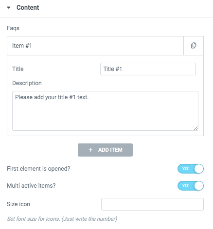
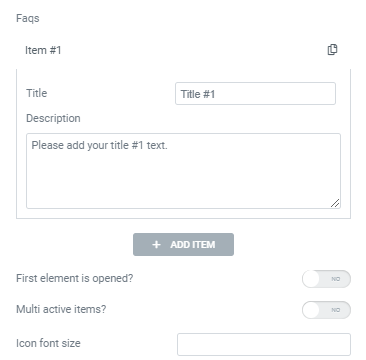
Faq:

Content Settings

Add item - Please, click on the button to add a new item.
Item settings:
- Title - Here you can add the title to the current item.
- Description - Here you can add the description for the current item.
First element is opened? - Turn on the switcher if you want to make the first element opened.
Multi active items? - Turn on the switcher if you want to make the elements multi-active.
Title Typography:

Alignment - - Here you can select the title alignment.
- Family - Here you can select the typography for the title;
- Size - Here you can set up the title size;
- Weight - Please, select the weight for the title;
- Transform - This option allows to change the case of the text;
- Style - Please, select text style for the title;
- Decoration - Please, select style for the title decoration;
- Line-Height - Here you can enter a line height for the title;
- Letter Spacing - Here you can enter a letter spacing for the title.
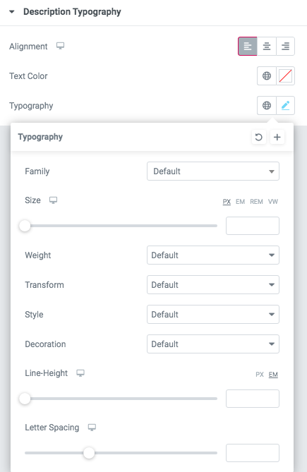
Content Typography:

Alignment - - Here you can select the content alignment.
Text Color - Here you can select a content color from the palette.
- Family - Here you can select the typography for the content;
- Size - Here you can set up the content size;
- Weight - Please, select the weight for the content;
- Transform - This option allows to change the case of the text;
- Style - Please, select text style for the content;
- Decoration - Please, select a style for the content decoration;
- Line-Height - Here you can enter a line height for the content;
- Letter Spacing - Here you can enter a letter spacing for the content.
Text with Icon:

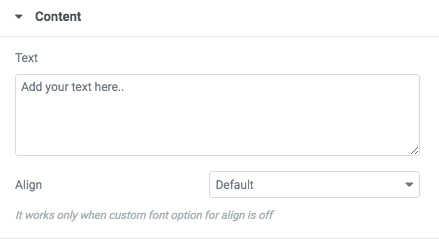
Text - Add your text here, please.
Align - Please, select the text alignment.
Icon:

- Icon library - Please, select the icon library from the list.
- Icon color - Please, choose the icon color from the color palette.
- Icon font size - Enter icon font size with units.
Content 1:

- Add item - Please, click on the button to add a new item.
- Title - Here you can add the title to the current item.
- Description - Here you can add the description for the current item.
First element is opened? - Turn on the switcher if you want to make the first element opened.
Multi active items? - Turn on the switcher if you want to make the elements multi-active.
Size icon - Set font size for icons. Just write a number.
Title Typography:
Alignment - - Here you can select the title alignment.
- Family - Here you can select the typography for the title;
- Size - Here you can set up the title size;
- Weight - Please, select the weight for the title;
- Transform - This option allows to change the case of the text;
- Style - Please, select text style for the title;
- Decoration - Please, select style for the title decoration;
- Line-Height - Here you can enter a line height for the title;
- Letter Spacing - Here you can enter a letter spacing for the title.
Content Typography:
Alignment - - Here you can select the content alignment.
Text Color - Here you can select a content color from the palette.
- Family - Here you can select the typography for the content;
- Size - Here you can set up the content size;
- Weight - Please, select the weight for the content;
- Transform - This option allows to change the case of the text;
- Style - Please, select text style for the content;
- Decoration - Please, select a style for the content decoration;
- Line-Height - Here you can enter a line height for the content;
- Letter Spacing - Here you can enter a letter spacing for the content.
Icon:
- Icon library - Please, select the icon library from the list.
- Icon color - Please, choose the icon color from the color palette.
- Icon font size - Enter icon font size with units.
Content 2:

Content Settings:

- Add item - Please, click on the button to add a new item.
- Title - Here you can add the title to the current item.
- Use dot at the end of the title? - Turn on the switcher if you want to add a dot at the end of the title.
- Color for dot - Please, select the dot style here.
- Description - Here you can add the description for the current item.
- Buttons direction - Please, select horizontal or vertical buttons direction.
- Add button? - Turn on the switcher to add the button for the current slide. If you turn on the switcher, there are the next items.

Button items:
- Layout - Please, select the button layout.
- Name - Please, enter the button text.
- Link - Please, add a URL to the button.
- Style - Here you can select the button style (dark or light).
- Size - Here you can select button size (small or large).
- Type - Here you can select the button type (reverse or transparent).
- Box shadow - This option allows you to add the box-shadow to the button. It only works if the box-shadow is specified in the skin generator.
- Enable Full width - Turn on the switcher if you want to enable full width to the current button.
Add icon? - Turn on the switcher to add the icon for the current button.If you turn on the switcher, there are the next items:

- Icon library - Please, select the icon library.
- Icon font size - Enter icon font size with units. just use the number.
- Icon position - Please, select the icon alignment.
Add additional button? - Turn on the switcher to add the additional button for the current slide. If you turn on the switcher, there are the next items.

Enable creative version? - Turn on the switcher to enable a creative version of the current sliders.
Use custom font for description? - Turn on the switcher if you want to customize the font for the description.
Use custom font for title? - Turn on the switcher if you want to customize the font for the title.
Acacio Description Typography:

If you turn on the switcher "Use custom font for description?" in Content Settings you can customize font for the description.
Alignment - - Here you can select the description alignment.
Text Color - Here you can select description color from the palette.
- Family - Here you can select the typography for the description;
- Size - Here you can set up the description size;
- Weight - Please, select the weight for the description;
- Transform - This option allows to change the case of the text;
- Style - Please, select the text style for the description;
- Decoration - Please, select a style for the description decoration;
- Line-Height - Here you can enter a line height for the description;
- Letter Spacing - Here you can enter a letter spacing for the description.
Acacio title Typography:

Alignment - - Here you can select the title alignment.
- Family - Here you can select the typography for the title;
- Size - Here you can set up the title size;
- Weight - Please, select the weight for the title;
- Transform - This option allows to change the case of the text;
- Style - Please, select text style for the title;
- Decoration - Please, select style for the title decoration;
- Line-Height - Here you can enter a line height for the title;
- Letter Spacing - Here you can enter a letter spacing for the title.
Swiper Settings:

Change swiper options? - Turn on switcher if you want to change the following swiper options:
- Arrows - Turn on the switcher to display swiper in arrows style.
- Pagination - Turn on the switcher to display pagination.
- Effect Type - Here you can select from the list the effect type for swiper (Slide, Fade, Cube, Flip, Coverflow).
- Loop - Turn on the switcher to display the loop effect.
- Simulate Touch - Turn on the switcher to add the simulate touch.
- Autoplay - Please, enter autoplay speed(in ms). 0 - autoplay off.
- Speed - Please, enter speed(in ms).
- Lazy load image - Amount of next/prev slides to preload lazy images in. (if 0 - lazy load off).
Images size for content:

Image original size - Select the image size.
Bizy Creative:

Content Settings:

- Main image - Select the image.
- Point Image - Select point image.
- Breakpoint for mobile version - Enter a breakpoint.
Bizy Image size:

Image original size - Select the image size.
Content 3:

Content Settings:

- Title - Here you can add the title to the current item.
- Description - Here you can add the description for the current item.
- First element is opened? - Turn on the switcher if you want to make the first element opened.
- Multi active items? - Turn on the switcher if you want to make the elements multi-active.
- Enable light version? - Turn on the switcher if you want to enable the light version of the content section.
- Use custom font for description? - Turn on the switcher if you want to customize the description.
Title Typography:
Alignment - - Here you can select the title alignment.
- Family - Here you can select the typography for the title;
- Size - Here you can set up the title size;
- Weight - Please, select the weight for the title;
- Transform - This option allows to change the case of the text;
- Style - Please, select text style for the title;
- Decoration - Please, select style for the title decoration;
- Line-Height - Here you can enter a line height for the title;
- Letter Spacing - Here you can enter a letter spacing for the title.
Content Typography:
Alignment - - Here you can select the content alignment.
Text Color - Here you can select a content color from the palette.
- Family - Here you can select the typography for the content;
- Size - Here you can set up the content size;
- Weight - Please, select the weight for the content;
- Transform - This option allows to change the case of the text;
- Style - Please, select text style for the content;
- Decoration - Please, select a style for the content decoration;
- Line-Height - Here you can enter a line height for the content;
- Letter Spacing - Here you can enter a letter spacing for the content.
Description Typography:
If you turn on the switcher "Use custom font for description?" in Content Settings you can customize font for the description.
Alignment - - Here you can select the description alignment.
Text Color - Here you can select description color from the palette.
- Family - Here you can select the typography for the description;
- Size - Here you can set up the description size;
- Weight - Please, select the weight for the description;
- Transform - This option allows to change the case of the text;
- Style - Please, select the text style for the description;
- Decoration - Please, select a style for the description decoration;
- Line-Height - Here you can enter a line height for the description;
- Letter Spacing - Here you can enter a letter spacing for the description.
Content 4:

Content Settings:

- Title - Here you can add the title to the current item.
- Description - Here you can add the description for the current item.
- First element is opened? - Turn on the switcher if you want to make the first element opened.
- Multi active items? - Turn on the switcher if you want to make the elements multi-active.
- Use custom font for arrow? - Turn on the switcher if you want to customize the arroq.
Title Typography:
Alignment - - Here you can select the title alignment.
- Family - Here you can select the typography for the title;
- Size - Here you can set up the title size;
- Weight - Please, select the weight for the title;
- Transform - This option allows to change the case of the text;
- Style - Please, select text style for the title;
- Decoration - Please, select style for the title decoration;
- Line-Height - Here you can enter a line height for the title;
- Letter Spacing - Here you can enter a letter spacing for the title.
Content Typography:
Alignment - - Here you can select the content alignment.
Text Color - Here you can select a content color from the palette.
- Family - Here you can select the typography for the content;
- Size - Here you can set up the content size;
- Weight - Please, select the weight for the content;
- Transform - This option allows to change the case of the text;
- Style - Please, select text style for the content;
- Decoration - Please, select a style for the content decoration;
- Line-Height - Here you can enter a line height for the content;
- Letter Spacing - Here you can enter a letter spacing for the content.
Ewo Arrow Typography:

If you turn on the switcher "Use custom font for arrow?" in Content Settings you can customize font for the arrow.
Text Color - Here you can select arrow color from the palette.
Typography items:
- Family - Here you can select the typography for the arrow.
- Size - Here you can set up the arrow size.
- Weight - Please, select the weight for the arrow.
- Transform - This option allows to change the case of the text.
- Style - Please, select a text style for the arrow.
- Decoration - Please, select a style for the arrow decoration.
- Line-Height - Here you can enter a line height for the arrow.
- Letter Spacing - Here you can enter a letter spacing for the arrow.
Content 5:

Content Settings:

Ewo Consult Gallery Items:
- Category - Enter the text for the category here.
- Item Image - Choose the image for the gallery item here.
- Double width or height - Please, select the double-width or double-height.
Use custom font for category? - Turn on the switcher if you want to customize the font for the category.
Ewo Category Typography:

If you turn on the switcher "Use custom font for category?" in Content Settings you can customize font for the category.
Text Color - Here you can select category color from the palette.
Typography items:
- Family - Here you can select the typography for the category.
- Size - Here you can set up the category size.
- Weight - Please, select the weight for the category.
- Transform - This option allows to change the case of the text.
- Style - Please, select text style for the category.
- Decoration - Please, select style for the category decoration.
- Line-Height - Here you can enter a line height for the category.
Content 6:

Content Settings:

- Title - Here you can add the title to the current item.
- Description - Here you can add the description for the current item.
- First element is opened? - Turn on the switcher if you want to make the first element opened.
- Multi-active items? - Turn on the switcher if you want to make the elements multi-active.
- Border radius - Enter the radius.
Title Typography:
Alignment - - Here you can select the title alignment.
- Family - Here you can select the typography for the title;
- Size - Here you can set up the title size;
- Weight - Please, select the weight for the title;
- Transform - This option allows to change the case of the text;
- Style - Please, select text style for the title;
- Decoration - Please, select style for the title decoration;
- Line-Height - Here you can enter a line height for the title;
- Letter Spacing - Here you can enter a letter spacing for the title.
Content Typography:
Alignment - - Here you can select the content alignment.
Text Color - Here you can select a content color from the palette.
- Family - Here you can select the typography for the content;
- Size - Here you can set up the content size;
- Weight - Please, select the weight for the content;
- Transform - This option allows to change the case of the text;
- Style - Please, select text style for the content;
- Decoration - Please, select a style for the content decoration;
- Line-Height - Here you can enter a line height for the content;
- Letter Spacing - Here you can enter a letter spacing for the content.
Content 7:

Content Settings:

- Add image - Please, click on the button to add a new item.
- Title - Here you can add the title to the current item.
- Description - Here you can add the description for the current item.
- Buttons direction - Please, select horizontal or vertical buttons direction.
- Add button? - Turn on the switcher to add the button for the current slide. If you turn on the switcher, there are the next items.
Button items:
- Layout - Please, select the button layout.
- Name - Please, enter the button text.
- Link - Please, add a URL to the button.
- Style - Here you can select the button style (dark or light).
- Size - Here you can select button size (small or large).
- Type - Here you can select the button type (reverse or transparent).
- Box shadow - This option allows you to add the box-shadow to the button. It only works if the box-shadow is specified in the skin generator.
- Enable Full width - Turn on the switcher if you want to enable full width to the current button.
Add icon? - Turn on the switcher to add the icon for the current button.If you turn on the switcher, there are the next items:
- Icon library - Please, select the icon library.
- Icon font size - Enter icon font size with units. just use the number.
- Icon position - Please, select the icon alignment.
Add additional button? - Turn on the switcher to add the additional button for the current slide. If you turn on the switcher, there are the next items.
Use custom font for highlight? - Turn on the switcher if you want to customize the font for the highlight text.
Use custom font for link? - Turn on the switcher if you want to customize the font for the link text.
Use custom font for link arrow? - Turn on the switcher if you want to customize the font for the link arrow text.
Title Typography:
Alignment - - Here you can select the title alignment.
- Family - Here you can select the typography for the title;
- Size - Here you can set up the title size;
- Weight - Please, select the weight for the title;
- Transform - This option allows to change the case of the text;
- Style - Please, select text style for the title;
- Decoration - Please, select style for the title decoration;
- Line-Height - Here you can enter a line height for the title;
- Letter Spacing - Here you can enter a letter spacing for the title.
Swiper Settings:
Change swiper options? - Turn on switcher if you want to change the following swiper options:
- Arrows - Turn on the switcher to display swiper in arrows style.
- Pagination - Turn on the switcher to display pagination.
- Effect Type - Here you can select from the list the effect type for swiper (Slide, Fade, Cube, Flip, Coverflow).
- Loop - Turn on the switcher to display the loop effect.
- Simulate Touch - Turn on the switcher to add the simulate touch.
- Autoplay - Please, enter autoplay speed(in ms). 0 - autoplay off.
- Speed - Please, enter speed(in ms).
- Lazy load image - Amount of next/prev slides to preload lazy images in. (if 0 - lazy load off).
Famulus Highlight Typography:

If you turn on the switcher "Use custom font for highlight?" in Content Settings you can customize font for the highlight.
Text Color - Here you can select highlight color from the palette.
Typography items:
- Family - Here you can select the typography for the highlight.
- Size - Here you can set up the highlight size.
- Weight - Please, select the weight for the highlight.
- Transform - This option allows to change the case of the text.
- Style - Please, select text style for the highlight.
- Decoration - Please, select style for the highlight decoration.
- Line-Height - Here you can enter a line height for the highlight.
- Letter Spacing - Here you can enter a letter spacing for the highlight.
Famulus Link Typography:

If you turn on the switcher "Use custom font for link?" in Content Settings you can customize font for the link text.
Text Color - Here you can select link text color from the palette.
Typography items:
- Family - Here you can select the typography for the link text.
- Size - Here you can set up the link text size.
- Weight - Please, select the weight for the link text.
- Transform - This option allows to change the case of the text.
- Style - Please, select text style for the link text.
- Decoration - Please, select style for the link text decoration.
- Line-Height - Here you can enter a line height for the link text.
- Letter Spacing - Here you can enter a letter spacing for the link text.
Famulus Link Arrow Typography:

If you turn on the switcher "Use custom font for link arrow?" in Content Settings you can customize font for the link arrow text.
Text Color - Here you can select link arrow text color from the palette.
Typography items:
- Family - Here you can select the typography for the link arrow text.
- Size - Here you can set up the link arrow text size.
- Weight - Please, select the weight for the link arrow text.
- Transform - This option allows to change the case of the text.
- Style - Please, select a text style for the link arrow text.
- Decoration - Please, select a style for the link arrow text decoration.
- Line-Height - Here you can enter a line height for the link arrow text.
- Letter Spacing - Here you can enter a letter spacing for the link arrow text.
Images size:

Image original size - Select the image size.
Content 8:

Content Settings:

- First element is opened? - Turn on the switcher if you want to display the first item opened.
- Multi active items? - Turn on the switcher if you want to display multi-active items.
- Use custom font for highlight? - Turn on the switcher if you want to customize the font for the highlighted text.
- Title - Here you can add the title for Faq item.
- Element tag for Title - Select a title tag.
- Use custom font for main title? - Turn on the switcher if you want to customize the font for the main title text.
- Use custom font for title? - Turn on the switcher if you want to customize the font for the title text.
- Color for active title - Choose the color for an active title from the color palette.
- Color for title divider - Choose the color for the title divider from the color palette.
Content Typography:
Alignment - - Here you can select the content alignment.
Text Color - Here you can select a content color from the palette.
- Family - Here you can select the typography for the content;
- Size - Here you can set up the content size;
- Weight - Please, select the weight for the content;
- Transform - This option allows to change the case of the text;
- Style - Please, select text style for the content;
- Decoration - Please, select a style for the content decoration;
- Line-Height - Here you can enter a line height for the content;
- Letter Spacing - Here you can enter a letter spacing for the content.
Famulus Highlight Typography:
If you turn on the switcher "Use custom font for highlight?" in Content Settings you can customize font for the highlight.
Text Color - Here you can select highlight color from the palette.
Typography items:
- Family - Here you can select the typography for the highlight.
- Size - Here you can set up the highlight size.
- Weight - Please, select the weight for the highlight.
- Transform - This option allows to change the case of the text.
- Style - Please, select text style for the highlight.
- Decoration - Please, select style for the highlight decoration.
- Line-Height - Here you can enter a line height for the highlight.
- Letter Spacing - Here you can enter a letter spacing for the highlight.
Famulus Main Title Typography:

If you turn on the switcher "Use custom font for main title?" in Content Settings you can customize font for the main title.
Text Color - Here you can select the main title color from the palette.
Typography items:
- Family - Here you can select the typography for the main title.
- Size - Here you can set up the main title size.
- Weight - Please, select the weight for the main title.
- Transform - This option allows to change the case of the text.
- Style - Please, select the main title style for the highlight.
- Decoration - Please, select a style for the main title decoration.
- Line-Height - Here you can enter a line height for the main title.
- Letter Spacing - Here you can enter a letter spacing for the main title.
Famulus Title Typography:
If you turn on the switcher "Use custom font for title?" in Content Settings you can customize font for the title.
Text Color - Here you can select the title color from the palette.
Typography items:
- Family - Here you can select the typography for the title.
- Size - Here you can set up the title size.
- Weight - Please, select the weight for the title.
- Transform - This option allows to change the case of the text.
- Style - Please, select the title style for the highlight.
- Decoration - Please, select a style for the title decoration.
- Line-Height - Here you can enter a line height for the title.
- Letter Spacing - Here you can enter a letter spacing for the title.
Content 9:

Content Settings:

- First element is opened? - Turn on the switcher if you want to make the first element opened.
- Multi active items? - Turn on the switcher if you want to make the elements multi-active.
- Title - Here you can add the title to the current item.
- Type - Here you can add the text for the type of the item.
- Description - Here you can add the description for the current item.
- Add button? - Turn on the switcher to add the button for the current slide. If you turn on the switcher, there are the next items.
- Add button? - Turn on the switcher to add the button for the current slide. If you turn on the switcher, there are the next items.
Button items:
- Layout - Please, select the button layout.
- Name - Please, enter the button text.
- Link - Please, add a URL to the button.
- Style - Here you can select the button style (dark or light).
- Size - Here you can select button size (small or large).
- Type - Here you can select the button type (reverse or transparent).
- Box shadow - This option allows you to add the box-shadow to the button. It only works if the box-shadow is specified in the skin generator.
- Enable Full width - Turn on the switcher if you want to enable full width to the current button.
Add icon? - Turn on the switcher to add the icon for the current button.If you turn on the switcher, there are the next items:
- Icon library - Please, select the icon library.
- Icon font size - Enter icon font size with units. just use the number.
- Icon position - Please, select the icon alignment.
Famulus Type Typography:
 If you turn on the switcher "Use custom font for type?" in Content Settings you can customize font for the type text.
Text Color - Here you can select the type text color from the palette.
Typography items:
- Family - Here you can select the typography for the type text.
- Size - Here you can set up the type text size.
- Weight - Please, select the weight for the the type text.
- Transform - This option allows to change the case of the text.
- Style - Please, select the type text style for the highlight.
- Decoration - Please, select a style for the type text decoration.
- Line-Height - Here you can enter a line height for the type text.
- Letter Spacing - Here you can enter a letter spacing for the type text.
Content 10:

Content Settings:

- Title - Here you can add the title to the current item.
- Add icon? - Turn on the switcher to add the icon for the current button.If you turn on the switcher, there are the next items:
- Icon library - Please, select the icon library.
- Icon font size - Enter icon font size with units. just use the number.
Content 11:

Content Settings:

- Title - Here you can add the title to the current item.
- Element tag for Title - Select a title tag.
- Text - Add your text here.
- Link title - Add the title text of the link.
- Link Url - Add the url for the link.
Content 12:

Content Settings:

- Add item - Click on the button to add a new item.
- Add Dark Overlay?- Click on the button to add dark overlay on the image.
- Subtitle - Add some text for the subtitle here.
- Title - Here you can add the title to the current item.
- Description - Here you can add the description for the current item.
- Add button? - Turn on the switcher to add the button for the current slide. If you turn on the switcher, there are the next items.
Button items:
- Layout - Please, select the button layout.
- Name - Please, enter the button text.
- Link - Please, add a URL to the button.
- Style - Here you can select the button style (dark or light).
- Size - Here you can select button size (small or large).
- Type - Here you can select the button type (reverse or transparent).
- Box shadow - This option allows you to add the box-shadow to the button. It only works if the box-shadow is specified in the skin generator.
- Enable Full width - Turn on the switcher if you want to enable full width to the current button.
Add icon? - Turn on the switcher to add the icon for the current button.If you turn on the switcher, there are the next items:
- Icon library - Please, select the icon library.
- Icon font size - Enter icon font size with units. just use the number.
- Icon position - Please, select the icon alignment.
Use custom font for title? - Turn on the switcher if you want to customize the font for the title text.
Use custom font for description? - Turn on the switcher if you want to customize the description.
Use custom font for subtitle? - Turn on the switcher if you want to customize the font for subtitle text.
Use custom font for link arrow? - Turn on the switcher if you want to customize the font for the link arrow text.
Use custom font for link button? - Turn on the switcher if you want to customize the font for the link button text.
Funero Title Typography:

Alignment - - Here you can select the title alignment.
- Family - Here you can select the typography for the title;
- Size - Here you can set up the title size;
- Weight - Please, select the weight for the title;
- Transform - This option allows to change the case of the text;
- Style - Please, select text style for the title;
- Decoration - Please, select style for the title decoration;
- Line-Height - Here you can enter a line height for the title;
- Letter Spacing - Here you can enter a letter spacing for the title.
Funero Description Typography:

If you turn on the switcher "Use custom font for description?" in Content Settings you can customize font for the description.
Alignment - - Here you can select the description alignment.
Text Color - Here you can select a description color from the palette.
- Family - Here you can select the typography for the description;
- Size - Here you can set up the description size;
- Weight - Please, select the weight for the description;
- Transform - This option allows to change the case of the text;
- Style - Please, select the text style for the description;
- Decoration - Please, select a style for the description decoration;
- Line-Height - Here you can enter a line height for the description;
- Letter Spacing - Here you can enter a letter spacing for the description.
Funero Subtitle Typography

If you turn on the switcher "Use custom font for subtitle?" in Content Settings you can customize font for the subtitle.
Text Color - Here you can select the subtitle color from the palette.
Typography items:
- Family - Here you can select the typography for the subtitle.
- Size - Here you can set up the subtitle size.
- Weight - Please, select the weight for the subtitle.
- Transform - This option allows to change the case of the text.
- Style - Please, select the subtitle style for the highlight.
- Decoration - Please, select a style for the subtitle decoration.
- Line-Height - Here you can enter a line height for the subtitle.
- Letter Spacing - Here you can enter a letter spacing for the subtitle.
Swiper Settings:

Change swiper options? - Turn on switcher if you want to change the following swiper options:
- Arrows - Turn on the switcher to display swiper in arrows style.
- Pagination - Turn on the switcher to display pagination.
- Effect Type - Here you can select from the list the effect type for swiper (Slide, Fade, Cube, Flip, Coverflow).
- Loop - Turn on the switcher to display the loop effect.
- Simulate Touch - Turn on the switcher to add the simulate touch.
- Autoplay - Please, enter autoplay speed(in ms). 0 - autoplay off.
- Speed - Please, enter speed(in ms).
- Lazy load image - Amount of next/prev slides to preload lazy images in. (if 0 - lazy load off).
Funero Button Typography

If you turn on the switcher "Use custom font for title?" in Content Settings you can customize font for the title.
Text Color - Here you can select the title color from the palette.
Typography items:
- Family - Here you can select the typography for the button.
- Size - Here you can set up the button size.
- Weight - Please, select the weight for the button.
- Transform - This option allows to change the case of the button.
- Style - Please, select the button style for the highlight.
- Decoration - Please, select a style for the button decoration.
- Line-Height - Here you can enter a line height for the button.
- Letter Spacing - Here you can enter a letter spacing for the button.
Funero Image

Image original size - Select the image size.
Content 13:

Content Settings:

Use custom font for title? - Turn on the switcher if you want to customize the font for the title text.
Use custom font for description? - Turn on the switcher if you want to customize the description
Use custom font for subtitle? - Turn on the switcher if you want to customize the font for subtitle text.
- Add item - Please, click on the button to add a new item.
- Subtitle - Add some text for the subtitle here.
- Title - Here you can add the title to the current item.
- Description - Here you can add the description for the current item.
- Add button? - Turn on the switcher to add the button for the current slide. If you turn on the switcher, there are the next items.
Button items:
- Layout - Please, select the button layout.
- Name - Please, enter the button text.
- Link - Please, add a URL to the button.
- Style - Here you can select the button style (dark or light).
- Size - Here you can select button size (small or large).
- Type - Here you can select the button type (reverse or transparent).
- Box shadow - This option allows you to add the box-shadow to the button. It only works if the box-shadow is specified in the skin generator.
- Enable Full width - Turn on the switcher if you want to enable full width to the current button.
Add icon? - Turn on the switcher to add the icon for the current button.If you turn on the switcher, there are the next items:
- Icon library - Please, select the icon library.
- Icon font size - Enter icon font size with units. just use the number.
- Icon position - Please, select the icon alignment.
Funero Title Typography:
Alignment - - Here you can select the title alignment.
- Family - Here you can select the typography for the title;
- Size - Here you can set up the title size;
- Weight - Please, select the weight for the title;
- Transform - This option allows to change the case of the text;
- Style - Please, select text style for the title;
- Decoration - Please, select style for the title decoration;
- Line-Height - Here you can enter a line height for the title;
- Letter Spacing - Here you can enter a letter spacing for the title.
Funero Description Typography:
If you turn on the switcher "Use custom font for description?" in Content Settings you can customize font for the description.
Alignment - - Here you can select the description alignment.
Text Color - Here you can select a description color from the palette.
- Family - Here you can select the typography for the description;
- Size - Here you can set up the description size;
- Weight - Please, select the weight for the description;
- Transform - This option allows to change the case of the text;
- Style - Please, select the text style for the description;
- Decoration - Please, select a style for the description decoration;
- Line-Height - Here you can enter a line height for the description;
- Letter Spacing - Here you can enter a letter spacing for the description.
Funero Subtitle Typography
If you turn on the switcher "Use custom font for subtitle?" in Content Settings you can customize font for the subtitle.
Alignment - - Here you can select the content alignment.
Text Color - Here you can select the subtitle color from the palette.
Typography items:
- Family - Here you can select the typography for the subtitle.
- Size - Here you can set up the subtitle size.
- Weight - Please, select the weight for the subtitle.
- Transform - This option allows to change the case of the text.
- Style - Please, select the subtitle style for the highlight.
- Decoration - Please, select a style for the subtitle decoration.
- Line-Height - Here you can enter a line height for the subtitle.
- Letter Spacing - Here you can enter a letter spacing for the subtitle.
Funero Button Typography
If you turn on the switcher "Use custom font for title?" in Content Settings you can customize font for the title.
Text Color - Here you can select the title color from the palette.
Typography items:
- Family - Here you can select the typography for the button.
- Size - Here you can set up the button size.
- Weight - Please, select the weight for the button.
- Transform - This option allows to change the case of the button.
- Style - Please, select the button style for the highlight.
- Decoration - Please, select a style for the button decoration.
- Line-Height - Here you can enter a line height for the button.
- Letter Spacing - Here you can enter a letter spacing for the button.
Funero Image
Image original size - Select the image size.
Funero Background Text Typography:

Text Color - Here you can select a content color from the palette.
- Family - Here you can select the typography for the text;
- Size - Here you can set up the text size;
- Weight - Please, select the weight for the text;
- Transform - This option allows to change the case of the text;
- Style - Please, select text style for the text;
- Decoration - Please, select a style for the text decoration;
- Line-Height - Here you can enter a line height for the text;
- Letter Spacing - Here you can enter a letter spacing for the text.
Content 14:

Content Settings:

Use custom font for description? - Turn on the switcher if you want to customize the font for the description text.
Funero Description Typography:
If you turn on the switcher "Use custom font for description?" in Content Settings you can customize font for the description.
Alignment - - Here you can select the description alignment.
Text Color - Here you can select a description color from the palette.
- Family - Here you can select the typography for the description;
- Size - Here you can set up the description size;
- Weight - Please, select the weight for the description;
- Transform - This option allows to change the case of the text;
- Style - Please, select the text style for the description;
- Decoration - Please, select a style for the description decoration;
- Line-Height - Here you can enter a line height for the description;
- Letter Spacing - Here you can enter a letter spacing for the description.
Funero Title Item Typography:

Alignment - - Here you can select the title alignment.
- Family - Here you can select the typography for the title;
- Size - Here you can set up the title size;
- Weight - Please, select the weight for the title;
- Transform - This option allows to change the case of the text;
- Style - Please, select text style for the title;
- Decoration - Please, select style for the title decoration;
- Line-Height - Here you can enter a line height for the title;
- Letter Spacing - Here you can enter a letter spacing for the title.
Content 15:

Content Settings
Add item - Please, click on the button to add a new item.
Item settings:
- Title - Here you can add the title to the current item.
- Description - Here you can add the description for the current item.
First element is opened? - Turn on the switcher if you want to make the first element opened.
Multi active items? - Turn on the switcher if you want to make the elements multi-active.
Title Typography:
Alignment - - Here you can select the title alignment.
- Family - Here you can select the typography for the title;
- Size - Here you can set up the title size;
- Weight - Please, select the weight for the title;
- Transform - This option allows to change the case of the text;
- Style - Please, select text style for the title;
- Decoration - Please, select style for the title decoration;
- Line-Height - Here you can enter a line height for the title;
- Letter Spacing - Here you can enter a letter spacing for the title.
Content Typography:
Alignment - - Here you can select the content alignment.
Text Color - Here you can select a content color from the palette.
- Family - Here you can select the typography for the content;
- Size - Here you can set up the content size;
- Weight - Please, select the weight for the content;
- Transform - This option allows to change the case of the text;
- Style - Please, select text style for the content;
- Decoration - Please, select a style for the content decoration;
- Line-Height - Here you can enter a line height for the content;
- Letter Spacing - Here you can enter a letter spacing for the content.
Hryzantema Symbol Typography

Text Color - Here you can select logo text color from the palette.
Typography items:
- Family - Here you can select the typography for the logo text.
- Size - Here you can set up the logo text size.
- Weight - Please, select the weight for the logo text.
- Transform - This option allows to change the case of the logo text.
- Style - Please, select a text style for the logo text.
- Decoration - Please, select a style for the logo text decoration.
- Line-Height - Here you can enter a line height for the logo text.
- Letter Spacing - Here you can enter a letter spacing for the logo text.
Content 16:

Content Settings:

- Add item - Please, click on the button to add a new image.
- Title - Here you can add the title to the current item.
- Use dot at the end of the title? - Turn on the switcher if you want to add a dot at the end of the title.
- Color for dot - Please, select the dot style here.
- Description - Here you can add the description for the current item.
- Buttons direction - Please, select horizontal or vertical buttons direction.
- Add button? - Turn on the switcher to add the button for the current slide. If you turn on the switcher, there are the next items.
Button items:
- Layout - Please, select the button layout.
- Name - Please, enter the button text.
- Link - Please, add a URL to the button.
- Style - Here you can select the button style (dark or light).
- Size - Here you can select button size (small or large).
- Type - Here you can select the button type (reverse or transparent).
- Box shadow - This option allows you to add the box-shadow to the button. It only works if the box-shadow is specified in the skin generator.
- Enable Full width - Turn on the switcher if you want to enable full width to the current button.
- Add icon? - Turn on the switcher to add the icon for the current button.If you turn on the switcher, there are the next items:
Icon library - Please, select the icon library.
Icon font size - Enter icon font size with units. just use the number.
Icon position - Please, select the icon alignment.
Add additional button? - Turn on the switcher to add the additional button for the current slide. If you turn on the switcher, there are the next items.
Enable creative version? - Turn on the switcher to enable a creative version of the current sliders.
Swiper setting

- Change swiper options? - Turn on switcher if you want to change the following swiper options:
- Arrows - Turn on the switcher to display swiper in arrows style.
- Pagination - Turn on the switcher to display pagination.
- Effect Type - Here you can select from the list the effect type for swiper (Slide, Fade, Cube, Flip, Coverflow).
- Loop - Turn on the switcher to display the loop effect.
- Simulate Touch - Turn on the switcher to add the simulate touch.
- Autoplay - Please, enter autoplay speed(in ms). 0 - autoplay off.
- Speed - Please, enter speed(in ms).
- Lazy load image - Amount of next/prev slides to preload lazy images in. (if 0 - lazy load off).
Content 16:

Content Settings:

- Image - Choose an image for the current slide here.
- Title - Here you can add the title to the current item.
- Use dot at the end of the title? - Turn on the switcher if you want to add a dot at the end of the title.
- Color for dot - Please, select the dot style here.
- Description - Here you can add the description for the current item.
- Buttons direction - Please, select horizontal or vertical buttons direction.
- Add button? - Turn on the switcher to add the button for the current slide. If you turn on the switcher, there are the next items.
Button items:
- Layout - Please, select the button layout.
- Name - Please, enter the button text.
- Link - Please, add a URL to the button.
- Style - Here you can select the button style (dark or light).
- Size - Here you can select button size (small or large).
- Type - Here you can select the button type (reverse or transparent).
- Box shadow - This option allows you to add the box-shadow to the button. It only works if the box-shadow is specified in the skin generator.
- Enable Full width - Turn on the switcher if you want to enable full width to the current button.
Add icon? - Turn on the switcher to add the icon for the current button.If you turn on the switcher, there are the next items:
- Icon library - Please, select the icon library.
- Icon font size - Enter icon font size with units. just use the number.
- Icon position - Please, select the icon alignment.
Add additional button? - Turn on the switcher to add the additional button for the current slide. If you turn on the switcher, there are the next items.
Enable creative version? - Turn on the switcher to enable creative version of the current sliders.
Swiper Settings:
Change swiper options? - Turn on switcher if you want to change the following swiper options:
- Arrows - Turn on the switcher to display swiper in arrows style.
- Pagination - Turn on the switcher to display pagination.
- Effect Type - Here you can select from the list the effect type for swiper (Slide, Fade, Cube, Flip, Coverflow).
- Loop - Turn on the switcher to display the loop effect.
- Simulate Touch - Turn on the switcher to add the simulate touch.
- Autoplay - Please, enter autoplay speed(in ms). 0 - autoplay off.
- Speed - Please, enter speed(in ms).
- Lazy load image - Amount of next/prev slides to preload lazy images in. (if 0 - lazy load off).
Content 17:

Content Settings:

- Title - Here you can add the title to the current item.
- Element tag for Title - Select a title tag.
- Element tag for text- Select a title tag.
- Text - Add your text here.
- Content background type
- Use custom font for text? - Turn on the switcher if you want to customize the font for text.
Hryzantema Text Typography:

Alignment - - Here you can select the title alignment.
Text Color - Here you can select title color from the palette.
Typography items:
- Family - Here you can select the typography for the text;
- Size - Here you can set up the text size;
- Weight - Please, select the weight for the text;
- Transform - This option allows to change the case of the text;
- Style - Please, select text style for the text;
- Decoration - Please, select style for the text decoration;
- Line-Height - Here you can enter a line height for the text;
- Letter Spacing - Here you can enter a letter spacing for the text.
Hryzantema Title Typography:

Alignment - - Here you can select the title alignment.
Text Color - Here you can select title color from the palette.
Typography items:
- Family - Here you can select the typography for the title;
- Size - Here you can set up the title size;
- Weight - Please, select the weight for the title;
- Transform - This option allows to change the case of the text;
- Style - Please, select text style for the title;
- Decoration - Please, select style for the title decoration;
- Line-Height - Here you can enter a line height for the title;
- Letter Spacing - Here you can enter a letter spacing for the title.
Video Content:

- Add video? - Turn on the switcher if you want to add the video to the current item.
- Preview Image for video - Insert image from the library.
- Video link - Add link to button.
- Style - Set primary/ dark or light style.
- Size - Set standard /small or large style.
Hryzantema Button:

Add button? - Turn on the switcher to add the button for the current slide. If you turn on the switcher, there are the next items.
Button items:
- Layout - Please, select the button layout.
- Name - Please, enter the button text.
- Link - Please, add a URL to the button.
- Style - Here you can select the button style (dark or light).
- Size - Here you can select button size (small or large).
- Type - Here you can select the button type (reverse or transparent).
- Box shadow - This option allows you to add the box-shadow to the button. It only works if the box-shadow is specified in the skin generator.
- Enable Full width - Turn on the switcher if you want to enable full width to the current button.
- Add icon? - Turn on the switcher to add the icon for the current button.If you turn on the switcher, there are the next items:
Content 18:
 Content Settings:

- Element tag for Title - Select a title tag.
- Text - Add your text here.
- Use custom font for text? - Turn on the switcher if you want to customize the font for text.
- Link title - Please, add the title text of the link.
- Link Url - Please, add the url for the link.
- Align text - Please, select the text alignment.
- Link color - Here you can choose the link color from the color palette.
- Link color hover - Here you can choose the link color hover from the color palette.
Hryzantema Text Typography:

Alignment - Select the heading alignment.
Text Color - Here you can select color from the palette.
- Family - Here you can select the typography for the text;
- Size - Here you can set up the text size;
- Weight - Please, select the weight for the text;
- Transform - This option allows to change the case of the text;
- Style - Please, select text style for the text;
- Decoration - Please, select a style for the text decoration;
- Line-Height - Here you can enter a line height for the text;
- Letter Spacing - Here you can enter a letter spacing for the text.
Hryzantema Icon

- Icon library - Select icon from library.
- Icon color- Choose icon’s color on block.
- Icon font size - Enter icon font size with units.
Content 19:

Content

- Title - Here you can add the title text.
- Element tag for Title - Select a title tag.
- Text - Here you can add the text.
- Background for content - Choose the color for background from the color palette.
- Color for content - Choose the color for content from the color palette.
- Use custom font for text? - Turn on the switcher if you want to customize the font for the text.
Images size:
Image original size - Select the image size.
Video Content:
- Add video? - Turn on the switcher if you want to add the video to the current item.
- Preview Image for video - Insert image from the library.
- Video link - Add link to button.
- Style - Set primary/ dark or light style.
- Size - Set standard /small or large style.
Text Typography:

Text Color - Here you can select a content color from the palette.
- Family - Here you can select the typography for the text;
- Size - Here you can set up the text size;
- Weight - Please, select the weight for the text;
- Transform - This option allows to change the case of the text;
- Style - Please, select text style for the text;
- Decoration - Please, select a style for the text decoration;
- Line-Height - Here you can enter a line height for the text;
- Letter Spacing - Here you can enter a letter spacing for the text.
Button Settings
Button items:
- Layout - Please, select the button layout.
- Name - Please, enter the button text.
- Link - Please, add a URL to the button.
- Style - Here you can select the button style (dark or light).
- Size - Here you can select button size (small or large).
- Type - Here you can select the button type (reverse or transparent).
- Box shadow - This option allows you to add the box-shadow to the button. It only works if the box-shadow is specified in the skin generator.
- Enable Full width - Turn on the switcher if you want to enable full width to the current button.
Add icon? - Turn on the switcher to add the icon for the current button.If you turn on the switcher, there are the next items:
- Icon library - Please, select the icon library.
- Icon font size - Enter icon font size with units. just use the number.
- Icon position - Please, select the icon alignment.
Content 20:
Content
- Add item - Please, click on the button to add a new image.
- Title - Here you can add the title to the current item.
- Use dot at the end of the title? - Turn on the switcher if you want to add a dot at the end of the title.
- Description - Here you can add the description for the current item.
- Buttons direction - Please, select horizontal or vertical buttons direction.
- Add button? - Turn on the switcher to add the button for the current slide. If you turn on the switcher, there are the next items.
Button items:
- Layout - Please, select the button layout.
- Name - Please, enter the button text.
- Link - Please, add a URL to the button.
- Style - Here you can select the button style (dark or light).
- Size - Here you can select button size (small or large).
- Type - Here you can select the button type (reverse or transparent).
- Box shadow - This option allows you to add the box-shadow to the button. It only works if the box-shadow is specified in the skin generator.
- Enable Full width - Turn on the switcher if you want to enable full width to the current button.
- Add icon? - Turn on the switcher to add the icon for the current button.If you turn on the switcher, there are the next items:
Icon library - Please, select the icon library.
Icon font size - Enter icon font size with units. just use the number.
Icon position - Please, select the icon alignment.
Add additional button? - Turn on the switcher to add the additional button for the current slide. If you turn on the switcher, there are the next items.
Enable creative version? - Turn on the switcher to enable a creative version of the current sliders.
Swiper
- Change swiper options? - Turn on switcher if you want to change the following swiper options:
- Arrows - Turn on the switcher to display swiper in arrows style.
- Pagination - Turn on the switcher to display pagination.
- Effect Type - Here you can select from the list the effect type for swiper (Slide, Fade, Cube, Flip, Coverflow).
- Loop - Turn on the switcher to display the loop effect.
- Simulate Touch - Turn on the switcher to add the simulate touch.
- Autoplay - Please, enter autoplay speed(in ms). 0 - autoplay off.
- Speed - Please, enter speed(in ms).
- Lazy load image - Amount of next/prev slides to preload lazy images in. (if 0 - lazy load off).
Images size:
Image original size - Select the image size.
Content 21:

Content
Add item - Please, click on the button to add a new item.
Item settings:
- Title - Here you can add the title to the current item.
- Description - Here you can add the description for the current item.
First element is opened? - Turn on the switcher if you want to make the first element opened.
Multi active items? - Turn on the switcher if you want to make the elements multi-active.
Icon font size - Enter icon font size with units.
Title Typography:
Alignment - - Here you can select the title alignment.
- Family - Here you can select the typography for the title;
- Size - Here you can set up the title size;
- Weight - Please, select the weight for the title;
- Transform - This option allows to change the case of the text;
- Style - Please, select text style for the title;
- Decoration - Please, select style for the title decoration;
- Line-Height - Here you can enter a line height for the title;
- Letter Spacing - Here you can enter a letter spacing for the title.
Content Typography:
Alignment - - Here you can select the content alignment.
Text Color - Here you can select a content color from the palette.
- Family - Here you can select the typography for the content;
- Size - Here you can set up the content size;
- Weight - Please, select the weight for the content;
- Transform - This option allows to change the case of the text;
- Style - Please, select text style for the content;
- Decoration - Please, select a style for the content decoration;
- Line-Height - Here you can enter a line height for the content;
- Letter Spacing - Here you can enter a letter spacing for the content.
Add item - Please, click on the button to add a new item.
Item settings:
- Image - Here you can add the image to the current item.
- Title - Here you can add the title to the current item.
- URL - Here you can add the link url for the current item.
Use custom font for links? - Turn on the switcher if you want to customize the font for link text.
Images size:
Image original size - Select the image size.
Text Typography
Text Color - Here you can select the text color from the palette.
Typography items:
- Family - Here you can select the typography for the text.
- Size - Here you can set up the text size.
- Weight - Please, select the weight for the text.
- Transform - This option allows to change the case of the text.
- Style - Please, select the text style for the highlight.
- Decoration - Please, select a style for the text-decoration.
- Line-Height - Here you can enter a line height for the text.
- Letter Spacing - Here you can enter a letter spacing for the
- text.
Content 22:

Content

- Image - Here you can add the image to the current item.
- Title - Here you can add the title to the current item.
- URL - Here you can add the link url for the current item.
Use custom font for links? - Turn on the switcher if you want to customize the font for link text.
Images size:
Image original size - Select the image size.
Moovit Custom Links Typography:
Text Color - Here you can select link text color from the palette.
Typography items:
- Family - Here you can select the typography for the custom links
- Size - Here you can set up the links size.
- Weight - Please, select the weight for the custom links
- Transform - This option allows to change the case of the text.
- Style - Please, select style for the custom links.
- Decoration - Please, select style for the custom links decoration.
- Line-Height - Here you can enter a line height for the custom links.
- Letter Spacing - Here you can enter a letter spacing for the custom links.
Content 23 Content
 Content
Add item - Please, click on the button to add a new item.
- Title - Here you can add the title for Faq item.
- Description - Here you can add the description for the current item.
- First element is opened? - Turn on the switcher if you want to display the first item opened.
- Use custom font for description? - Turn on the switcher if you want to customize the text font for description.
- Size icon - Add the icon font size. Just write a number.
- Color icon - Choose the icon color from the color palette.
Ninedok Description Typography:
Text Color - Here you can select description color from the palette.
- Family - Here you can select the typography for the description;
- Size - Here you can set up the description size;
- Weight - Please, select the weight for the description;
- Transform - This option allows to change the case of the text;
- Style - Please, select the text style for the description;
- Decoration - Please, select a style for the description decoration;
- Line-Height - Here you can enter a line height for the description;
- Letter Spacing - Here you can enter a letter spacing for the description.
Content 24
 Content:

Add item - Please, click on the button to add a new item.
Item Settings:
- Element tag for heading - Please, select the tag for heading.
- Contents category - Here you can add the category for the current item.
- Contents heading - Here you can add the heading for the current item.
- Contents description - Here you can add the description for the current item.
Use custom font for filter category? - Turn on the switcher if you want to customize the text font for the filter category.
Use custom font for heading? - Turn on the switcher if you want to customize the text font for heading.
Use custom font for description? - Turn on the switcher if you want to customize the text font for description.
Noize Filter Category Typography:
Alignment - Select the heading alignment.
Text Color - Here you can select filter category text color from the palette.
Typography items:
- Family - Here you can select the typography for the filter category text.
- Size - Here you can set up the filter category text size.
- Weight - Please, select the weight for the filter category text.
- Transform - This option allows to change the case of the text.
- Style - Please, select text-style for the filter category text.
- Decoration - Please, select style for the filter category text-decoration.
- Line-Height - Here you can enter a line height for the filter category text.
- Letter Spacing - Here you can enter a letter spacing for the filter category text.
Noize Heading Typography:
Alignment - Here you can select the heading;
Text Color - Here you can select heading color from the palette.
Typography items:
- Family - Here you can select the typography for the heading.
- Size - Here you can set up the heading size.
- Weight - Please, select the weight for the heading.
- Transform - This option allows to change the case of the text.
- Style - Please, select text style for the heading.
- Decoration - Please, select a style for the heading decoration.
- Line-Height - Here you can enter a line height for the heading.
- Letter Spacing - Here you can enter a letter spacing for the heading.
Noize Description Typography:
Alignment - Here you can select the description;
Text Color - Here you can select description color from the palette.
Typography items:
- Family - Here you can select the typography for the description.
- Size - Here you can set up the description size.
- Weight - Please, select the weight for the description.
- Transform - This option allows to change the case of the text.
- Style - Please, select text style for the description.
- Decoration - Please, select style for the description decoration.
- Line-Height - Here you can enter a line height for the description.
- Letter Spacing - Here you can enter a letter spacing for the description.
Content 25
 Content:

Text Simple - You can enter the text here.
Use custom font for simple text? - Turn on the switcher if you want to customize the text.
Noize Simple Text Typography:
Alignment - Here you can select the simple text;
Text Color - Here you can select the simple text color from the palette.
Typography items:
- Family - Here you can select the typography for the simple text.
- Size - Here you can set up the simple text size.
- Weight - Please, select the weight for the simple text.
- Transform - This option allows to change the case of the text.
- Style - Please, select text-style for the simple text.
- Decoration - Please, select style for the simple text decoration.
- Line-Height - Here you can enter a line height for the simple text.
- Letter Spacing - Here you can enter a letter spacing for the simple text.
Content 26

Content Settings:
- Add item - Please, click on the button to add a new image.
- Title - Here you can add the title to the current item.
- Use dot at the end of the title? - Turn on the switcher if you want to add a dot at the end of the title.
- Color for dot - Please, select the dot style here.
- Description - Here you can add the description for the current item.
- Buttons direction - Please, select horizontal or vertical buttons direction.
- Add button? - Turn on the switcher to add the button for the current slide. If you turn on the switcher, there are the next items.
Button items:
- Layout - Please, select the button layout.
- Name - Please, enter the button text.
- Link - Please, add a URL to the button.
- Style - Here you can select the button style (dark or light).
- Size - Here you can select button size (small or large).
- Type - Here you can select the button type (reverse or transparent).
- Box shadow - This option allows you to add the box-shadow to the button. It only works if the box-shadow is specified in the skin generator.
- Enable Full width - Turn on the switcher if you want to enable full width to the current button.
- Add icon? - Turn on the switcher to add the icon for the current button.If you turn on the switcher, there are the next items:
Icon library - Please, select the icon library.
Icon font size - Enter icon font size with units. just use the number.
Icon position - Please, select the icon alignment.
Add additional button? - Turn on the switcher to add the additional button for the current slide. If you turn on the switcher, there are the next items.
Enable creative version? - Turn on the switcher to enable a creative version of the current sliders.
Swiper:
Change swiper options? - Turn on switcher if you want to change the following swiper options:
- Arrows - Turn on the switcher to display swiper in arrows style.
- Pagination - Turn on the switcher to display pagination.
- Effect Type - Here you can select from the list the effect type for swiper (Slide, Fade, Cube, Flip, Coverflow).
- Loop - Turn on the switcher to display the loop effect.
- Simulate Touch - Turn on the switcher to add the simulate touch.
- Autoplay - Please, enter autoplay speed(in ms). 0 - autoplay off.
- Speed - Please, enter speed(in ms).
- Lazy load image - Amount of next/prev slides to preload lazy images in. (if 0 - lazy load off).
Images size:
Image original size - Select the image size.
Content 27
Content
Add item - Please, click on the button to add a new item.
- Title - Here you can add the title to the current item.
- Description - Here you can add the description for the current item.
First element is opened? - Turn on the switcher if you want to make the first element opened.
Multi active items? - Turn on the switcher if you want to make the elements multi-active.
Title Typography:
Alignment - - Here you can select the title alignment.
- Family - Here you can select the typography for the title;
- Size - Here you can set up the title size;
- Weight - Please, select the weight for the title;
- Transform - This option allows to change the case of the text;
- Style - Please, select text style for the title;
- Decoration - Please, select style for the title decoration;
- Line-Height - Here you can enter a line height for the title;
- Letter Spacing - Here you can enter a letter spacing for the title.
Content Typography:
Alignment - - Here you can select the content alignment.
Text Color - Here you can select a content color from the palette.
- Family - Here you can select the typography for the content;
- Size - Here you can set up the content size;
- Weight - Please, select the weight for the content;
- Transform - This option allows to change the case of the text;
- Style - Please, select text style for the content;
- Decoration - Please, select a style for the content decoration;
- Line-Height - Here you can enter a line height for the content;
- Letter Spacing - Here you can enter a letter spacing for the content.
Content 28
 Content:
Text Simple - You can enter the text here.
Use custom font for simple text? - Turn on the switcher if you want to customize the text.
Outsourseo Simple Text Typography:
Text Color - Here you can select the simple text color from the palette.
Typography items:
- Family - Here you can select the typography for the simple text.
- Size - Here you can set up the simple text size.
- Weight - Please, select the weight for the simple text.
- Transform - This option allows to change the case of the text.
- Style - Please, select text-style for the simple text.
- Decoration - Please, select style for the simple text decoration.
- Line-Height - Here you can enter a line height for the simple text.
- Letter Spacing - Here you can enter a letter spacing for the simple text.
Content 29

Content Settings
Add item - Please, click on the button to add a new item.
Item settings:
- Title - Here you can add the title to the current item.
- Description - Here you can add the description for the current item.
First element is opened? - Turn on the switcher if you want to make the first element opened.
Multi active items? - Turn on the switcher if you want to make the elements multi-active.
Icon font size - Enter icon font size with units.
Content 30
 Content
Add item - Please, click on the button to add a new item.
Item settings:
- Title - Here you can add the title to the current item.
- Description - Here you can add the description for the current item.
First element is opened? - Turn on the switcher if you want to make the first element opened.
Multi active items? - Turn on the switcher if you want to make the elements multi-active.
Title Typography:
Alignment - - Here you can select the title alignment.
- Family - Here you can select the typography for the title;
- Size - Here you can set up the title size;
- Weight - Please, select the weight for the title;
- Transform - This option allows to change the case of the text;
- Style - Please, select text style for the title;
- Decoration - Please, select style for the title decoration;
- Line-Height - Here you can enter a line height for the title;
- Letter Spacing - Here you can enter a letter spacing for the title.
Content Typography:
Alignment - - Here you can select the content alignment.
Text Color - Here you can select a content color from the palette.
- Family - Here you can select the typography for the content;
- Size - Here you can set up the content size;
- Weight - Please, select the weight for the content;
- Transform - This option allows to change the case of the text;
- Style - Please, select text style for the content;
- Decoration - Please, select a style for the content decoration;
- Line-Height - Here you can enter a line height for the content;
- Letter Spacing - Here you can enter a letter spacing for the content.
Content 31
Content
Add item - Please, click on the button to add a new item.
Item settings:
- Title - Here you can add the title to the current item.
- Description - Here you can add the description for the current item.
First element is opened? - Turn on the switcher if you want to make the first element opened.
Multi active items? - Turn on the switcher if you want to make the elements multi-active.
Title Typography:
Alignment - - Here you can select the title alignment.
- Family - Here you can select the typography for the title;
- Size - Here you can set up the title size;
- Weight - Please, select the weight for the title;
- Transform - This option allows to change the case of the text;
- Style - Please, select text style for the title;
- Decoration - Please, select style for the title decoration;
- Line-Height - Here you can enter a line height for the title;
- Letter Spacing - Here you can enter a letter spacing for the title.
Content Typography:
Alignment - - Here you can select the content alignment.
Text Color - Here you can select a content color from the palette.
- Family - Here you can select the typography for the content;
- Size - Here you can set up the content size;
- Weight - Please, select the weight for the content;
- Transform - This option allows to change the case of the text;
- Style - Please, select text style for the content;
- Decoration - Please, select a style for the content decoration;
- Line-Height - Here you can enter a line height for the content;
- Letter Spacing - Here you can enter a letter spacing for the content.
Content 31

Content

Add item - Please, click on the button to add a new item.
Item settings:
- Title - Here you can add the title to the current item.
- Description - Here you can add the description for the current item.
First element is opened? - Turn on the switcher if you want to make the first element opened.
Multi active items? - Turn on the switcher if you want to make the elements multi-active.
Subtitle - Add some text for the subtitle here.
Element tag for subtitle - Please, select the subtitle tag.
Use custom font for subtitle? - Turn on the switcher if you want to customize the font for subtitle text.
Title - Add some text for the title here.
Element tag for title - Please, select the title tag.
Use custom font for title? - Turn on the switcher if you want to customize the font for title text.
Title Typography:
Alignment - - Here you can select the title alignment.
Text Color - Here you can select title color from the palette.
Typography items:
- Family - Here you can select the typography for the title;
- Size - Here you can set up the title size;
- Weight - Please, select the weight for the title;
- Transform - This option allows to change the case of the text;
- Style - Please, select text style for the title;
- Decoration - Please, select style for the title decoration;
- Line-Height - Here you can enter a line height for the title;
- Letter Spacing - Here you can enter a letter spacing for the title.
Content Typography:
Alignment - - Here you can select the content alignment.
Text Color - Here you can select a content color from the palette.
- Family - Here you can select the typography for the content;
- Size - Here you can set up the content size;
- Weight - Please, select the weight for the content;
- Transform - This option allows to change the case of the text;
- Style - Please, select text style for the content;
- Decoration - Please, select a style for the content decoration;
- Line-Height - Here you can enter a line height for the content;
- Letter Spacing - Here you can enter a letter spacing for the content.
Images size:
Image original size - Select the image size.
Video Content:
- Add video? - Turn on the switcher if you want to add the video to the current item.
- Preview Image for video - Insert image from the library.
- Video link - Add link to button.
- Style - Set primary/ dark or light style.
- Size - Set standard /small or large style.
Vestry Subtitle Typography:
If you turn on the switcher "Use custom font for subtitle?" in Content Settings you can customize font for the subtitle.
Text Color - Here you can select the subtitle color from the palette.
Typography items:
- Family - Here you can select the typography for the subtitle.
- Size - Here you can set up the subtitle size.
- Weight - Please, select the weight for the subtitle.
- Transform - This option allows to change the case of the text.
- Style - Please, select the subtitle style for the highlight.
- Decoration - Please, select a style for the subtitle decoration.
- Line-Height - Here you can enter a line height for the subtitle.
- Letter Spacing - Here you can enter a letter spacing for the subtitle.
Sterling Faq

Content Settings
Add item - Please, click on the button to add a new item.
Item settings:
- Title - Here you can add the title to the current item.
- Description - Here you can add the description for the current item.
First element is opened? - Turn on the switcher if you want to make the first element opened.
Multi active items? - Turn on the switcher if you want to make the elements multi-active.
Title Typography:
Alignment - - Here you can select the title alignment.
- Family - Here you can select the typography for the title;
- Size - Here you can set up the title size;
- Weight - Please, select the weight for the title;
- Transform - This option allows to change the case of the text;
- Style - Please, select text style for the title;
- Decoration - Please, select style for the title decoration;
- Line-Height - Here you can enter a line height for the title;
- Letter Spacing - Here you can enter a letter spacing for the title.
Content Typography:
Alignment - - Here you can select the content alignment.
Text Color - Here you can select a content color from the palette.
- Family - Here you can select the typography for the content;
- Size - Here you can set up the content size;
- Weight - Please, select the weight for the content;
- Transform - This option allows to change the case of the text;
- Style - Please, select text style for the content;
- Decoration - Please, select a style for the content decoration;
- Line-Height - Here you can enter a line height for the content;
- Letter Spacing - Here you can enter a letter spacing for the content.