Contacts (Sterling)
Contacts shortcode:
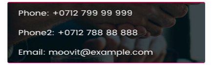
Classic:

Content Settings:

Use custom font for description? - Turn on the switcher if you want to customize the font for the description.
Use custom font for content? - Turn on the switcher if you want to customize the font for content.
- Heading - Add the heading of the block.
- Email- Add email to the block.
- Phone- Add phone number to the block.
Heading Typography:

- Family - Select the typography fof the heading.
- Size - Set up the heading size.
- Weight - Select the weight of the heading.
- Transform - Change the case of the text.
- Style - Select text style for the heading.
- Decoration - Select a style for the title decoration.
- Line-Height - Enter a line-height of the heading.
- Letter Spacing - Enter a letter spacing of the heading.
Content Typography:

Alignment - - Here you can select the content alignment.
Text Color - Here you can select a content color from the palette.
- Family - Here you can select the typography for the content;
- Size - Here you can set up the content size;
- Weight - Please, select the weight for the content;
- Transform - This option allows to change the case of the text;
- Style - Please, select text style for the content;
- Decoration - Please, select a style for the content decoration;
- Line-Height - Here you can enter a line height for the content;
- Letter Spacing - Here you can enter a letter spacing for the content.
Modern:

Content Settings:

- Heading - Add the heading of the block.
- Address - Put address to the block.
- Link Text - Add a URL to the text.
- Link - Add a URL to the button.
- Email- Add email to the block.
- Phone- Add phone number to the block.
- Networks- Put networks to the block.
Heading Typography:
- Family - Select the typography fof the heading.
- Size - Set up the heading size.
- Weight - Select the weight of the heading.
- Transform - Change the case of the text.
- Style - Select text style for the heading.
- Decoration - Select a style for the title decoration.
- Line-Height - Enter a line-height of the heading.
- Letter Spacing - Enter a letter spacing of the heading.
Content Typography:
Alignment - - Here you can select the content alignment.
Text Color - Here you can select a content color from the palette.
- Family - Here you can select the typography for the content;
- Size - Here you can set up the content size;
- Weight - Please, select the weight for the content;
- Transform - This option allows to change the case of the text;
- Style - Please, select text style for the content;
- Decoration - Please, select a style for the content decoration;
- Line-Height - Here you can enter a line height for the content;
- Letter Spacing - Here you can enter a letter spacing for the content.
Simple:

Content Settings:

- Add item - Please, click on the button to add a new item.
- Content - Choose between address email or phone #
- Icon - Choose the icon to add to the block.
- Heading - Add the heading of the block.
- Content - Text your content.
Heading Typography:
- Family - Select the typography fof the heading.
- Size - Set up the heading size.
- Weight - Select the weight of the heading.
- Transform - Change the case of the text.
- Style - Select text style for the heading.
- Decoration - Select a style for the title decoration.
- Line-Height - Enter a line-height of the heading.
- Letter Spacing - Enter a letter spacing of the heading.
Content Typography:
Alignment - - Here you can select the content alignment.
Text Color - Here you can select a content color from the palette.
- Family - Here you can select the typography for the content;
- Size - Here you can set up the content size;
- Weight - Please, select the weight for the content;
- Transform - This option allows to change the case of the text;
- Style - Please, select text style for the content;
- Decoration - Please, select a style for the content decoration;
- Line-Height - Here you can enter a line height for the content;
- Letter Spacing - Here you can enter a letter spacing for the content.
Contacts 1:

Content Settings:

- Heading - Add the heading of the block.
- Address - Put address to the block.
- Email - Add email to the block.
- Phone - Add phone number to the block.
- Networks - Put networks to the block.
Button Settings

Button items:
- Layout - Please, select the button layout.
- Name - Please, enter the button text.
- Link - Please, add a URL to the button.
- Style - Here you can select the button style (dark or light).
- Size - Here you can select button size (small or large).
- Type - Here you can select the button type (reverse or transparent).
- Box shadow - This option allows you to add the box-shadow to the button. It only works if the box-shadow is specified in the skin generator.
- Enable Full width - Turn on the switcher if you want to enable full width to the current button.
Contacts 2:
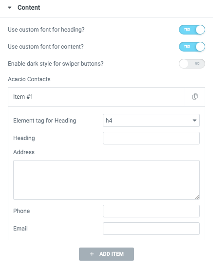
Use custom font for heading? - Turn on the switcher if you want to customize the font for the heading.
Use custom font for content? - Turn on the switcher if you want to customize the font for content.
Enable dark style for swiper buttons? - Turn on the switcher if you want to choose style for swiper buttons.
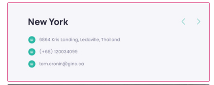
- Add item - Please, click on the button to add a new item.
- Element tag for Heading - Choose a litle tag.
- Heading - Add the heading of the block.
- Address - Put address to the block.
- Phone- Add phone number to the block.
- Email- Add email to the block.
Heading Typography:
- Family - Select the typography fof the heading.
- Size - Set up the heading size.
- Weight - Select the weight of the heading.
- Transform - Change the case of the text.
- Style - Select text style for the heading.
- Decoration - Select a style for the title decoration.
- Line-Height - Enter a line-height of the heading.
- Letter Spacing - Enter a letter spacing of the heading.
Content Typography:
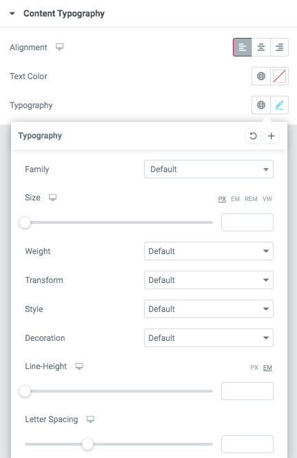
Alignment - - Here you can select the content alignment.
Text Color - Here you can select a content color from the palette.
Typography items:
- Family - Here you can select the typography for the content;
- Size - Here you can set up the content size;
- Weight - Please, select the weight for the content;
- Transform - This option allows to change the case of the text;
- Style - Please, select text style for the content;
- Decoration - Please, select a style for the content decoration;
- Line-Height - Here you can enter a line height for the content;
- Letter Spacing - Here you can enter a letter spacing for the content.
Swiper Settings:
- Arrows - Turn on the switcher to display swiper in arrows style.
- Pagination - Turn on the switcher to display the sliders pagination.
- Loop - Turn on the switcher to display the loop effect.
- Simulate Touch - Turn on the switcher to display the simulate touch.
- Autoplay - Enter autoplay speed(in ms). 0 - autoplay off.
- Speed - Enter speed(in ms).
- Slides count - Enter the number of slides by default.
- Slides count (lg) - Enter the number of default slides on devices width <1200px.
- Slides count(md) - Enter the default slider count for devices with a width of <991px.
- Slides count(sm) - Enter spaces between slides on devices with a width of <768px.
- Slides count(xs) - Enter slides between devices on widths <480px.
- Spaces between slides - Enter spaces between slides.
- Spaces(lg) - Enter the space width <1200px.
- Spaces(md) - Enter the space width <991px.
- Spaces(sm) - Enter the space width <768px.
- Spaces(xs) - Enter the space width <480px.
Contacts 3:
Content Settings:

- Add item - Please, click on the button to add a new item.
- Element tag for Heading - Choose a litle tag.
- Heading - Add the heading of the block.
- Address - Put address to the block.
- Phone- Add phone number to the block.
- Email- Add email to the block.
- Enable dark light version - Turn on the switcher if you want to choose the light version.
- Use contacts typography? - Turn on the switcher if you want to customize contacts typography.
Contacts typography:

Alignment - - Here you can select the title alignment.
Text Color - Here you can select title color from the palette.
Typography items:
- Family - Here you can select the typography for the typography;
- Size - Here you can set up the title typography;
- Weight - Please, select the weight for the typography;
- Transform - This option allows to change the case of the text;
- Style - Please, select text style for the typography;
- Decoration - Please, select style for the title typography;
- Line-Height - Here you can enter a line height for the typography;
- Letter Spacing - Here you can enter a letter spacing for the typography.
Contacts 4:

Content Settings:

- Add item - Please, click on the button to add a new item.
- Heading - Add the heading of the block.
- Address - Put address to the block.
- Phone- Add phone number to the block.
- Email- Add email to the block.
- Enable dark light version - Turn on the switcher if you want to choose light version.
- Use contacts typography? - Turn on the switcher if you want to customize contacts typography.
Enable dark version? - Turn on the switcher if you want to choose dark version.
Use custom font for heading? - Turn on the switcher if you want to customize the font for the heading.
Use custom font for content? - Turn on the switcher if you want to customize the font for content.
Swiper Settings:

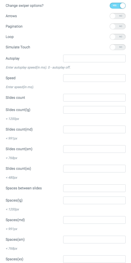
Change swiper options? - Turn on switcher if you want to change the following swiper options:
- Arrows - Turn on the switcher to display swiper in arrows style.
- Pagination - Turn on the switcher to display pagination.
- Effect Type - Here you can select from the list the effect type for swiper (Slide, Fade, Cube, Flip, Coverflow).
- Loop - Turn on the switcher to display the loop effect.
- Simulate Touch - Turn on the switcher to add the simulate touch.
- Autoplay - Please, enter autoplay speed(in ms). 0 - autoplay off.
- Speed - Please, enter speed(in ms).
- Lazy load image - Amount of next/prev slides to preload lazy images in. (if 0 - lazy load off).
Contacts Title Typography:

Alignment - - Here you can select the title alignment.
- Family - Here you can select the typography for the title;
- Size - Here you can set up the title size;
- Weight - Please, select the weight for the title;
- Transform - This option allows to change the case of the text;
- Style - Please, select text style for the title;
- Decoration - Please, select style for the title decoration;
- Line-Height - Here you can enter a line height for the title;
- Letter Spacing - Here you can enter a letter spacing for the title.
Contacts Content Typography:

Alignment - - Here you can select the content alignment.
Text Color - Here you can select a content color from the palette.
- Family - Here you can select the typography for the content;
- Size - Here you can set up the content size;
- Weight - Please, select the weight for the content;
- Transform - This option allows to change the case of the text;
- Style - Please, select text style for the content;
- Decoration - Please, select a style for the content decoration;
- Line-Height - Here you can enter a line height for the content;
- Letter Spacing - Here you can enter a letter spacing for the content.
Contacts 5:

Content Settings:

Use custom font for heading? - Turn on the switcher if you want to customize the font for the heading.
Use custom font for content? - Turn on the switcher if you want to customize the font for content.
- Add item - Please, click on the button to add a new item.
- Element tag for Heading - Choose a litle tag.
- Address - Put address to the block.
- Phone - Add phone number to the block.
- Email - Add email to the block.
Enable dark style for text? - Turn on the switcher if you want to choose dark style .
Heading Typography:
- Family - Select the typography fof the heading.
- Size - Set up the heading size.
- Weight - Select the weight of the heading.
- Transform - Change the case of the text.
- Style - Select text style for the heading.
- Decoration - Select a style for the title decoration.
- Line-Height - Enter a line-height of the heading.
- Letter Spacing - Enter a letter spacing of the heading.
Content Typography:
Alignment - - Here you can select the content alignment.
Text Color - Here you can select a content color from the palette.
Typography items:
- Family - Here you can select the typography for the content;
- Size - Here you can set up the content size;
- Weight - Please, select the weight for the content;
- Transform - This option allows to change the case of the text;
- Style - Please, select text style for the content;
- Decoration - Please, select a style for the content decoration;
- Line-Height - Here you can enter a line height for the content;
- Letter Spacing - Here you can enter a letter spacing for the content.
Contacts 6:

Content Settings:

Use custom font for heading? - Turn on the switcher if you want to customize the font for the heading.
Use custom font for content? - Turn on the switcher if you want to customize the font for content.
- Add item - Please, click on the button to add a new item.
- Element tag for Heading - Choose a litle tag.
- Heading - Add the heading of the block.
- Address - Put address to the block.
- Phone - Add phone number to the block.
- Email - Add email to the block.
Enable dark style for text? - Turn on the switcher if you want to choose dark style.
Use custom font for arrows? - Turn on the switcher if you want to customize the arrows.
Heading Typography:
- Family - Select the typography fof the heading.
- Size - Set up the heading size.
- Weight - Select the weight of the heading.
- Transform - Change the case of the text.
- Style - Select text style for the heading.
- Decoration - Select a style for the title decoration.
- Line-Height - Enter a line-height of the heading.
- Letter Spacing - Enter a letter spacing of the heading.
Content Typography:
Alignment - - Here you can select the content alignment.
Text Color - Here you can select a content color from the palette.
Typography items:
- Family - Here you can select the typography for the content;
- Size - Here you can set up the content size;
- Weight - Please, select the weight for the content;
- Transform - This option allows to change the case of the text;
- Style - Please, select text style for the content;
- Decoration - Please, select a style for the content decoration;
- Line-Height - Here you can enter a line height for the content;
- Letter Spacing - Here you can enter a letter spacing for the content.
Hryzantema Swiper:

Text Color - Here you can select a content color from the palette.
Typography - Select the typography for the heading.
Change swiper options? - Turn on switcher if you want to change the following swiper options:
- Arrows - Turn on the switcher to display swiper in arrows style.
- Pagination - Turn on the switcher to display pagination.
- Effect Type - Here you can select from the list the effect type for swiper (Slide, Fade, Cube, Flip, Coverflow).
- Loop - Turn on the switcher to display the loop effect.
- Simulate Touch - Turn on the switcher to add the simulate touch.
- Autoplay - Please, enter autoplay speed(in ms). 0 - autoplay off.
- Speed - Please, enter speed(in ms).
Hryzantema Button:

Button items:
- Layout - Please, select the button layout.
- Name - Please, enter the button text.
- Link - Please, add a URL to the button.
- Style - Here you can select the button style (dark or light).
- Size - Here you can select button size (small or large).
- Type - Here you can select the button type (reverse or transparent).
- Box shadow - This option allows you to add the box-shadow to the button. It only works if the box-shadow is specified in the skin generator.
- Enable Full width - Turn on the switcher if you want to enable full width to the current button.
Contacts 7:

Content Settings:

Use custom font for heading? - Turn on the switcher if you want to customize the font for the heading.
Use custom font for content? - Turn on the switcher if you want to customize the font for content.
Enable light version - Turn on the switcher if you want to choose light version.
- Add item - Please, click on the button to add a new item.
- Element tag for Heading - Choose a litle tag.
- Heading - Add the heading of the block.
- Address - Put address to the block.
- Phone - Add phone number to the block.
- Email - Add email to the block.
Heading Typography:
- Family - Select the typography fof the heading.
- Size - Set up the heading size.
- Weight - Select the weight of the heading.
- Transform - Change the case of the text.
- Style - Select text style for the heading.
- Decoration - Select a style for the title decoration.
- Line-Height - Enter a line-height of the heading.
- Letter Spacing - Enter a letter spacing of the heading.
Content Typography:
Alignment - - Here you can select the content alignment.
Text Color - Here you can select a content color from the palette.
Typography items:
- Family - Here you can select the typography for the content;
- Size - Here you can set up the content size;
- Weight - Please, select the weight for the content;
- Transform - This option allows to change the case of the text;
- Style - Please, select text style for the content;
- Decoration - Please, select a style for the content decoration;
- Line-Height - Here you can enter a line height for the content;
- Letter Spacing - Here you can enter a letter spacing for the content.
Contacts 8:

Content Settings:

Use custom font for content? - Turn on the switcher if you want to customize the font for content.
- Address - Put address to the block.
- Link Text - Add a URL to the text.\
- Link - Add a URL to the button.
- Email - Add email to the block.
- Phone- Add phone number to the block.
- Add item - Please, click on the button to add a new item.
Content Typography:
Alignment - - Here you can select the content alignment.
Text Color - Here you can select a content color from the palette.
Typography items:
- Family - Here you can select the typography for the content;
- Size - Here you can set up the content size;
- Weight - Please, select the weight for the content;
- Transform - This option allows to change the case of the text;
- Style - Please, select text style for the content;
- Decoration - Please, select a style for the content decoration;
- Line-Height - Here you can enter a line height for the content;
- Letter Spacing - Here you can enter a letter spacing for the content.
Contacts 9:

Content Settings:
- Element tag for Heading - Choose a litle tag.
- Heading - Add the heading of the block.
- Address - Put address to the block.
- Phone- Add phone number to the block.
- Email- Add email to the block.
Use contents content typography? - Turn on the switcher if you want to customize content typography.
Heading Typography:
- Family - Select the typography fof the heading.
- Size - Set up the heading size.
- Weight - Select the weight of the heading.
- Transform - Change the case of the text.
- Style - Select text style for the heading.
- Decoration - Select a style for the title decoration.
- Line-Height - Enter a line-height of the heading.
- Letter Spacing - Enter a letter spacing of the heading.
Swiper Settings:
- Arrows - Turn on the switcher to display swiper in arrows style.
- Pagination - Turn on the switcher to display the sliders pagination.
- Loop - Turn on the switcher to display the loop effect.
- Simulate Touch - Turn on the switcher to display the simulate touch.
- Autoplay - Enter autoplay speed(in ms). 0 - autoplay off.
- Speed - Enter speed(in ms).
- Slides count - Enter the number of slides by default.
- Slides count (lg) - Enter the number of default slides on devices width <1200px.
- Slides count(md) - Enter the default slider count for devices with a width of <991px.
- Slides count(sm) - Enter spaces between slides on devices with a width of <768px.
- Slides count(xs) - Enter slides between devices on widths <480px.
- Spaces between slides - Enter spaces between slides.
- Spaces(lg) - Enter the space width <1200px.
- Spaces(md) - Enter the space width <991px.
- Spaces(sm) - Enter the space width <768px.
- Spaces(xs) - Enter the space width <480px.
Contacts Content Typography:
Alignment - - Here you can select the content alignment.
Text Color - Here you can select a content color from the palette.
- Family - Here you can select the typography for the content;
- Size - Here you can set up the content size;
- Weight - Please, select the weight for the content;
- Transform - This option allows to change the case of the text;
- Style - Please, select text style for the content;
- Decoration - Please, select a style for the content decoration;
- Line-Height - Here you can enter a line height for the content;
- Letter Spacing - Here you can enter a letter spacing for the content.
Icon

- Icon library - Please, select the icon library from the list.
- Icon font size - Enter icon font size with units.
Contacts 10:

Content Settings:

Use custom font for heading? - Turn on the switcher if you want to customize the font for the heading.
Use custom font for content? - Turn on the switcher if you want to customize the font for content.
- Heading - Add the heading of the block.
- Text - Add text to the box.
Heading Typography:
- Family - Select the typography fof the heading.
- Size - Set up the heading size.
- Weight - Select the weight of the heading.
- Transform - Change the case of the text.
- Style - Select text style for the heading.
- Decoration - Select a style for the title decoration.
- Line-Height - Enter a line-height of the heading.
- Letter Spacing - Enter a letter spacing of the heading.
Content Typography:
Alignment - - Here you can select the content alignment.
Text Color - Here you can select a content color from the palette.
Typography items:
- Family - Here you can select the typography for the content;
- Size - Here you can set up the content size;
- Weight - Please, select the weight for the content;
- Transform - This option allows to change the case of the text;
- Style - Please, select text style for the content;
- Decoration - Please, select a style for the content decoration;
- Line-Height - Here you can enter a line height for the content;
- Letter Spacing - Here you can enter a letter spacing for the content.
Contacts 11:

Content Settings:

- Heading - Add the heading of the block.
- Address - Put address to the block.
- Phone- Add phone number to the block.
- Email - Add email to the block.
- Element tag for Heading - Choose a little tag.
Heading Typography:
- Family - Select the typography fof the heading.
- Size - Set up the heading size.
- Weight - Select the weight of the heading.
- Transform - Change the case of the text.
- Style - Select text style for the heading.
- Decoration - Select a style for the title decoration.
- Line-Height - Enter a line-height of the heading.
- Letter Spacing - Enter a letter spacing of the heading.
Icon

- Icon library - Please, select the icon library from the list.
- Icon color - Please, choose the icon color from the color palette.
- Icon font size - Enter icon font size with units.
Contacts 12:

Content Settings:

Use custom font for heading? - Turn on the switcher if you want to customize the font for the heading.
Use custom font for content? - Turn on the switcher if you want to customize the font for content.
Enable light version - Turn on the switcher if you want to choose light version.
- Add item - Please, click on the button to add a new item.
- Element tag for Heading - Choose a litle tag.
- Heading - Add the heading of the block.
- Address - Put address to the block.
- Phone - Add phone number to the block.
- Email - Add email to the block.
Heading Typography:
- Family - Select the typography fof the heading.
- Size - Set up the heading size.
- Weight - Select the weight of the heading.
- Transform - Change the case of the text.
- Style - Select text style for the heading.
- Decoration - Select a style for the title decoration.
- Line-Height - Enter a line-height of the heading.
- Letter Spacing - Enter a letter spacing of the heading.
Content Typography:
Alignment - - Here you can select the content alignment.
Text Color - Here you can select a content color from the palette.
Typography items:
- Family - Here you can select the typography for the content;
- Size - Here you can set up the content size;
- Weight - Please, select the weight for the content;
- Transform - This option allows to change the case of the text;
- Style - Please, select text style for the content;
- Decoration - Please, select a style for the content decoration;
- Line-Height - Here you can enter a line height for the content;
- Letter Spacing - Here you can enter a letter spacing for the content.
Swiper Settings:
Change swiper options? - Turn on switcher if you want to change the following swiper options:
- Arrows - Turn on the switcher to display swiper in arrows style.
- Pagination - Turn on the switcher to display pagination.
- Effect Type - Here you can select from the list the effect type for swiper (Slide, Fade, Cube, Flip, Coverflow).
- Loop - Turn on the switcher to display the loop effect.
- Simulate Touch - Turn on the switcher to add the simulate touch.
- Autoplay - Please, enter autoplay speed(in ms). 0 - autoplay off.
- Speed - Please, enter speed(in ms).
Contacts 13:

Content Settings:

Enable light version - Turn on the switcher if you want to choose light version.
- Add item - Please, click on the button to add a new item.
- Heading - Add the heading of the block.
- Address - Put address to the block.
- Phone - Add phone number to the block.
- Email - Add email to the block.
Contacts 14:

Content Settings:

- Add item - Please, click on the button to add a new item.
- Element tag for Heading - Choose a litle tag.
- Heading - Add the heading of the block.
- Address - Put address to the block.
- Phone - Add phone number to the block.
- Email - Add email to the block.
Swiper Settings:
- Arrows - Turn on the switcher to display swiper in arrows style.
- Pagination - Turn on the switcher to display the sliders pagination.
- Loop - Turn on the switcher to display the loop effect.
- Simulate Touch - Turn on the switcher to display the simulate touch.
- Autoplay - Enter autoplay speed(in ms). 0 - autoplay off.
- Speed - Enter speed(in ms).
- Slides count - Enter the number of slides by default.
- Slides count (lg) - Enter the number of default slides on devices width <1200px.
- Slides count(md) - Enter the default slider count for devices with a width of <991px.
- Slides count(sm) - Enter spaces between slides on devices with a width of <768px.
- Slides count(xs) - Enter slides between devices on widths <480px.
- Spaces between slides - Enter spaces between slides.
- Spaces(lg) - Enter the space width <1200px.
- Spaces(md) - Enter the space width <991px.
- Spaces(sm) - Enter the space width <768px.
- Spaces(xs) - Enter the space width <480px.
Contacts 15:

Content Settings:
Text - Add text to the box.
Contacts 16:

Content Settings:

Use custom font for heading? - Turn on the switcher if you want to customize the font for the heading.
Use custom font for content? - Turn on the switcher if you want to customize the font for content.
- Heading - Add the heading of the block.
- Address - Put address to the block.
- Phone - Add phone number to the block.
- Email - Add email to the block.
Heading Typography:
- Family - Select the typography fof the heading.
- Size - Set up the heading size.
- Weight - Select the weight of the heading.
- Transform - Change the case of the text.
- Style - Select text style for the heading.
- Decoration - Select a style for the title decoration.
- Line-Height - Enter a line-height of the heading.
- Letter Spacing - Enter a letter spacing of the heading.
Content Typography:
Alignment - - Here you can select the content alignment.
Text Color - Here you can select a content color from the palette.
Typography items:
- Family - Here you can select the typography for the content;
- Size - Here you can set up the content size;
- Weight - Please, select the weight for the content;
- Transform - This option allows to change the case of the text;
- Style - Please, select text style for the content;
- Decoration - Please, select a style for the content decoration;
- Line-Height - Here you can enter a line height for the content;
- Letter Spacing - Here you can enter a letter spacing for the content.
Swiper Settings:

- - Turn on the switcher to display swiper in arrows style.
- Pagination - Turn on the switcher to display the sliders pagination.
- Loop - Turn on the switcher to display the loop effect.
- Simulate Touch - Turn on the switcher to display the simulate touch.
- Autoplay - Enter autoplay speed(in ms). 0 - autoplay off.
- Speed - Enter speed(in ms).
- Slides count - Enter the number of slides by default.
- Slides count (lg) - Enter the number of default slides on devices width <1200px.
- Slides count(md) - Enter the default slider count for devices with a width of <991px.
- Slides count(sm) - Enter spaces between slides on devices with a width of <768px.
- Slides count(xs) - Enter slides between devices on widths <480px.
Contacts 17:

Content Settings:
Use custom font for heading? - Turn on the switcher if you want to customize the font for the heading.
Use custom font for content? - Turn on the switcher if you want to customize the font for content.
- Heading - Add the heading of the block.
- Address - Put address to the block.
- Phone - Add phone number to the block.
- Email - Add email to the block.
Enable light version - Turn on the switcher if you want to choose light version.
Heading Typography:
- Family - Select the typography fof the heading.
- Size - Set up the heading size.
- Weight - Select the weight of the heading.
- Transform - Change the case of the text.
- Style - Select text style for the heading.
- Decoration - Select a style for the title decoration.
- Line-Height - Enter a line-height of the heading.
- Letter Spacing - Enter a letter spacing of the heading.
Content Typography:
Alignment - - Here you can select the content alignment.
Text Color - Here you can select a content color from the palette.
Typography items:
- Family - Here you can select the typography for the content;
- Size - Here you can set up the content size;
- Weight - Please, select the weight for the content;
- Transform - This option allows to change the case of the text;
- Style - Please, select text style for the content;
- Decoration - Please, select a style for the content decoration;
- Line-Height - Here you can enter a line height for the content;
- Letter Spacing - Here you can enter a letter spacing for the content.
Contacts 18:

Content Settings:

Use custom font for heading? - Turn on the switcher if you want to customize the font for the heading.
Use custom font for content? - Turn on the switcher if you want to customize the font for content.
Turn on light arrows? - Turn on the switcher if you want to choose arrows
- Add item - Please, click on the button to add a new item.
- Element tag for Heading - Choose a litle tag.
- Heading - Add the heading of the block.
- Address - Put address to the block.
- Phone- Add phone number to the block.
- Email- Add email to the block.
Heading Typography:
- Family - Select the typography fof the heading.
- Size - Set up the heading size.
- Weight - Select the weight of the heading.
- Transform - Change the case of the text.
- Style - Select text style for the heading.
- Decoration - Select a style for the title decoration.
- Line-Height - Enter a line-height of the heading.
- Letter Spacing - Enter a letter spacing of the heading.
Content Typography:
Alignment - ere you can select the content alignment.
Text Color - Here you can select a content color from the palette.
Typography items:
- Family - Here you can select the typography for the content;
- Size - Here you can set up the content size;
- Weight - Please, select the weight for the content;
- Transform - This option allows to change the case of the text;
- Style - Please, select text style for the content;
- Decoration - Please, select a style for the content decoration;
- Line-Height - Here you can enter a line height for the content;
- Letter Spacing - Here you can enter a letter spacing for the content.
Swiper Settings:
Change swiper options? - Turn on switcher if you want to change the following swiper options:
- Arrows - Turn on the switcher to display swiper in arrows style.
- Pagination - Turn on the switcher to display pagination.
- Effect Type - Here you can select from the list the effect type for swiper (Slide, Fade, Cube, Flip, Coverflow).
- Loop - Turn on the switcher to display the loop effect.
- Simulate Touch - Turn on the switcher to add the simulate touch.
- Autoplay - Please, enter autoplay speed(in ms). 0 - autoplay off.
- Speed - Please, enter speed(in ms).
- Lazy load image - Amount of next/prev slides to preload lazy images in. (if 0 - lazy load off).
Icon
- Icon library - Please, select the icon library from the list.
- Icon color - Please, choose the icon color from the color palette.
- Icon font size - Enter icon font size with units.