Features Single (Sterling)
This shortcode allows adding a section with different features information to the page.
Classic Style:

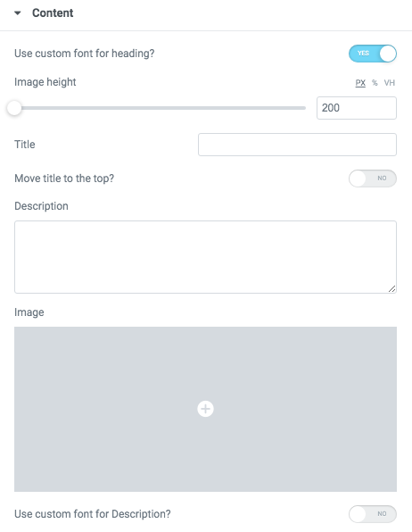
Content Settings:


- Image - Here you can add the image to this section
- Heading - Here you can add the text for the heading.
- Use the custom font for heading? - Turn on the switcher if you want to customize heading typography.
- Description - Please, enter your description text.
- Use the custom font for description? - Turn on the switcher if you want to customize description typography.
- Desktop align for content - Select align for desktop.
- Tablet align for content- Select align for tablet.
- Mobile align for content - Select align for mobile.
- Link Text - Add link text to the button here.
- Link - Add URL to the button.
Icons


- Icon library - Please, select the icon library from the list.
- Icon color - Please, choose the icon color from the color palette.
- Icon font size - Enter icon font size with units.
Images size:

Image original size - Select the image size.
Heading Typography:

- Family - Select the typography fof the heading.
- Size - Set up the heading size.
- Weight - Select the weight of the heading.
- Transform - Change the case of the text.
- Style - Select text style for the heading.
- Decoration - Select a style for the title decoration.
- Line-Height - Enter a line-height of the heading.
- Letter Spacing - Enter a letter spacing of the heading.
Description Typography:
If you turn on the switcher "Use custom font for description?" in Content Settings you can customize font for the description.
Alignment - - Here you can select the description alignment.
Text Color - Here you can select description color from the palette.
Typography - Select the typography for the heading.
- Family - Here you can select the typography for the description text.
- Size - Here you can set up the description text size.
- Weight - Please, select the weight for the description text.
- Transform - This option allows to change the case of the description text.
- Style - Please, select text style for the description text.
- Decoration - Please, select a style for the description text decoration.
- Line-Height - Here you can enter a line height for the description text.
- Letter Spacing - Here you can enter a letter spacing for the description text.
Simple Style:

Content Settings:

Heading - Here you can add the text for the heading.
Use the custom font for description? - Turn on the switcher if you want to customize description typography.
Icons

- Icon library - Please, select the icon library from the list.
- Icon color - Please, choose the icon color from the color palette.
- Icon font size - Enter icon font size with units.
Heading Typography:
- Family - Select the typography fof the heading.
- Size - Set up the heading size.
- Weight - Select the weight of the heading.
- Transform - Change the case of the text.
- Style - Select text style for the heading.
- Decoration - Select a style for the title decoration.
- Line-Height - Enter a line-height of the heading.
- Letter Spacing - Enter a letter spacing of the heading.
Description Typography:
If you turn on the switcher "Use custom font for description?" in Content Settings you can customize font for the description.
Alignment - - Here you can select the description alignment.
Text Color - Here you can select description color from the palette.
Typography - Select the typography for the heading.
- Family - Here you can select the typography for the description text.
- Size - Here you can set up the description text size.
- Weight - Please, select the weight for the description text.
- Transform - This option allows to change the case of the description text.
- Style - Please, select text style for the description text.
- Decoration - Please, select a style for the description text decoration.
- Line-Height - Here you can enter a line height for the description text.
- Letter Spacing - Here you can enter a letter spacing for the description text.
Simple with number Style:

Content Settings:

Number - Here you can add the number to this section.
Heading - Here you can add the text for the heading.
Use the custom font for description? - Turn on the switcher if you want to customize description typography.
Heading Typography:
- Family - Select the typography fof the heading.
- Size - Set up the heading size.
- Weight - Select the weight of the heading.
- Transform - Change the case of the text.
- Style - Select text style for the heading.
- Decoration - Select a style for the title decoration.
- Line-Height - Enter a line-height of the heading.
- Letter Spacing - Enter a letter spacing of the heading.
Description Typography:
If you turn on the switcher "Use custom font for description?" in Content Settings you can customize font for the description.
Alignment - - Here you can select the description alignment.
Text Color - Here you can select description color from the palette.
Typography - Select the typography for the heading.
- Family - Here you can select the typography for the description text.
- Size - Here you can set up the description text size.
- Weight - Please, select the weight for the description text.
- Transform - This option allows to change the case of the description text.
- Style - Please, select text style for the description text.
- Decoration - Please, select a style for the description text decoration.
- Line-Height - Here you can enter a line height for the description text.
- Letter Spacing - Here you can enter a letter spacing for the description text.
Number Typography:

Text Color - Here you can select title color from the palette.
Alignment - Here you can select the number alignment.
- Family - Here you can select the typography for the number .
- Size - Here you can set up the number size.
- Weight - Please, select the weight for the number .
- Transform - This option allows to change the case of the text.
- Style - Please, select text style for the number .
- Decoration - Please, select a style for the number decoration.
- Line-Height - Here you can enter a line height for the number .
- Letter Spacing - Here you can enter a letter spacing for the number .
Modern Style:

Content Settings:

- Image - Here you can add the image to this section
- Heading - Here you can add the text for the heading.
- Use the custom font for heading? - Turn on the switcher if you want to customize heading typography.
- Description - Please, enter your description text.
- Use the custom font for description? - Turn on the switcher if you want to customize description typography.
- Link Text - Add link text to the button here.
- Link - Add url to the button.
Icons
- Icon library - Please, select the icon library from the list.
- Icon color - Please, choose the icon color from the color palette.
- Icon font size - Enter icon font size with units.
Images size:
Image original size - Select the image size.
Heading Typography:
- Family - Select the typography fof the heading.
- Size - Set up the heading size.
- Weight - Select the weight of the heading.
- Transform - Change the case of the text.
- Style - Select text style for the heading.
- Decoration - Select a style for the title decoration.
- Line-Height - Enter a line-height of the heading.
- Letter Spacing - Enter a letter spacing of the heading.
Description Typography:
If you turn on the switcher "Use custom font for description?" in Content Settings you can customize font for the description.
Alignment - - Here you can select the description alignment.
Text Color - Here you can select description color from the palette.
Typography - Select the typography for the heading.
- Family - Here you can select the typography for the description text.
- Size - Here you can set up the description text size.
- Weight - Please, select the weight for the description text.
- Transform - This option allows to change the case of the description text.
- Style - Please, select text style for the description text.
- Decoration - Please, select a style for the description text decoration.
- Line-Height - Here you can enter a line height for the description text.
- Letter Spacing - Here you can enter a letter spacing for the description text.
Simple With Icon and Text Style:

Content Settings:

- Full width? - Turn on the switcher if you want to make a full-width section.
- Heading - Here you can add the text for the heading.
- Use the custom font for heading? - Turn on the switcher if you want to customize heading typography.
- Description - Please, enter your description text.
- Use the custom font for description? - Turn on the switcher if you want to customize description typography.
- Link Text - Add link text to the button here.
- Link - Add url to the button.
- Background - Please, select the style of the background.
Icons
- Icon library - Please, select the icon library from the list.
- Icon color - Please, choose the icon color from the color palette.
- Icon font size - Enter icon font size with units.
Heading Typography:
- Family - Select the typography fof the heading.
- Size - Set up the heading size.
- Weight - Select the weight of the heading.
- Transform - Change the case of the text.
- Style - Select text style for the heading.
- Decoration - Select a style for the title decoration.
- Line-Height - Enter a line-height of the heading.
- Letter Spacing - Enter a letter spacing of the heading.
Description Typography:
If you turn on the switcher "Use custom font for description?" in Content Settings you can customize font for the description.
Alignment - - Here you can select the description alignment.
Text Color - Here you can select description color from the palette.
Typography - Select the typography for the heading.
- Family - Here you can select the typography for the description text.
- Size - Here you can set up the description text size.
- Weight - Please, select the weight for the description text.
- Transform - This option allows to change the case of the description text.
- Style - Please, select text style for the description text.
- Decoration - Please, select a style for the description text decoration.
- Line-Height - Here you can enter a line height for the description text.
- Letter Spacing - Here you can enter a letter spacing for the description text.
List with Icon Style:
 Content Settings:
- Heading - Here you can add the text for the heading.
- Use the custom font for heading? - Turn on the switcher if you want to customize heading typography.
- Description - Please, enter your description text.
- Use the custom font for description? - Turn on the switcher if you want to customize description typography.
Icons
- Icon library - Please, select the icon library from the list.
- Icon color - Please, choose the icon color from the color palette.
- Icon font size - Enter icon font size with units.
Heading Typography:
- Family - Select the typography fof the heading.
- Size - Set up the heading size.
- Weight - Select the weight of the heading.
- Transform - Change the case of the text.
- Style - Select text style for the heading.
- Decoration - Select a style for the title decoration.
- Line-Height - Enter a line-height of the heading.
- Letter Spacing - Enter a letter spacing of the heading.
Description Typography:
If you turn on the switcher "Use custom font for description?" in Content Settings you can customize font for the description.
Alignment - - Here you can select the description alignment.
Text Color - Here you can select description color from the palette.
Typography - Select the typography for the heading.
- Family - Here you can select the typography for the description text.
- Size - Here you can set up the description text size.
- Weight - Please, select the weight for the description text.
- Transform - This option allows to change the case of the description text.
- Style - Please, select text style for the description text.
- Decoration - Please, select a style for the description text decoration.
- Line-Height - Here you can enter a line height for the description text.
- Letter Spacing - Here you can enter a letter spacing for the description text.
Modern with image Style:

Content Settings:

- Image - Here you can add the image to this section
- Heading - Here you can add the text for the heading.
- Use the custom font for heading? - Turn on the switcher if you want to customize heading typography.
- Description - Please, enter your description text.
- Use the custom font for description? - Turn on the switcher if you want to customize description typography.
Images size:
Image original size - Select the image size.
Heading Typography:
- Family - Select the typography fof the heading.
- Size - Set up the heading size.
- Weight - Select the weight of the heading.
- Transform - Change the case of the text.
- Style - Select text style for the heading.
- Decoration - Select a style for the title decoration.
- Line-Height - Enter a line-height of the heading.
- Letter Spacing - Enter a letter spacing of the heading.
Description Typography:
If you turn on the switcher "Use custom font for description?" in Content Settings you can customize font for the description.
Alignment - - Here you can select the description alignment.
Text Color - Here you can select description color from the palette.
Typography - Select the typography for the heading.
- Family - Here you can select the typography for the description text.
- Size - Here you can set up the description text size.
- Weight - Please, select the weight for the description text.
- Transform - This option allows to change the case of the description text.
- Style - Please, select text style for the description text.
- Decoration - Please, select a style for the description text decoration.
- Line-Height - Here you can enter a line height for the description text.
- Letter Spacing - Here you can enter a letter spacing for the description text.
Features Single 1 Style:
 Content Settings:
- Image - Here you can add the image to this section
- Heading - Here you can add the text for the heading.
- Use the custom font for heading? - Turn on the switcher if you want to customize heading typography.
- Description - Please, enter your description text.
- Use the custom font for description? - Turn on the switcher if you want to customize description typography.
Heading Typography:
- Family - Select the typography fof the heading.
- Size - Set up the heading size.
- Weight - Select the weight of the heading.
- Transform - Change the case of the text.
- Style - Select text style for the heading.
- Decoration - Select a style for the title decoration.
- Line-Height - Enter a line-height of the heading.
- Letter Spacing - Enter a letter spacing of the heading.
Description Typography:
If you turn on the switcher "Use custom font for description?" in Content Settings, you can customize font for the description.
Alignment - - Here you can select the description alignment.
Text Color - Here you can select description color from the palette.
Typography - Select the typography for the heading.
- Family - Here you can select the typography for the description text.
- Size - Here you can set up the description text size.
- Weight - Please, select the weight for the description text.
- Transform - This option allows to change the case of the description text.
- Style - Please, select text style for the description text.
- Decoration - Please, select a style for the description text decoration.
- Line-Height - Here you can enter a line height for the description text.
- Letter Spacing - Here you can enter a letter spacing for the description text.
Button Settings

- Add button? - Turn on the switcher to add the button for the current slide. If you turn on the switcher, there are the next items.
Button items:
- Layout - Please, select the button layout.
- Name - Please, enter the button text.
- Link - Please, add a URL to the button.
- Style - Here you can select the button style (dark or light).
- Size - Here you can select button size (small or large).
- Type - Here you can select the button type (reverse or transparent).
- Box shadow - This option allows you to add the box-shadow to the button. It only works if the box-shadow is specified in the skin generator.
- Enable Full width - Turn on the switcher if you want to enable full width to the current button.
Images size:
Image original size - Select the image size.
Features Single 2 Style:


- Image - Here you can add the image to this section.
- Use the custom font for heading? - Turn on the switcher if you want to customize heading typography.
- Add your title - Here you can add the text for the title.
- Add your description - Please, enter your description text.
- Use the custom font for description? - Turn on the switcher if you want to customize description typography.
- Content orientation - Please, select the orientation for the content: line or column.
Heading Typography:
- Family - Select the typography fof the heading.
- Size - Set up the heading size.
- Weight - Select the weight of the heading.
- Transform - Change the case of the text.
- Style - Select text style for the heading.
- Decoration - Select a style for the title decoration.
- Line-Height - Enter a line-height of the heading.
- Letter Spacing - Enter a letter spacing of the heading.
If you turn on the switcher "Use custom font for description?" in Content Settings you can customize font for the description.
Alignment - - Here you can select the description alignment.
Text Color - Here you can select description color from the palette.
Typography - Select the typography for the heading.
- Family - Here you can select the typography for the description text.
- Size - Here you can set up the description text size.
- Weight - Please, select the weight for the description text.
- Transform - This option allows to change the case of the description text.
- Style - Please, select text style for the description text.
- Decoration - Please, select a style for the description text decoration.
- Line-Height - Here you can enter a line height for the description text.
- Letter Spacing - Here you can enter a letter spacing for the description text.
Images size:
Features Single 3 Style:

Content Settings:

- Image - Here you can add the image to this section
- Heading - Here you can add the text for the heading.
- Use the custom font for heading? - Turn on the switcher if you want to customize heading typography.
- Description - Please, enter your description text.
- Add your title - Here you can add the text for the title.
- Add your description - Please, enter your description text.
- Content orientation - Please, select the orientation for the content: line or column.
- Mark is active? - Turn on the switcher if you want to make the mark active.

Item Settings:
- Image - Here you can upload the image for this shortcode.
- Add your background image for numbers - Here you can upload the image for the background of the numbers.
- Add your title image - Here you can upload the image for the title.
- Title - Here you can add the text for the title.
- Description - Please, enter your description text.
Set image height? - Please, set the image height here.
Heading Typography:
- Family - Select the typography fof the heading.
- Size - Set up the heading size.
- Weight - Select the weight of the heading.
- Transform - Change the case of the text.
- Style - Select text style for the heading.
- Decoration - Select a style for the title decoration.
- Line-Height - Enter a line-height of the heading.
- Letter Spacing - Enter a letter spacing of the heading.
If you turn on the switcher "Use custom font for description?" in Content Settings you can customize font for the description.
Alignment - - Here you can select the description alignment.
Text Color - Here you can select description color from the palette.
Typography - Select the typography for the heading.
- Family - Here you can select the typography for the description text.
- Size - Here you can set up the description text size.
- Weight - Please, select the weight for the description text.
- Transform - This option allows to change the case of the description text.
- Style - Please, select text style for the description text.
- Decoration - Please, select a style for the description text decoration.
- Line-Height - Here you can enter a line height for the description text.
- Letter Spacing - Here you can enter a letter spacing for the description text.
Button Settings
- Add button? - Turn on the switcher to add the button for the current slide. If you turn on the switcher, there are the next items.
Button items:
- Layout - Please, select the button layout.
- Name - Please, enter the button text.
- Link - Please, add a URL to the button.
- Style - Here you can select the button style (dark or light).
- Size - Here you can select button size (small or large).
- Type - Here you can select the button type (reverse or transparent).
- Box shadow - This option allows you to add the box-shadow to the button. It only works if the box-shadow is specified in the skin generator.
- Enable Full width - Turn on the switcher if you want to enable full width to the current button.
Images size:
Features Single 4 Style:

Content Settings:

- Image - Here you can add the image to this section
- Heading - Here you can add the text for the heading.
- Use the custom font for heading? - Turn on the switcher if you want to customize heading typography.
- Description - Please, enter your description text.
- Use the custom font for description? - Turn on the switcher if you want to customize description typography.
- Image height - Please, set the height of the image in px, % or vh.
Heading Typography:
- Family - Select the typography fof the heading.
- Size - Set up the heading size.
- Weight - Select the weight of the heading.
- Transform - Change the case of the text.
- Style - Select text style for the heading.
- Decoration - Select a style for the title decoration.
- Line-Height - Enter a line-height of the heading.
- Letter Spacing - Enter a letter spacing of the heading.
If you turn on the switcher "Use custom font for description?" in Content Settings you can customize font for the description.
Alignment - - Here you can select the description alignment.
Text Color - Here you can select description color from the palette.
Typography - Select the typography for the heading.
- Family - Here you can select the typography for the description text.
- Size - Here you can set up the description text size.
- Weight - Please, select the weight for the description text.
- Transform - This option allows to change the case of the description text.
- Style - Please, select text style for the description text.
- Decoration - Please, select a style for the description text decoration.
- Line-Height - Here you can enter a line height for the description text.
- Letter Spacing - Here you can enter a letter spacing for the description text.
Button Settings
- Add button? - Turn on the switcher to add the button for the current slide. If you turn on the switcher, there are the next items.
Button items:
- Layout - Please, select the button layout.
- Name - Please, enter the button text.
- Link - Please, add a URL to the button.
- Style - Here you can select the button style (dark or light).
- Size - Here you can select button size (small or large).
- Type - Here you can select the button type (reverse or transparent).
- Box shadow - This option allows you to add the box-shadow to the button. It only works if the box-shadow is specified in the skin generator.
- Enable Full width - Turn on the switcher if you want to enable full width to the current button.
Features Single 5 Style:

Content Settings:

- Image - Here you can add the image to this section
- Heading - Here you can add the text for the heading.
- Use the custom font for heading? - Turn on the switcher if you want to customize heading typography.
- Description - Please, enter your description text.
- Use the custom font for description? - Turn on the switcher if you want to customize description typography.
- Mark is active? - Turn on the switcher if you want to make the mark active.
- Use subtitle? - Turn on the switcher if you want to use the subtitle for this section.
- Use the custom font for title? - Turn on the switcher if you want to customize title typography.
- Use end symbol for title? - Turn on the switcher if you want to use end symbol for the current title.
- End symbol for title - Please, enter your symbol here.
- Use end symbol typography? - Turn on the switcher if you want to customize end symbol typography.
Heading Typography:
- Family - Select the typography fof the heading.
- Size - Set up the heading size.
- Weight - Select the weight of the heading.
- Transform - Change the case of the text.
- Style - Select text style for the heading.
- Decoration - Select a style for the title decoration.
- Line-Height - Enter a line-height of the heading.
- Letter Spacing - Enter a letter spacing of the heading.
If you turn on the switcher "Use custom font for description?" in Content Settings you can customize font for the description.
Alignment - - Here you can select the description alignment.
Text Color - Here you can select description color from the palette.
Typography - Select the typography for the heading.
- Family - Here you can select the typography for the description text.
- Size - Here you can set up the description text size.
- Weight - Please, select the weight for the description text.
- Transform - This option allows to change the case of the description text.
- Style - Please, select text style for the description text.
- Decoration - Please, select a style for the description text decoration.
- Line-Height - Here you can enter a line height for the description text.
- Letter Spacing - Here you can enter a letter spacing for the description text.
Button Settings
- Add button? - Turn on the switcher to add the button for the current slide. If you turn on the switcher, there are the next items.
Button items:
- Layout - Please, select the button layout.
- Name - Please, enter the button text.
- Link - Please, add a URL to the button.
- Style - Here you can select the button style (dark or light).
- Size - Here you can select button size (small or large).
- Type - Here you can select the button type (reverse or transparent).
- Box shadow - This option allows you to add the box-shadow to the button. It only works if the box-shadow is specified in the skin generator.
- Enable Full width - Turn on the switcher if you want to enable full width to the current button.
Images size:
Subtitle Typography
If you turn on the switcher "Use custom font for subtitle?" in Content Settings you can customize font for the subtitle.
Alignment - - Here you can select the content alignment.
Text Color - Here you can select the subtitle color from the palette.
Typography items:
- Family - Here you can select the typography for the subtitle.
- Size - Here you can set up the subtitle size.
- Weight - Please, select the weight for the subtitle.
- Transform - This option allows to change the case of the text.
- Style - Please, select the subtitle style for the highlight.
- Decoration - Please, select a style for the subtitle decoration.
- Line-Height - Here you can enter a line height for the subtitle.
- Letter Spacing - Here you can enter a letter spacing for the subtitle.
End symbol typo Typography

Text Color - Here you can select the end symbol color from the palette.
Alignment - Here you can select the end symbol alignment.
Typography items:
- Family - Here you can select the typography for the end symbol.
- Size - Here you can set up the end symbol size.
- Weight - Please, select the weight for the end symbol.
- Transform - This option allows to change the case of the text.
- Style - Please, select a text style for the end symbol.
- Decoration - Please, select a style for the end symbol decoration.
- Line-Height - Here you can enter a line height for the end symbol.
- Letter Spacing - Here you can enter a letter spacing for the end symbol.
Features Single 5 Style:

Content Settings:

Item Settings:
- Image - Here you can upload the image for this shortcode.
- Add your background image for numbers - Here you can upload the image for the background of the numbers.
- Add your title image - Here you can upload the image for the title.
- Title - Here you can add the text for the title.
- Description - Please, enter your description text
- Image height - Please, set the height of the image in px, % or vh.
Images size:
Image original size - Select the image size.
Bizy Modern Style:

Content Settings:

- Image - Here you can add the image to this section
- Heading - Here you can add the text for the heading.
- Use the custom font for heading? - Turn on the switcher if you want to customize heading typography.
- Description - Please, enter your description text.
- Use the custom font for description? - Turn on the switcher if you want to customize description typography.
- Image height - Please, set the height of the image in px, % or vh.
- Subtitle - Add the subtitle text to the box-section.
- Use the custom font for subtitle? - Turn on the switcher if you want to customize subtitle typography.
Heading Typography:
- Family - Select the typography fof the heading.
- Size - Set up the heading size.
- Weight - Select the weight of the heading.
- Transform - Change the case of the text.
- Style - Select text style for the heading.
- Decoration - Select a style for the title decoration.
- Line-Height - Enter a line-height of the heading.
- Letter Spacing - Enter a letter spacing of the heading.
Description Typography:
If you turn on the switcher "Use custom font for description?" in Content Settings you can customize font for the description.
Alignment - - Here you can select the description alignment.
Text Color - Here you can select description color from the palette.
Typography - Select the typography for the heading.
- Family - Select the typography fof the heading.
- Size - Set up the heading size.
- Weight - Select the weight of the heading.
- Transform - Change the case of the text.
- Style - Select text style for the heading.
- Decoration - Select a style for the title decoration.
- Line-Height - Enter a line-height of the heading.
- Letter Spacing - Enter a letter spacing of the heading.
Bizy Image size:

Image original size - Select the image size.
Bizy Button Settings
- Add button? - Turn on the switcher to add the button for the current slide. If you turn on the switcher, there are the next items.
Button items:
- Layout - Please, select the button layout.
- Name - Please, enter the button text.
- Link - Please, add a URL to the button.
- Style - Here you can select the button style (dark or light).
- Size - Here you can select button size (small or large).
- Type - Here you can select the button type (reverse or transparent).
- Box shadow - This option allows you to add the box-shadow to the button. It only works if the box-shadow is specified in the skin generator.
- Enable Full width - Turn on the switcher if you want to enable full width to the current button.
Add icon? - Turn on the switcher to add the icon for the current button.If you turn on the switcher, there are the next items:

- Icon library - Please, select the icon library.
- Icon font size - Enter icon font size with units. just use the number.
- Icon position - Please, select the icon alignment.
Bizy Creative:

Content Settings:

- Use the custom font for heading? - Turn on the switcher if you want to customize heading typography.
- Image height - Please, set the height of the image in px, % or vh.
- Count of columns - Select number of columns.

- Image - Here you can add the image to this section
- Title - Here you can add the title to the current item.
- Add button? - Turn on the switcher to add the button for the current slide. If you turn on the switcher, there are the next items.
Button items:
- Layout - Please, select the button layout.
- Name - Please, enter the button text.
- Link - Please, add a URL to the button.
- Style - Here you can select the button style (dark or light).
- Size - Here you can select button size (small or large).
- Type - Here you can select the button type (reverse or transparent).
- Box shadow - This option allows you to add the box-shadow to the button. It only works if the box-shadow is specified in the skin generator.
- Enable Full width - Turn on the switcher if you want to enable full width to the current button.
Add icon? - Turn on the switcher to add the icon for the current button.If you turn on the switcher, there are the next items:
- Icon library - Please, select the icon library.
- Icon font size - Enter icon font size with units. just use the number.
- Icon position - Please, select the icon alignment.
Heading Typography:
- Family - Select the typography fof the heading.
- Size - Set up the heading size.
- Weight - Select the weight of the heading.
- Transform - Change the case of the text.
- Style - Select text style for the heading.
- Decoration - Select a style for the title decoration.
- Line-Height - Enter a line-height of the heading.
- Letter Spacing - Enter a letter spacing of the heading.
Bizy Image size:
Image original size - Select the image size.
Bizy Simple Style:

Content Settings:

- Image height - Please, set the height of the image in px, % or vh.
- Title - Here you can add the title to the current item.
- Image - Choose an image for the current slide here.
- Link URL - Please, add the URL for the link.
Bizy Image size:
Image original size - Select the image size.
Features Single 7 Style:

Content Settings:
- Image - Here you can add the image to this section
- Heading - Here you can add the text for the heading.
- Use the custom font for heading? - Turn on the switcher if you want to customize heading typography.
- Description - Please, enter your description text.
- Use the custom font for description? - Turn on the switcher if you want to customize description typography.
- Image height - Please, set the height of the image in px, % or vh.
Heading Typography:
- Family - Select the typography fof the heading.
- Size - Set up the heading size.
- Weight - Select the weight of the heading.
- Transform - Change the case of the text.
- Style - Select text style for the heading.
- Decoration - Select a style for the title decoration.
- Line-Height - Enter a line-height of the heading.
- Letter Spacing - Enter a letter spacing of the heading.
If you turn on the switcher "Use custom font for description?" in Content Settings you can customize font for the description.
Alignment - - Here you can select the description alignment.
Text Color - Here you can select description color from the palette.
Typography - Select the typography for the heading.
- Family - Here you can select the typography for the description text.
- Size - Here you can set up the description text size.
- Weight - Please, select the weight for the description text.
- Transform - This option allows to change the case of the description text.
- Style - Please, select text style for the description text.
- Decoration - Please, select a style for the description text decoration.
- Line-Height - Here you can enter a line height for the description text.
- Letter Spacing - Here you can enter a letter spacing for the description text.
Features Single 8 Style:

Content Settings:

- Image - Here you can add the image to this section
- Heading - Here you can add the text for the heading.
- Use the custom font for heading? - Turn on the switcher if you want to customize heading typography.
- Description - Please, enter your description text.
- Use the custom font for description? - Turn on the switch if you want to customize the description typography.
- Align - Here you can select the alignment of the content in the section.
- Color on background - Please, choose the color for background from the color palette.
Heading Typography:
- Family - Select the typography fof the heading.
- Size - Set up the heading size.
- Weight - Select the weight of the heading.
- Transform - Change the case of the text.
- Style - Select text style for the heading.
- Decoration - Select a style for the title decoration.
- Line-Height - Enter a line-height of the heading.
- Letter Spacing - Enter a letter spacing of the heading.
If you turn on the switcher "Use custom font for description?" in Content Settings you can customize font for the description.
Alignment - - Here you can select the description alignment.
Text Color - Here you can select description color from the palette.
Typography - Select the typography for the heading.
- Family - Here you can select the typography for the description text.
- Size - Here you can set up the description text size.
- Weight - Please, select the weight for the description text.
- Transform - This option allows to change the case of the description text.
- Style - Please, select text style for the description text.
- Decoration - Please, select a style for the description text decoration.
- Line-Height - Here you can enter a line height for the description text.
- Letter Spacing - Here you can enter a letter spacing for the description text.
Features Single 9 Style:

Content Settings:
- Image - Here you can add the image to this section
- Heading - Here you can add the text for the heading.
- Use the custom font for heading? - Turn on the switcher if you want to customize heading typography.
- Description - Please, enter your description text.
- Use the custom font for description? - Turn on the switcher if you want to customize description typography.
- Link Text - Add link text to the button here.
- Link - Add url to the button.

- Image height - Please, set the height of the image in px, % or vh.
- Use the custom font for Link? - Turn on the switcher if you want to customize link typography.
Heading Typography:
- Family - Select the typography fof the heading.
- Size - Set up the heading size.
- Weight - Select the weight of the heading.
- Transform - Change the case of the text.
- Style - Select text style for the heading.
- Decoration - Select a style for the title decoration.
- Line-Height - Enter a line-height of the heading.
- Letter Spacing - Enter a letter spacing of the heading.
If you turn on the switcher "Use custom font for description?" in Content Settings you can customize font for the description.
Alignment - - Here you can select the description alignment.
Text Color - Here you can select description color from the palette.
Typography - Select the typography for the heading.
- Family - Here you can select the typography for the description text.
- Size - Here you can set up the description text size.
- Weight - Please, select the weight for the description text.
- Transform - This option allows to change the case of the description text.
- Style - Please, select text style for the description text.
- Decoration - Please, select a style for the description text decoration.
- Line-Height - Here you can enter a line height for the description text.
- Letter Spacing - Here you can enter a letter spacing for the description text.
Link Typography

If you turn on the switcher "Use custom font for link arrow?" in Content Settings you can customize font for the link text.
Text Color - Here you can select link arrow text color from the palette.
Typography items:
- Family - Here you can select the typography for the link text.
- Size - Here you can set up the link text size.
- Weight - Please, select the weight for the link text.
- Transform - This option allows to change the case of the text.
- Style - Please, select a text style for the link text.
- Decoration - Please, select a style for the link text decoration.
- Line-Height - Here you can enter a line height for the link text.
- Letter Spacing - Here you can enter a letter spacing for the link text.
Features Single 10 Style:

Content Settings:
- Image - Here you can add the image to this section
- Heading - Here you can add the text for the heading.
- Use the custom font for heading? - Turn on the switcher if you want to customize heading typography.
- Description - Please, enter your description text.
- Use the custom font for description? - Turn on the switcher if you want to customize description typography.
- Image height - Please, set the height of the image in px, % or vh.
Heading Typography:
- Family - Select the typography fof the heading.
- Size - Set up the heading size.
- Weight - Select the weight of the heading.
- Transform - Change the case of the text.
- Style - Select text style for the heading.
- Decoration - Select a style for the title decoration.
- Line-Height - Enter a line-height of the heading.
- Letter Spacing - Enter a letter spacing of the heading.
If you turn on the switcher "Use custom font for description?" in Content Settings you can customize font for the description.
Alignment - - Here you can select the description alignment.
Text Color - Here you can select description color from the palette.
Typography - Select the typography for the heading.
- Family - Here you can select the typography for the description text.
- Size - Here you can set up the description text size.
- Weight - Please, select the weight for the description text.
- Transform - This option allows to change the case of the description text.
- Style - Please, select text style for the description text.
- Decoration - Please, select a style for the description text decoration.
- Line-Height - Here you can enter a line height for the description text.
- Letter Spacing - Here you can enter a letter spacing for the description text.
Features Single 11 Style:

Content Settings:


- Image - Here you can upload the image for this shortcode.
- Description - Please, enter your description text.
- Use the custom font for description? - Turn on the switcher if you want to customize description typography.
- Link Text - Add url to button.
- Link - Add url to button.
- Image height - Please, set the height of the image in px, % or vh.
- Use the custom font for Link? - Turn on the switcher if you want to customize link typography.
- Use the custom font for heading? - Turn on the switcher if you want to customize heading typography.
- Use the custom font for description? - Turn on the switcher if you want to customize description typography.
- Before Number - Add text or marks which be displayed before number.
- Number - Add number here.
- After Number - Add text or marks which be displayed after number.
- Item full width? - Turn on the switcher if you want to full width of the item.
- Add link to arrow? - Turn on the switcher if you want to add link to arrow.
- After Title Default Font Size? - Turn on the switcher if you want to default font size after the title.
If you turn on the switcher "Use custom font for description?" in Content Settings you can customize font for the description.
Alignment - - Here you can select the description alignment.
Text Color - Here you can select description color from the palette.
Typography - Select the typography for the heading.
- Family - Here you can select the typography for the description text.
- Size - Here you can set up the description text size.
- Weight - Please, select the weight for the description text.
- Transform - This option allows to change the case of the description text.
- Style - Please, select text style for the description text.
- Decoration - Please, select a style for the description text decoration.
- Line-Height - Here you can enter a line height for the description text.
- Letter Spacing - Here you can enter a letter spacing for the description text.
Link Typography
If you turn on the switcher "Use custom font for link arrow?" in Content Settings you can customize font for the link arrow text.
Text Color - Here you can select link arrow text color from the palette.
Typography items:
- Family - Here you can select the typography for the link arrow text.
- Size - Here you can set up the link arrow text size.
- Weight - Please, select the weight for the link arrow text.
- Transform - This option allows to change the case of the text.
- Style - Please, select a text style for the link arrow text.
- Decoration - Please, select a style for the link arrow text decoration.
- Line-Height - Here you can enter a line height for the link arrow text.
- Letter Spacing - Here you can enter a letter spacing for the link arrow text.
Famulus Heading Typography:
- Family - Select the typography fof the heading.
- Size - Set up the heading size.
- Weight - Select the weight of the heading.
- Transform - Change the case of the text.
- Style - Select text style for the heading.
- Decoration - Select a style for the title decoration.
- Line-Height - Enter a line-height of the heading.
- Letter Spacing - Enter a letter spacing of the heading.
Famulus Description Typography:

If you turn on the switcher "Use custom font for description?" in Content Settings you can customize font for the description.
Alignment - - Here you can select the description alignment.
Text Color - Here you can select a description color from the palette.
- Family - Here you can select the typography for the description;
- Size - Here you can set up the description size;
- Weight - Please, select the weight for the description;
- Transform - This option allows to change the case of the text;
- Style - Please, select the text style for the description;
- Decoration - Please, select a style for the description decoration;
- Line-Height - Here you can enter a line height for the description;
- Letter Spacing - Here you can enter a letter spacing for the description.
Features Single 12 Style:

Content Settings:

- Image - Here you can add the image to this section
- Heading - Here you can add the text for the heading.
- Description - Please, enter your description text.
- Link Text - Add url to button.
- Link - Add url to button.
- Image height - Please, set the height of the image in px, % or vh.
- Align - Here you can select the alignment of the content in the section.
- Use the custom font for Link? - Turn on the switcher if you want to customize link typography.
- Use the custom font for heading? - Turn on the switcher if you want to customize heading typography.
- Full width image? - Turn on the switcher if you want to full width of an image.
Images size:
Image original size - Select the image size.
Link Typography
If you turn on the switcher "Use custom font for link arrow?" in Content Settings you can customize font for the link arrow text.
Text Color - Here you can select link arrow text color from the palette.
Typography items:
- Family - Here you can select the typography for the link arrow text.
- Size - Here you can set up the link arrow text size.
- Weight - Please, select the weight for the link arrow text.
- Transform - This option allows to change the case of the text.
- Style - Please, select a text style for the link arrow text.
- Decoration - Please, select a style for the link arrow text decoration.
- Line-Height - Here you can enter a line height for the link arrow text.
- Letter Spacing - Here you can enter a letter spacing for the link arrow text.
Famulus Heading Typography:
- Family - Select the typography fof the heading.
- Size - Set up the heading size.
- Weight - Select the weight of the heading.
- Transform - Change the case of the text.
- Style - Select text style for the heading.
- Decoration - Select a style for the title decoration.
- Line-Height - Enter a line-height of the heading.
- Letter Spacing - Enter a letter spacing of the heading.
Highlight Typography:

If you turn on the switcher "Use custom font for highlight?" in Content Settings you can customize font for the highlight.
Text Color - Here you can select highlight color from the palette.
Typography items:
- Family - Here you can select the typography for the highlight.
- Size - Here you can set up the highlight size.
- Weight - Please, select the weight for the highlight.
- Transform - This option allows to change the case of the text.
- Style - Please, select text style for the highlight.
- Decoration - Please, select style for the highlight decoration.
- Line-Height - Here you can enter a line height for the highlight.
- Letter Spacing - Here you can enter a letter spacing for the highlight.
Features Single 13 Style:

Content Settings:

- Image - Here you can upload the image for this shortcode.
- Heading - Here you can add the text for the heading.
- Description - Please, enter your description text.
- Image height - Please, set the height of the image in px, % or vh.
- Use the custom font for heading? - Turn on the switcher if you want to customize heading typography.
- Add logo - Here you can upload the logo for this shortcode.
- Use the custom font for description? - Turn on the switcher if you want to customize description typography.
Images size:
Image original size - Select the image size.
Famulus Heading Typography:
- Family - Select the typography fof the heading.
- Size - Set up the heading size.
- Weight - Select the weight of the heading.
- Transform - Change the case of the text.
- Style - Select text style for the heading.
- Decoration - Select a style for the title decoration.
- Line-Height - Enter a line-height of the heading.
- Letter Spacing - Enter a letter spacing of the heading.
Famulus Description Typography:
If you turn on the switcher "Use custom font for description?" in Content Settings you can customize font for the description.
Alignment - - Here you can select the description alignment.
Text Color - Here you can select a description color from the palette.
- Family - Here you can select the typography for the description;
- Size - Here you can set up the description size;
- Weight - Please, select the weight for the description;
- Transform - This option allows to change the case of the text;
- Style - Please, select the text style for the description;
- Decoration - Please, select a style for the description decoration;
- Line-Height - Here you can enter a line height for the description;
- Letter Spacing - Here you can enter a letter spacing for the description.
Features Single 14 Style:

Content Settings:

- Image - Here you can add the image to this section
- Heading - Here you can add the text for the heading.
- Image height - Please, set the height of the image in px, % or vh.
- Use the custom font for heading? - Turn on the switcher if you want to customize heading typography.
- Famulus Subtitle - Add some text for the subtitle here.
- After Title - Here you can add the text or marks for after the title.
- Use the custom font for Subtitle? - Turn on the switch if you want to customize the Subtitle typography.
Subtitle Typography
If you turn on the switcher "Use custom font for subtitle?" in Content Settings you can customize font for the subtitle.
Alignment - - Here you can select the content alignment.
Text Color - Here you can select the subtitle color from the palette.
Typography items:
- Family - Here you can select the typography for the subtitle.
- Size - Here you can set up the subtitle size.
- Weight - Please, select the weight for the subtitle.
- Transform - This option allows to change the case of the text.
- Style - Please, select the subtitle style for the highlight.
- Decoration - Please, select a style for the subtitle decoration.
- Line-Height - Here you can enter a line height for the subtitle.
- Letter Spacing - Here you can enter a letter spacing for the subtitle.
Famulus Heading Typography:
- Family - Select the typography fof the heading.
- Size - Set up the heading size.
- Weight - Select the weight of the heading.
- Transform - Change the case of the text.
- Style - Select text style for the heading.
- Decoration - Select a style for the title decoration.
- Line-Height - Enter a line-height of the heading.
- Letter Spacing - Enter a letter spacing of the heading.
Features Single 15 Style:

Content Settings:

Use the custom font for heading? - Turn on the switcher if you want to customize heading typography.
- Image height - Please, set the height of the image in px, % or vh.
- Background text - Please, set the text on the background.
- Subtitle - Add some text for the subtitle here.
- Title - Here you can add the title to the current item.
- Image - Choose an image for the current slide here.
- Use custom font for subtitle? - Turn on the switcher if you want to customize the font for subtitle text.
Images size:
Image original size - Select the image size.
Heading Typography:
- Family - Select the typography fof the heading.
- Size - Set up the heading size.
- Weight - Select the weight of the heading.
- Transform - Change the case of the text.
- Style - Select text style for the heading.
- Decoration - Select a style for the title decoration.
- Line-Height - Enter a line-height of the heading.
- Letter Spacing - Enter a letter spacing of the heading.
Funero Subtitle Typography
If you turn on the switcher "Use custom font for subtitle?" in Content Settings you can customize font for the subtitle.
Alignment - - Here you can select the content alignment.
Text Color - Here you can select the subtitle color from the palette.
Typography items:
- Family - Here you can select the typography for the subtitle.
- Size - Here you can set up the subtitle size.
- Weight - Please, select the weight for the subtitle.
- Transform - This option allows to change the case of the text.
- Style - Please, select the subtitle style for the highlight.
- Decoration - Please, select a style for the subtitle decoration.
- Line-Height - Here you can enter a line height for the subtitle.
- Letter Spacing - Here you can enter a letter spacing for the subtitle.
Features Single 16 Style:

Content Settings:
- Image height - Please, set the height of the image in px, % or vh.
- Title - Here you can add the title to the current item.
Images size:
Heading Typography:
- Family - Select the typography fof the heading.
- Size - Set up the heading size.
- Weight - Select the weight of the heading.
- Transform - Change the case of the text.
- Style - Select text style for the heading.
- Decoration - Select a style for the title decoration.
- Line-Height - Enter a line-height of the heading.
- Letter Spacing - Enter a letter spacing of the heading.
Funero Description Typography:
If you turn on the switcher "Use custom font for description?" in Content Settings you can customize font for the description.
Alignment - - Here you can select the description alignment.
Text Color - Here you can select description color from the palette.
Typography - Select the typography for the heading.
- Family - Here you can select the typography for the description text.
- Size - Here you can set up the description text size.
- Weight - Please, select the weight for the description text.
- Transform - This option allows to change the case of the description text.
- Style - Please, select text style for the description text.
- Decoration - Please, select a style for the description text decoration.
- Line-Height - Here you can enter a line height for the description text.
- Letter Spacing - Here you can enter a letter spacing for the description text.
Features Single 17 Style:


- Use the custom font for heading? - Turn on the switcher if you want to customize heading typography.
- Image height - Please, set the height of the image in px, % or vh
- Subtitle - Add some text for the subtitle here.
- Title - Here you can add the title to the current item.
- Use custom font for subtitle? - Turn on the switcher if you want to customize the font for subtitle text.
- Description - Please, enter your description text.
- Image - Here you can add the image to this section.
- Use the custom font for description? - Turn on the switcher if you want to customize descripti
- on typography.
- Link title - Please, add the title text of the link.
- Link Url - Please, add the url for the link.
- Use custom font for link? - Turn on the switcher if you want to customize the font for the link text.
Images size:
Image original size - Select the image size.
Heading Typography:
- Family - Select the typography fof the heading.
- Size - Set up the heading size.
- Weight - Select the weight of the heading.
- Transform - Change the case of the text.
- Style - Select text style for the heading.
- Decoration - Select a style for the title decoration.
- Line-Height - Enter a line-height of the heading.
- Letter Spacing - Enter a letter spacing of the heading.
Funero Subtitle Typography
If you turn on the switcher "Use custom font for subtitle?" in Content Settings you can customize font for the subtitle.
Alignment - - Here you can select the content alignment.
Text Color - Here you can select the subtitle color from the palette.
Typography items:
- Family - Here you can select the typography for the subtitle.
- Size - Here you can set up the subtitle size.
- Weight - Please, select the weight for the subtitle.
- Transform - This option allows to change the case of the text.
- Style - Please, select the subtitle style for the highlight.
- Decoration - Please, select a style for the subtitle decoration.
- Line-Height - Here you can enter a line height for the subtitle.
- Letter Spacing - Here you can enter a letter spacing for the subtitle.
Funero Description Typography:
If you turn on the switcher "Use custom font for description?" in Content Settings you can customize font for the description.
Alignment - - Here you can select the description alignment.
Text Color - Here you can select description color from the palette.
Typography - Select the typography for the heading.
- Family - Here you can select the typography for the description text.
- Size - Here you can set up the description text size.
- Weight - Please, select the weight for the description text.
- Transform - This option allows to change the case of the description text.
- Style - Please, select text style for the description text.
- Decoration - Please, select a style for the description text decoration.
- Line-Height - Here you can enter a line height for the description text.
- Letter Spacing - Here you can enter a letter spacing for the description text.
Funero Link Typography
If you turn on the switcher "Use custom font for link arrow?" in Content Settings you can customize font for the link arrow text.
Text Color - Here you can select link arrow text color from the palette.
Typography items:
- Family - Here you can select the typography for the link arrow text.
- Size - Here you can set up the link arrow text size.
- Weight - Please, select the weight for the link arrow text.
- Transform - This option allows to change the case of the text.
- Style - Please, select a text style for the link arrow text.
- Decoration - Please, select a style for the link arrow text decoration.
- Line-Height - Here you can enter a line height for the link arrow text.
- Letter Spacing - Here you can enter a letter spacing for the link arrow text.
Features Single 18 Style:

Content Settings:


- Use the custom font for heading? - Turn on the switcher if you want to customize heading typography.
- Image height - Please, set the height of the image in px, % or vh
- Subtitle - Add some text for the subtitle here.
- Title - Here you can add the title to the current item.
- BackgroundImage - Here you can add the image to this section
- Use custom font for subtitle? - Turn on the switcher if you want to customize the font for subtitle text.
- Description - Please, enter your description text.
- Image - Here you can add the image to this section.
- Use the custom font for description? - Turn on the switcher if you want to customize description typography.
- Link title - Please, add the title text of the link.
- Link Url - Please, add the url for the link.
- Use custom font for link? - Turn on the switcher if you want to customize the font for the link text.
Images size:
Image original size - Select the image size.
Heading Typography:
- Family - Select the typography fof the heading.
- Size - Set up the heading size.
- Weight - Select the weight of the heading.
- Transform - Change the case of the text.
- Style - Select text style for the heading.
- Decoration - Select a style for the title decoration.
- Line-Height - Enter a line-height of the heading.
- Letter Spacing - Enter a letter spacing of the heading.
Funero Subtitle Typography
If you turn on the switcher "Use custom font for subtitle?" in Content Settings you can customize font for the subtitle.
Alignment - - Here you can select the content alignment.
Text Color - Here you can select the subtitle color from the palette.
Typography items:
- Family - Here you can select the typography for the subtitle.
- Size - Here you can set up the subtitle size.
- Weight - Please, select the weight for the subtitle.
- Transform - This option allows to change the case of the text.
- Style - Please, select the subtitle style for the highlight.
- Decoration - Please, select a style for the subtitle decoration.
- Line-Height - Here you can enter a line height for the subtitle.
- Letter Spacing - Here you can enter a letter spacing for the subtitle.
Funero Description Typography:
If you turn on the switcher "Use custom font for description?" in Content Settings you can customize font for the description.
Alignment - - Here you can select the description alignment.
Text Color - Here you can select description color from the palette.
Typography - Select the typography for the heading.
- Family - Here you can select the typography for the description text.
- Size - Here you can set up the description text size.
- Weight - Please, select the weight for the description text.
- Transform - This option allows to change the case of the description text.
- Style - Please, select text style for the description text.
- Decoration - Please, select a style for the description text decoration.
- Line-Height - Here you can enter a line height for the description text.
- Letter Spacing - Here you can enter a letter spacing for the description text.
Funero Link Typography
If you turn on the switcher "Use custom font for link arrow?" in Content Settings you can customize font for the link text.
Text Color - Here you can select link arrow text color from the palette.
Typography items:
- Family - Here you can select the typography for the link text.
- Size - Here you can set up the link text size.
- Weight - Please, select the weight for the link text.
- Transform - This option allows to change the case of the text.
- Style - Please, select a text style for the link text.
- Decoration - Please, select a style for the link text decoration.
- Line-Height - Here you can enter a line height for the link text.
- Letter Spacing - Here you can enter a letter spacing for the link text.
Features Single 19 Style:

Content Settings:
- Image - Here you can add the image to this section
- Heading - Here you can add the text for the heading.
- Use the custom font for heading? - Turn on the switcher if you want to customize heading typography.
- Description - Please, enter your description text.
- Use the custom font for description? - Turn on the switcher if you want to customize description typography.
- Image height - Please, set the height of the image in px, % or vh.
Heading Typography:
- Family - Select the typography fof the heading.
- Size - Set up the heading size.
- Weight - Select the weight of the heading.
- Transform - Change the case of the text.
- Style - Select text style for the heading.
- Decoration - Select a style for the title decoration.
- Line-Height - Enter a line-height of the heading.
- Letter Spacing - Enter a letter spacing of the heading.
If you turn on the switcher "Use custom font for description?" in Content Settings you can customize font for the description.
Alignment - - Here you can select the description alignment.
Text Color - Here you can select description color from the palette.
Typography - Select the typography for the heading.
- Family - Here you can select the typography for the description text.
- Size - Here you can set up the description text size.
- Weight - Please, select the weight for the description text.
- Transform - This option allows to change the case of the description text.
- Style - Please, select text style for the description text.
- Decoration - Please, select a style for the description text decoration.
- Line-Height - Here you can enter a line height for the description text.
- Letter Spacing - Here you can enter a letter spacing for the description text.
Images size for images:

Image original size - Select the image size.
Features Single 20 Style:

Content Settings:
- Image - Here you can add the image to this section
- Image height - Please, set the height of the image in px, % or vh.
- Use the custom font for heading? - Turn on the switcher if you want to customize heading typography.
- Add your title - Here you can add the text for the title
- Add your description - Please, enter your description text.
- Use custom font for title? - Turn on the switcher if you want to customize the font for the title text.
- Content orientation - Please, select the orientation for the content: line or column.
Images size for images:
Image original size - Select the image size.
Hryzantema Title Typography:

Alignment - - Here you can select the title alignment.
- Family - Here you can select the typography for the title;
- Size - Here you can set up the title size;
- Weight - Please, select the weight for the title;
- Transform - This option allows to change the case of the text;
- Style - Please, select text style for the title;
- Decoration - Please, select style for the title decoration;
- Line-Height - Here you can enter a line height for the title;
- Letter Spacing - Here you can enter a letter spacing for the title.
Hryzantema Description Typography:
If you turn on the switcher "Use custom font for description?" in Content Settings you can customize font for the description.
Alignment - - Here you can select the description alignment.
Text Color - Here you can select description color from the palette.
Typography - Select the typography for the heading.
- Family - Here you can select the typography for the description text.
- Size - Here you can set up the description text size.
- Weight - Please, select the weight for the description text.
- Transform - This option allows to change the case of the description text.
- Style - Please, select text style for the description text.
- Decoration - Please, select a style for the description text decoration.
- Line-Height - Here you can enter a line height for the description text.
- Letter Spacing - Here you can enter a letter spacing for the description text.
Features Single 21 Style:

Content Settings:

- Image - Here you can add the image to this section
- Heading - Here you can add the text for the heading.
- Use the custom font for heading? - Turn on the switch if you want to customize heading typography.
- Description - Please, enter your description text.
- Use the custom font for description? - Turn on the switch if you want to customize the description typography.
- Image height - Please, set the height of the image in px, % or vh.
- Mark is active? - Turn on the switcher if you want to make the mark active.
- Set image height? - Please, set the image height here.
Heading Typography:
- Family - Select the typography fof the heading.
- Size - Set up the heading size.
- Weight - Select the weight of the heading.
- Transform - Change the case of the text.
- Style - Select text style for the heading.
- Decoration - Select a style for the title decoration.
- Line-Height - Enter a line-height of the heading.
- Letter Spacing - Enter a letter spacing of the heading.
If you turn on the switcher "Use custom font for description?" in Content Settings you can customize font for the description.
Alignment - - Here you can select the description alignment.
Text Color - Here you can select description color from the palette.
Typography - Select the typography for the heading.
- Family - Here you can select the typography for the description text.
- Size - Here you can set up the description text size.
- Weight - Please, select the weight for the description text.
- Transform - This option allows to change the case of the description text.
- Style - Please, select text style for the description text.
- Decoration - Please, select a style for the description text decoration.
- Line-Height - Here you can enter a line height for the description text.
- Letter Spacing - Here you can enter a letter spacing for the description text.
Hryzantema Button Settings
- Add button? - Turn on the switcher to add the button for the current slide. If you turn on the switcher, there are the next items.
Button items:
- Layout - Please, select the button layout.
- Name - Please, enter the button text.
- Link - Please, add a URL to the button.
- Style - Here you can select the button style (dark or light).
- Size - Here you can select button size (small or large).
- Type - Here you can select the button type (reverse or transparent).
- Box shadow - This option allows you to add the box-shadow to the button. It only works if the box-shadow is specified in the skin generator.
- Enable Full width - Turn on the switcher if you want to enable full width to the current button.
Add icon? - Turn on the switcher to add the icon for the current button.If you turn on the switcher, there are the next items:
- Icon library - Please, select the icon library.
- Icon font size - Enter icon font size with units. just use the number.
- Icon position - Please, select the icon alignment.
Features Single 22 Style:

Content Settings:

- Image - Here you can add the image to this section
- Heading - Here you can add the text for the heading.
- Use the custom font for heading? - Turn on the switch if you want to customize heading typography.
- Description - Please, enter your description text.
- Use the custom font for description? - Turn on the switch if you want to customize the description typography.
- Image height - Please, set the height of the image in px, % or vh.
Heading Typography:
- Family - Select the typography fof the heading.
- Size - Set up the heading size.
- Weight - Select the weight of the heading.
- Transform - Change the case of the text.
- Style - Select text style for the heading.
- Decoration - Select a style for the title decoration.
- Line-Height - Enter a line-height of the heading.
- Letter Spacing - Enter a letter spacing of the heading.
If you turn on the switcher "Use custom font for description?" in Content Settings you can customize font for the description.
Alignment - - Here you can select the description alignment.
Text Color - Here you can select description color from the palette.
Typography - Select the typography for the heading.
- Family - Here you can select the typography for the description text.
- Size - Here you can set up the description text size.
- Weight - Please, select the weight for the description text.
- Transform - This option allows to change the case of the description text.
- Style - Please, select text style for the description text.
- Decoration - Please, select a style for the description text decoration.
- Line-Height - Here you can enter a line height for the description text.
- Letter Spacing - Here you can enter a letter spacing for the description text.
Hryzantema Images size for images:
Image original size - Select the image size.
Hryzantema Button Settings
- Add button? - Turn on the switcher to add the button for the current slide. If you turn on the switcher, there are the next items.
Button items:
- Layout - Please, select the button layout.
- Name - Please, enter the button text.
- Link - Please, add a URL to the button.
- Style - Here you can select the button style (dark or light).
- Size - Here you can select button size (small or large).
- Type - Here you can select the button type (reverse or transparent).
- Box shadow - This option allows you to add the box-shadow to the button. It only works if the box-shadow is specified in the skin generator.
- Enable Full width - Turn on the switcher if you want to enable full width to the current button.
Add icon? - Turn on the switcher to add the icon for the current button.If you turn on the switcher, there are the next items:
- Icon library - Please, select the icon library.
- Icon font size - Enter icon font size with units. just use the number.
- Icon position - Please, select the icon alignment.
Features Single 23 Style:

Content Settings:

- Image - Here you can add the image to this section
- Heading - Here you can add the text for the heading.
- Use the custom font for heading? - Turn on the switch if you want to customize heading typography.
- Description - Please, enter your description text.
- Use the custom font for description? - Turn on the switch if you want to customize the description typography.
- Image height - Please, set the height of the image in px, % or vh.
- Mark is active? - Turn on the switcher if you want to make the mark active.
- Element tag for heading - Select a little tag.
- Use subtitle? - Turn on the switcher if you want to use the subtitle for this section.
Heading Typography:
- Family - Select the typography fof the heading.
- Size - Set up the heading size.
- Weight - Select the weight of the heading.
- Transform - Change the case of the text.
- Style - Select text style for the heading.
- Decoration - Select a style for the title decoration.
- Line-Height - Enter a line-height of the heading.
- Letter Spacing - Enter a letter spacing of the heading.
If you turn on the switcher "Use custom font for description?" in Content Settings you can customize font for the description.
Alignment - - Here you can select the description alignment.
Text Color - Here you can select description color from the palette.
Typography - Select the typography for the heading.
- Family - Here you can select the typography for the description text.
- Size - Here you can set up the description text size.
- Weight - Please, select the weight for the description text.
- Transform - This option allows to change the case of the description text.
- Style - Please, select text style for the description text.
- Decoration - Please, select a style for the description text decoration.
- Line-Height - Here you can enter a line height for the description text.
- Letter Spacing - Here you can enter a letter spacing for the description text.
Hryzantema Images size for images:
Image original size - Select the image size.
Hryzantema Button Settings
- Add button? - Turn on the switcher to add the button for the current slide. If you turn on the switcher, there are the next items.
Button items:
- Layout - Please, select the button layout.
- Name - Please, enter the button text.
- Link - Please, add a URL to the button.
- Style - Here you can select the button style (dark or light).
- Size - Here you can select button size (small or large).
- Type - Here you can select the button type (reverse or transparent).
- Box shadow - This option allows you to add the box-shadow to the button. It only works if the box-shadow is specified in the skin generator.
- Enable Full width - Turn on the switcher if you want to enable full width to the current button.
Add icon? - Turn on the switcher to add the icon for the current button.If you turn on the switcher, there are the next items:
- Icon library - Please, select the icon library.
- Icon font size - Enter icon font size with units. just use the number.
- Icon position - Please, select the icon alignment.
Hryzantema Subtitle Typography
If you turn on the switcher "Use custom font for subtitle?" in Content Settings you can customize font for the subtitle.
Alignment - - Here you can select the content alignment.
Text Color - Here you can select the subtitle color from the palette.
Typography items:
- Family - Here you can select the typography for the subtitle.
- Size - Here you can set up the subtitle size.
- Weight - Please, select the weight for the subtitle.
- Transform - This option allows to change the case of the text.
- Style - Please, select the subtitle style for the highlight.
- Decoration - Please, select a style for the subtitle decoration.
- Line-Height - Here you can enter a line height for the subtitle.
- Letter Spacing - Here you can enter a letter spacing for the subtitle.
Features Single 24 Style:

Content Settings:


- Image height - Please, set the height of the image in px, % or vh.
- Use the custom font for title? - Turn on the switcher if you want to customize title typography.
- Use the custom font for description? - Turn on the switcher if you want to customize description typography.
Item Settings:
- Image - Here you can upload the image for this shortcode.
- Add your background image for numbers - Here you can upload the image for the background of the numbers.
- Add your title image - Here you can upload the image for the title.
- Title - Here you can add the text for the title.
- Description - Please, enter your description text.
Hryzantema Images size for images:
Image original size - Select the image size.
Hryzantema Title Typography:
Alignment - - Here you can select the title alignment.
- Family - Here you can select the typography for the title;
- Size - Here you can set up the title size;
- Weight - Please, select the weight for the title;
- Transform - This option allows to change the case of the text;
- Style - Please, select text style for the title;
- Decoration - Please, select style for the title decoration;
- Line-Height - Here you can enter a line height for the title;
- Letter Spacing - Here you can enter a letter spacing for the title.
Hryzantema Description Typography:
If you turn on the switcher "Use custom font for description?" in Content Settings you can customize font for the description.
Alignment - - Here you can select the description alignment.
Text Color - Here you can select description color from the palette.
Typography - Select the typography for the heading.
- Family - Here you can select the typography for the description text.
- Size - Here you can set up the description text size.
- Weight - Please, select the weight for the description text.
- Transform - This option allows to change the case of the description text.
- Style - Please, select text style for the description text.
- Decoration - Please, select a style for the description text decoration.
- Line-Height - Here you can enter a line height for the description text.
- Letter Spacing - Here you can enter a letter spacing for the description text.
Features Single 25 Style:

Content Settings:

- Image height - Please, set the height of the image in px, % or vh
Item Settings:
- Add your background image for numbers - Here you can upload the image for the background of the numbers.
- Add your title image - Here you can upload the image for the title.
- Title - Here you can add the text for the title.
Features Single 26 Style:

Content Settings:

- Heading - Here you can add the text for the heading.
- Use the custom font for heading? - Turn on the switcher if you want to customize heading typography.
- Image height - Please, set the height of the image in px, % or vh.
- Heading tag - Select a little tag.
Heading Typography:
- Family - Select the typography fof the heading.
- Size - Set up the heading size.
- Weight - Select the weight of the heading.
- Transform - Change the case of the text.
- Style - Select text style for the heading.
- Decoration - Select a style for the title decoration.
- Line-Height - Enter a line-height of the heading.
- Letter Spacing - Enter a letter spacing of the heading.
Button Settings
- Add button? - Turn on the switcher to add the button for the current slide. If you turn on the switcher, there are the next items.
Button items:
- Layout - Please, select the button layout.
- Name - Please, enter the button text.
- Link - Please, add a URL to the button.
- Style - Here you can select the button style (dark or light).
- Size - Here you can select button size (small or large).
- Type - Here you can select the button type (reverse or transparent).
- Box shadow - This option allows you to add the box-shadow to the button. It only works if the box-shadow is specified in the skin generator.
- Enable Full width - Turn on the switcher if you want to enable full width to the current button.
Add icon? - Turn on the switcher to add the icon for the current button.If you turn on the switcher, there are the next items:
- Icon library - Please, select the icon library.
- Icon font size - Enter icon font size with units. just use the number.
- Icon position - Please, select the icon alignment.
Features Single 26 Style:
 Content Settings:
- Heading - Here you can add the text for the heading.
- Use the custom font for heading? - Turn on the switcher if you want to customize heading typography.
- Image height - Please, set the height of the image in px, % or vh.
- Heading tag - Select a little tag.
Heading Typography:
- Family - Select the typography fof the heading.
- Size - Set up the heading size.
- Weight - Select the weight of the heading.
- Transform - Change the case of the text.
- Style - Select text style for the heading.
- Decoration - Select a style for the title decoration.
- Line-Height - Enter a line-height of the heading.
- Letter Spacing - Enter a letter spacing of the heading.
Button Settings
- Add button? - Turn on the switcher to add the button for the current slide. If you turn on the switcher, there are the next items.
Button items:
- Layout - Please, select the button layout.
- Name - Please, enter the button text.
- Link - Please, add a URL to the button.
- Style - Here you can select the button style (dark or light).
- Size - Here you can select button size (small or large).
- Type - Here you can select the button type (reverse or transparent).
- Box shadow - This option allows you to add the box-shadow to the button. It only works if the box-shadow is specified in the skin generator.
- Enable Full width - Turn on the switcher if you want to enable full width to the current button.
Add icon? - Turn on the switcher to add the icon for the current button.If you turn on the switcher, there are the next items:
- Icon library - Please, select the icon library.
- Icon font size - Enter icon font size with units. just use the number.
- Icon position - Please, select the icon alignment.
Features Single 27 Style:

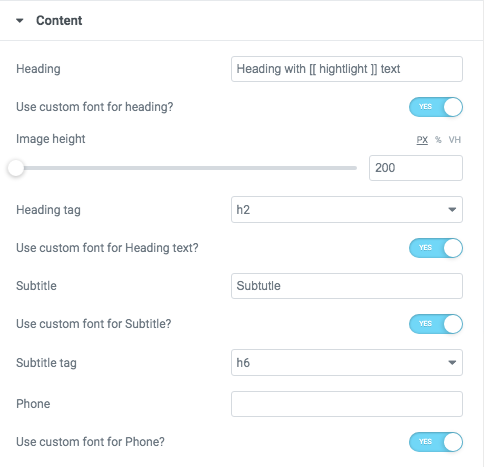
Heading - Here you can add the text for the heading.
- Image height - Please, set the height of the image in px, % or vh.
- Heading tag - Select a little tag.
- Use custom font for Heading text? - Turn on the switcher if you want to customize heading text.
- Subtitle - Add some text for the subtitle here.
- Use custom font for subtitle? - Turn on the switcher if you want to customize the font for subtitle text.
- Phone- Add phone number to the block.
- Use custom font for Phone? - Turn on the switcher if you want to customize this block.
Icons
- Icon library - Please, select the icon library from the list.
- Icon color - Please, choose the icon color from the color palette.
- Icon font size - Enter icon font size with units.
Heading Typography:
- Family - Select the typography fof the heading.
- Size - Set up the heading size.
- Weight - Select the weight of the heading.
- Transform - Change the case of the text.
- Style - Select text style for the heading.
- Decoration - Select a style for the title decoration.
- Line-Height - Enter a line-height of the heading.
- Letter Spacing - Enter a letter spacing of the heading.
Button Settings
- Add button? - Turn on the switcher to add the button for the current slide. If you turn on the switcher, there are the next items.
Button items:
- Layout - Please, select the button layout.
- Name - Please, enter the button text.
- Link - Please, add a URL to the button.
- Style - Here you can select the button style (dark or light).
- Size - Here you can select button size (small or large).
- Type - Here you can select the button type (reverse or transparent).
- Box shadow - This option allows you to add the box-shadow to the button. It only works if the box-shadow is specified in the skin generator.
- Enable Full width - Turn on the switcher if you want to enable full width to the current button.
Add icon? - Turn on the switcher to add the icon for the current button.If you turn on the switcher, there are the next items:
- Icon library - Please, select the icon library.
- Icon font size - Enter icon font size with units. just use the number.
- Icon position - Please, select the icon alignment.
Business Subtitle Typography
If you turn on the switcher "Use custom font for subtitle?" in Content Settings you can customize font for the subtitle.
Alignment - - Here you can select the content alignment.
Text Color - Here you can select the subtitle color from the palette.
Typography items:
- Family - Here you can select the typography for the subtitle.
- Size - Here you can set up the subtitle size.
- Weight - Please, select the weight for the subtitle.
- Transform - This option allows to change the case of the text.
- Style - Please, select the subtitle style for the highlight.
- Decoration - Please, select a style for the subtitle decoration.
- Line-Height - Here you can enter a line height for the subtitle.
- Letter Spacing - Here you can enter a letter spacing for the subtitle.
Business Phone Typography

Color - Here you can select a content color from the palette.
- Typography items:
- Family - Here you can select the typography for the text;
- Size - Here you can set up the text size;
- Weight - Please, select the weight for the text;
- Transform - This option allows to change the case of the text;
- Style - Please, select text style for the text;
- Decoration - Please, select a style for the text decoration;
- Line-Height - Here you can enter a line height for the text;
- Letter Spacing - Here you can enter a letter spacing for the text.
Features Single 28 Style:

Content Settings:

- Heading - Add the heading of the block.
- Description - Please, enter your description text.
- Image height - Please, set the height of the image in px, % or vh.
- After Title - Here you can add the title to the current item.
- Link title - Add the title text of the link.
- Link Url - Add the url for the link.
Use the custom font for heading? - Turn on the switcher if you want to customize heading typography.
Use the custom font for description? - Turn on the switcher if you want to customize description typography.
Use custom font for link? - Turn on the switcher if you want to customize the font for the link text.
Heading Typography:
- Family - Select the typography fof the heading.
- Size - Set up the heading size.
- Weight - Select the weight of the heading.
- Transform - Change the case of the text.
- Style - Select text style for the heading.
- Decoration - Select a style for the title decoration.
- Line-Height - Enter a line-height of the heading.
- Letter Spacing - Enter a letter spacing of the heading.
Description Typography:If you turn on the switcher "Use custom font for description?" in Content Settings you can customize font for the description.
Alignment - - Here you can select the description alignment.
Text Color - Here you can select description color from the palette.
Typography - Select the typography for the heading.
- Family - Here you can select the typography for the description text.
- Size - Here you can set up the description text size.
- Weight - Please, select the weight for the description text.
- Transform - This option allows to change the case of the description text.
- Style - Please, select text style for the description text.
- Decoration - Please, select a style for the description text decoration.
- Line-Height - Here you can enter a line height for the description text.
- Letter Spacing - Here you can enter a letter spacing for the description text.
Link Typography
If you turn on the switcher "Use custom font for link arrow?" in Content Settings you can customize font for the link text.
Text Color - Here you can select link arrow text color from the palette.
Typography items:
- Family - Here you can select the typography for the link text.
- Size - Here you can set up the link text size.
- Weight - Please, select the weight for the link text.
- Transform - This option allows to change the case of the text.
- Style - Please, select a text style for the link text.
- Decoration - Please, select a style for the link text decoration.
- Line-Height - Here you can enter a line height for the link text.
- Letter Spacing - Here you can enter a letter spacing for the link text.
Features Single 29 Style:

Content Settings:


- Heading - Add the heading of the block.
- Description - Please, enter your description text.
- Image height - Please, set the height of the image in px, % or vh.
- Link title - Add the title text of the link.
- Link Url - Add the url for the link.
Use the custom font for heading? - Turn on the switcher if you want to customize heading typography.
Use the custom font for description? - Turn on the switcher if you want to customize description typography.
Use custom font for link? - Turn on the switcher if you want to customize the font for the link text.
- Image - Choose an image for the current slide here.
- Price - Here you can add the price.
- Family - Select the typography fof the heading.
- Size - Set up the heading size.
- Weight - Select the weight of the heading.
- Transform - Change the case of the text.
- Style - Select text style for the heading.
- Decoration - Select a style for the title decoration.
- Line-Height - Enter a line-height of the heading.
- Letter Spacing - Enter a letter spacing of the heading.
Description Typography:If you turn on the switcher "Use custom font for description?" in Content Settings you can customize font for the description.
Alignment - - Here you can select the description alignment.
Text Color - Here you can select description color from the palette.
Typography - Select the typography for the heading.
- Family - Here you can select the typography for the description text.
- Size - Here you can set up the description text size.
- Weight - Please, select the weight for the description text.
- Transform - This option allows to change the case of the description text.
- Style - Please, select text style for the description text.
- Decoration - Please, select a style for the description text decoration.
- Line-Height - Here you can enter a line height for the description text.
- Letter Spacing - Here you can enter a letter spacing for the description text.
Link Typography
If you turn on the switcher "Use custom font for link arrow?" in Content Settings you can customize font for the link text.
Text Color - Here you can select link arrow text color from the palette.
Typography items:
- Family - Here you can select the typography for the link text.
- Size - Here you can set up the link text size.
- Weight - Please, select the weight for the link text.
- Transform - This option allows to change the case of the text.
- Style - Please, select a text style for the link text.
- Decoration - Please, select a style for the link text decoration.
- Line-Height - Here you can enter a line height for the link text.
- Letter Spacing - Here you can enter a letter spacing for the link text.
Price Typography

If you turn on the switcher "Use custom font for link arrow?" in Content Settings you can customize font for the price text.
Text Color - Here you can select link arrow text color from the palette.
Typography items:
- Family - Here you can select the typography for the link price text.
- Size - Here you can set up the link price text size.
- Weight - Please, select the weight for the link price text.
- Transform - This option allows to change the case of the text.
- Style - Please, select a text style for the link price text.
- Decoration - Please, select a style for the link price text decoration.
- Line-Height - Here you can enter a line height for the link price text.
- Letter Spacing - Here you can enter a letter spacing for the link price text.
Price Label Typography

If you turn on the switcher "Use custom font for link arrow?" in Content Settings you can customize font for the price text.
Text Color - Here you can select link arrow text color from the palette.
Typography items:
- Family - Here you can select the typography for the link price label.
- Size - Here you can set up the link price label size.
- Weight - Please, select the weight for the link price label.
- Transform - This option allows to change the case of the label.
- Style - Please, select a text style for the link price label.
- Decoration - Please, select a style for the link price label decoration.
- Line-Height - Here you can enter a line height for the link price label.
- Letter Spacing - Here you can enter a letter spacing for the link price label.
Address Typography

Text Color - Here you can select address text color from the palette.
Typography items:
- Family - Here you can select the typography for the address text.
- Size - Here you can set up the address text size.
- Weight - Please, select the weight for the address text.
- Transform - This option allows to change the case of the address text.
- Style - Please, select a text style for the address text.
- Decoration - Please, select a style for the address text decoration.
- Line-Height - Here you can enter a line height for the address text.
- Letter Spacing - Here you can enter a letter spacing for the address text.
Features Single 30 Style:

Content Settings:

- Image - Here you can add the image to this section
- Heading - Here you can add the text for the heading.
- Use the custom font for heading? - Turn on the switch if you want to customize heading typography.
- Description - Please, enter your description text.
- Use the custom font for description? - Turn on the switch if you want to customize the description typography.
- Image height - Please, set the height of the image in px, % or vh.
- Overlay color - Choose color for overlay from the palette box.
- Use the custom font for Description? - Turn on the switch if you want to customize the description typography.
- Family - Select the typography fof the heading.
- Size - Set up the heading size.
- Weight - Select the weight of the heading.
- Transform - Change the case of the text.
- Style - Select text style for the heading.
- Decoration - Select a style for the title decoration.
- Line-Height - Enter a line-height of the heading.
- Letter Spacing - Enter a letter spacing of the heading.
Description Typography:

If you turn on the switcher "Use custom font for description?" in Content Settings you can customize font for the description.
Alignment - - Here you can select the description alignment.
Text Color - Here you can select description color from the palette.
Typography - Select the typography for the heading.
- Family - Here you can select the typography for the description text.
- Size - Here you can set up the description text size.
- Weight - Please, select the weight for the description text.
- Transform - This option allows to change the case of the description text.
- Style - Please, select text style for the description text.
- Decoration - Please, select a style for the description text decoration.
- Line-Height - Here you can enter a line height for the description text.
- Letter Spacing - Here you can enter a letter spacing for the description text.
Karma size for additional images:

Image original size - Select the image size.
Features Single 31 Style:

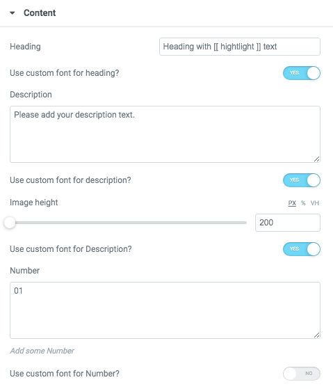
- Heading - Here you can add the text for the heading.
- Use the custom font for heading? - Turn on the switch if you want to customize heading typography.
- Description - Please, enter your description text.
- Use the custom font for description? - Turn on the switch if you want to customize the description typography.
- Image height - Please, set the height of the image in px, % or vh.
- Use the custom font for Description? - Turn on the switch if you want to customize the description typography.
- Number - Here you can add the number to this section.
- Family - Select the typography fof the heading.
- Size - Set up the heading size.
- Weight - Select the weight of the heading.
- Transform - Change the case of the text.
- Style - Select text style for the heading.
- Decoration - Select a style for the title decoration.
- Line-Height - Enter a line-height of the heading.
- Letter Spacing - Enter a letter spacing of the heading.
Description Typography:
If you turn on the switcher "Use custom font for description?" in Content Settings you can customize font for the description.
Alignment - - Here you can select the description alignment.
Text Color - Here you can select description color from the palette.
Typography - Select the typography for the heading.
- Family - Here you can select the typography for the description text.
- Size - Here you can set up the description text size.
- Weight - Please, select the weight for the description text.
- Transform - This option allows to change the case of the description text.
- Style - Please, select text style for the description text.
- Decoration - Please, select a style for the description text decoration.
- Line-Height - Here you can enter a line height for the description text.
- Letter Spacing - Here you can enter a letter spacing for the description text.
Number Typography:

Text Color - Here you can select title color from the palette.
Alignment - Here you can select the number alignment.
- Family - Here you can select the typography for the number .
- Size - Here you can set up the number size.
- Weight - Please, select the weight for the number .
- Transform - This option allows to change the case of the text.
- Style - Please, select text style for the number .
- Decoration - Please, select a style for the number decoration.
- Line-Height - Here you can enter a line height for the number .
- Letter Spacing - Here you can enter a letter spacing for the number .
Features Single 32 Style:

Content Settings:

- Heading - Here you can add the text for the heading.
- Use the custom font for heading? - Turn on the switch if you want to customize heading typography.
- Description - Please, enter your description text.
- Use the custom font for description? - Turn on the switch if you want to customize the description typography.
- Image height - Please, set the height of the image in px, % or vh.
- Use the custom font for Description? - Turn on the switch if you want to customize the description typography.
- Icon - Here you can choose an icon image.
- Link Title - Here you can add title for link
- Link URL - Please add link URL.
- Use the custom font for Link? - Turn on the switcher if you want to customize the link typography.
Heading Typography:
- Family - Select the typography fof the heading.
- Size - Set up the heading size.
- Weight - Select the weight of the heading.
- Transform - Change the case of the text.
- Style - Select text style for the heading.
- Decoration - Select a style for the title decoration.
- Line-Height - Enter a line-height of the heading.
- Letter Spacing - Enter a letter spacing of the heading.
Description Typography:
If you turn on the switcher "Use custom font for description?" in Content Settings you can customize font for the description.
Alignment - - Here you can select the description alignment.
Text Color - Here you can select description color from the palette.
Typography - Select the typography for the heading.
- Family - Here you can select the typography for the description text.
- Size - Here you can set up the description text size.
- Weight - Please, select the weight for the description text.
- Transform - This option allows to change the case of the description text.
- Style - Please, select text style for the description text.
- Decoration - Please, select a style for the description text decoration.
- Line-Height - Here you can enter a line height for the description text.
- Letter Spacing - Here you can enter a letter spacing for the description text.
Link Typography
If you turn on the switcher "Use custom font for link arrow?" in Content Settings you can customize font for the link text.
Text Color - Here you can select link arrow text color from the palette.
Typography items:
- Family - Here you can select the typography for the link text.
- Size - Here you can set up the link text size.
- Weight - Please, select the weight for the link text.
- Transform - This option allows to change the case of the text.
- Style - Please, select a text style for the link text.
- Decoration - Please, select a style for the link text decoration.
- Line-Height - Here you can enter a line height for the link text.
- Letter Spacing - Here you can enter a letter spacing for the link text.
Features Single 33 Style:

Content Settings:

- Image - Here you can add the image to this section
- Heading - Here you can add the text for the heading.
- Use custom font for heading? - Turn on the switch if you want to customize the heading typography.
- Description - Please, enter your description text.
- Use the custom font for description? - Turn on the switcher if you want to customize description typography.
- Image height - Please, set the height of the image in px, % or vh.
- Align - Here you can select the alignment of the content in the section.
Heading Typography:
- Family - Select the typography fof the heading.
- Size - Set up the heading size.
- Weight - Select the weight of the heading.
- Transform - Change the case of the text.
- Style - Select text style for the heading.
- Decoration - Select a style for the title decoration.
- Line-Height - Enter a line-height of the heading.
- Letter Spacing - Enter a letter spacing of the heading.
Description Typography:If you turn on the switcher "Use custom font for description?" in Content Settings you can customize font for the description.
Alignment - - Here you can select the description alignment.
Text Color - Here you can select description color from the palette.
Typography - Select the typography for the heading.
- Family - Here you can select the typography for the description text.
- Size - Here you can set up the description text size.
- Weight - Please, select the weight for the description text.
- Transform - This option allows to change the case of the description text.
- Style - Please, select text style for the description text.
- Decoration - Please, select a style for the description text decoration.
- Line-Height - Here you can enter a line height for the description text.
- Letter Spacing - Here you can enter a letter spacing for the description text.
Features Single 34 Style:

Content Settings:

- Image - Here you can add the image to this section
- Heading - Here you can add the text for the heading.
- Use custom font for heading? - Turn on the switch if you want to customize the heading typography.
- Description - Please, enter your description text.
- Use the custom font for description? - Turn on the switcher if you want to customize description typography.
- Image height - Please, set the height of the image in px, % or vh.
- Link - Add url to button.
Images size:
Image original size - Select the image size.
Heading Typography:
- Family - Select the typography fof the heading.
- Size - Set up the heading size.
- Weight - Select the weight of the heading.
- Transform - Change the case of the text.
- Style - Select text style for the heading.
- Decoration - Select a style for the title decoration.
- Line-Height - Enter a line-height of the heading.
- Letter Spacing - Enter a letter spacing of the heading.
Description Typography:
If you turn on the switcher "Use custom font for description?" in Content Settings you can customize font for the description.
Alignment - - Here you can select the description alignment.
Text Color - Here you can select description color from the palette.
Typography - Select the typography for the heading.
- Family - Here you can select the typography for the description text.
- Size - Here you can set up the description text size.
- Weight - Please, select the weight for the description text.
- Transform - This option allows to change the case of the description text.
- Style - Please, select text style for the description text.
- Decoration - Please, select a style for the description text decoration.
- Line-Height - Here you can enter a line height for the description text.
- Letter Spacing - Here you can enter a letter spacing for the description text.
Features Single 35 Style:

Content Settings:

- Image - Here you can add the image to this section
- Heading - Here you can add the text for the heading.
- Use custom font for heading? - Turn on the switch if you want to customize the heading typography.
- Description - Please, enter your description text.
- Use the custom font for description? - Turn on the switcher if you want to customize description typography.
- Image height - Please, set the height of the image in px, % or vh.
- Align for mobile - Please select content align for mobile.
- Title tag - Please select tag for title.
Images size:
Image original size - Select the image size.
Heading Typography:
- Family - Select the typography fof the heading.
- Size - Set up the heading size.
- Weight - Select the weight of the heading.
- Transform - Change the case of the text.
- Style - Select text style for the heading.
- Decoration - Select a style for the title decoration.
- Line-Height - Enter a line-height of the heading.
- Letter Spacing - Enter a letter spacing of the heading.
Description Typography:
If you turn on the switcher "Use custom font for description?" in Content Settings you can customize font for the description.
Alignment - - Here you can select the description alignment.
Text Color - Here you can select description color from the palette.
Typography - Select the typography for the heading.
- Family - Here you can select the typography for the description text.
- Size - Here you can set up the description text size.
- Weight - Please, select the weight for the description text.
- Transform - This option allows to change the case of the description text.
- Style - Please, select text style for the description text.
- Decoration - Please, select a style for the description text decoration.
- Line-Height - Here you can enter a line height for the description text.
- Letter Spacing - Here you can enter a letter spacing for the description text.
Features Single 36 Style:

Content Settings:

- Heading - Here you can add the text for the heading.
- Use custom font for heading? - Turn on the switch if you want to customize the heading typography.
- Image height - Please, set the height of the image in px, % or vh.
- Add link for heading?- Turn on the switcher to add
Icons
- Icon library - Please, select the icon library from the list.
- Icon color - Please, choose the icon color from the color palette.
- Icon font size - Enter icon font size with units.
Heading Typography:
- Family - Select the typography fof the heading.
- Size - Set up the heading size.
- Weight - Select the weight of the heading.
- Transform - Change the case of the text.
- Style - Select text style for the heading.
- Decoration - Select a style for the title decoration.
- Line-Height - Enter a line-height of the heading.
- Letter Spacing - Enter a letter spacing of the heading.
Features Single 38 Style:

Content Settings:

- Image - Here you can add the image to this section
- Heading - Here you can add the text for the heading.
- Use the custom font for heading? - Turn on the switch if you want to customize heading typography.
- Description - Please, enter your description text.
- Use the custom font for description? - Turn on the switch if you want to customize the description typography.
- Image height - Please, set the height of the image in px, % or vh.
- Overlay color - Choose color for overlay from the palette box.
Images size:
Image original size - Select the image size.
Heading Typography:
- Family - Select the typography fof the heading.
- Size - Set up the heading size.
- Weight - Select the weight of the heading.
- Transform - Change the case of the text.
- Style - Select text style for the heading.
- Decoration - Select a style for the title decoration.
- Line-Height - Enter a line-height of the heading.
- Letter Spacing - Enter a letter spacing of the heading.
Description Typography:
If you turn on the switcher "Use custom font for description?" in Content Settings you can customize font for the description.
Alignment - - Here you can select the description alignment.
Text Color - Here you can select description color from the palette.
Typography - Select the typography for the heading.
- Family - Here you can select the typography for the description text.
- Size - Here you can set up the description text size.
- Weight - Please, select the weight for the description text.
- Transform - This option allows to change the case of the description text.
- Style - Please, select text style for the description text.
- Decoration - Please, select a style for the description text decoration.
- Line-Height - Here you can enter a line height for the description text.
- Letter Spacing - Here you can enter a letter spacing for the description text.
Button Settings
- Add button? - Turn on the switcher to add the button for the current slide. If you turn on the switcher, there are the next items.
Button items:
- Layout - Please, select the button layout.
- Name - Please, enter the button text.
- Link - Please, add a URL to the button.
- Style - Here you can select the button style (dark or light).
- Size - Here you can select button size (small or large).
- Type - Here you can select the button type (reverse or transparent).
- Box shadow - This option allows you to add the box-shadow to the button. It only works if the box-shadow is specified in the skin generator.
- Enable Full width - Turn on the switcher if you want to enable full width to the current button.
Features Single 39 Style:
Content Settings:
- Image - Here you can add the image to this section
- Heading - Here you can add the text for the heading.
- Use the custom font for heading? - Turn on the switch if you want to customize heading typography.
- Description - Please, enter your description text.
- Use the custom font for description? - Turn on the switch if you want to customize the description typography.
- Image height - Please, set the height of the image in px, % or vh.
- Overlay color - Choose color for overlay from the palette box.
Images size:
Image original size - Select the image size.
Heading Typography:
- Family - Select the typography fof the heading.
- Size - Set up the heading size.
- Weight - Select the weight of the heading.
- Transform - Change the case of the text.
- Style - Select text style for the heading.
- Decoration - Select a style for the title decoration.
- Line-Height - Enter a line-height of the heading.
- Letter Spacing - Enter a letter spacing of the heading.
Description Typography:
If you turn on the switcher "Use custom font for description?" in Content Settings you can customize font for the description.
Alignment - - Here you can select the description alignment.
Text Color - Here you can select description color from the palette.
Typography - Select the typography for the heading.
- Family - Here you can select the typography for the description text.
- Size - Here you can set up the description text size.
- Weight - Please, select the weight for the description text.
- Transform - This option allows to change the case of the description text.
- Style - Please, select text style for the description text.
- Decoration - Please, select a style for the description text decoration.
- Line-Height - Here you can enter a line height for the description text.
- Letter Spacing - Here you can enter a letter spacing for the description text.
Features Single 40 Style:

Content Settings:

Image - Here you can upload the image for this shortcode.
Heading - Here you can add the text for the heading.
Use the custom font for heading? - Turn on the switch if you want to customize heading typography.
Description - Please, enter your description text.
Use the custom font for description? - Turn on the switch if you want to customize the description typography.
Image height - Please, set the height of the image in px, % or vh.
Use dot in the end heading - Turn on the switch if you want to use the dot in the heading end
Link Text - Here you can add the text for the link
Link URL - Here you can add the URL for the link.
Background Hover Color - Please, select the color for background.
Images size:
Image original size - Select the image size.
Heading Typography:
- Family - Select the typography fof the heading.
- Size - Set up the heading size.
- Weight - Select the weight of the heading.
- Transform - Change the case of the text.
- Style - Select text style for the heading.
- Decoration - Select a style for the title decoration.
- Line-Height - Enter a line-height of the heading.
- Letter Spacing - Enter a letter spacing of the heading.
Description Typography:
If you turn on the switcher "Use custom font for description?" in Content Settings you can customize font for the description.
Alignment - - Here you can select the description alignment.
Text Color - Here you can select description color from the palette.
Typography - Select the typography for the heading.
- Family - Here you can select the typography for the description text.
- Size - Here you can set up the description text size.
- Weight - Please, select the weight for the description text.
- Transform - This option allows to change the case of the description text.
- Style - Please, select text style for the description text.
- Decoration - Please, select a style for the description text decoration.
- Line-Height - Here you can enter a line height for the description text.
- Letter Spacing - Here you can enter a letter spacing for the description text.
Features Single 41 Style:

Content Settings:

Image Logo - Here you can add the image for the logo.
Images size:
Image original size - Select the image size.
Images size for logo:
Image original size - Select the image size.
Features Single 42 Style:
Content Settings:

- Image - Here you can add the image to this section.
- Heading - Here you can add the text for the heading.
- Use the custom font for heading? - Turn on the switch if you want to customize heading typography.
- Description - Please, enter your description text.
- Use the custom font for description? - Turn on the switch if you want to customize the description typography.
- Image height - Please, set the height of the image in px, % or vh.
- Use dot in the end heading - Turn on the switch if you want to use the dot in the heading end.
- Link Text - Here you can add the text for the link.
- Link URL - Here you can add the URL for the link.
- Background Hover Color - Please, select the color for background.
- Enable light style - Turn on the switch if you want to display the light style.
Images size:
Image original size - Select the image size.
Heading Typography:
- Family - Select the typography fof the heading.
- Size - Set up the heading size.
- Weight - Select the weight of the heading.
- Transform - Change the case of the text.
- Style - Select text style for the heading.
- Decoration - Select a style for the title decoration.
- Line-Height - Enter a line-height of the heading.
- Letter Spacing - Enter a letter spacing of the heading.
Description Typography:
If you turn on the switcher "Use custom font for description?" in Content Settings you can customize font for the description.
Alignment - - Here you can select the description alignment.
Text Color - Here you can select description color from the palette.
Typography - Select the typography for the heading.
- Family - Here you can select the typography for the description text.
- Size - Here you can set up the description text size.
- Weight - Please, select the weight for the description text.
- Transform - This option allows to change the case of the description text.
- Style - Please, select text style for the description text.
- Decoration - Please, select a style for the description text decoration.
- Line-Height - Here you can enter a line height for the description text.
- Letter Spacing - Here you can enter a letter spacing for the description text.
Features Single 43 Style:

Content Settings:

- Image - Here you can add the image to this section.
- Heading - Here you can add the text for the heading.
- Use the custom font for heading? - Turn on the switch if you want to customize heading typography.
- Description - Please, enter your description text.
- Use the custom font for description? - Turn on the switch if you want to customize the description typography.
- Image height - Please, set the height of the image in px, % or vh.
- Link Text - Here you can add the text for the link.
- Link URL - Here you can add the URL for the link.
Heading Typography:
- Family - Select the typography fof the heading.
- Size - Set up the heading size.
- Weight - Select the weight of the heading.
- Transform - Change the case of the text.
- Style - Select text style for the heading.
- Decoration - Select a style for the title decoration.
- Line-Height - Enter a line-height of the heading.
- Letter Spacing - Enter a letter spacing of the heading.
Description Typography:If you turn on the switcher "Use custom font for description?" in Content Settings you can customize font for the description.
Alignment - - Here you can select the description alignment.
Text Color - Here you can select description color from the palette.
Typography - Select the typography for the heading.
- Family - Here you can select the typography for the description text.
- Size - Here you can set up the description text size.
- Weight - Please, select the weight for the description text.
- Transform - This option allows to change the case of the description text.
- Style - Please, select text style for the description text.
- Decoration - Please, select a style for the description text decoration.
- Line-Height - Here you can enter a line height for the description text.
- Letter Spacing - Here you can enter a letter spacing for the description text.
Features Single 44 Style:

Content Settings:

- Image - Here you can add the image to this section.
- Heading - Here you can add the text for the heading.
- Description - Please, enter your description text.
- Image height - Please, set the height of the image in px, % or vh.
- Use the custom font for heading? - Turn on the switch if you want to customize heading typography.
- Use the custom font for description? - Turn on the switch if you want to customize the description typography.
- Background color - Please, select the background color from the palette box.
Images size:
Image original size - Select the image size.
Heading Typography:
- Family - Select the typography fof the heading.
- Size - Set up the heading size.
- Weight - Select the weight of the heading.
- Transform - Change the case of the text.
- Style - Select text style for the heading.
- Decoration - Select a style for the title decoration.
- Line-Height - Enter a line-height of the heading.
- Letter Spacing - Enter a letter spacing of the heading.
Rela Description Typography:If you turn on the switcher "Use custom font for description?" in Content Settings you can customize font for the description.
Alignment - - Here you can select the description alignment.
Text Color - Here you can select description color from the palette.
Typography - Select the typography for the heading.
- Family - Select the typography fof the heading.
- Size - Set up the heading size.
- Weight - Select the weight of the heading.
- Transform - Change the case of the text.
- Style - Select text style for the heading.
- Decoration - Select a style for the title decoration.
- Line-Height - Enter a line-height of the heading.
- Letter Spacing - Enter a letter spacing of the heading.
Features Single 45 Style:

Content Settings:
- Image - Here you can add the image to this section.
- Heading - Here you can add the text for the heading.
- Description - Please, enter your description text.
- Image height - Please, set the height of the image in px, % or vh.
- Use the custom font for heading? - Turn on the switch if you want to customize heading typography.
- Use the custom font for description? - Turn on the switch if you want to customize the description typography.
- Background color - Please, select the background color from the palette box.
Images size:
Image original size - Select the image size.
Heading Typography:
- Family - Select the typography fof the heading.
- Size - Set up the heading size.
- Weight - Select the weight of the heading.
- Transform - Change the case of the text.
- Style - Select text style for the heading.
- Decoration - Select a style for the title decoration.
- Line-Height - Enter a line-height of the heading.
- Letter Spacing - Enter a letter spacing of the heading.
Rela Description Typography:
If you turn on the switcher "Use custom font for description?" in Content Settings you can customize font for the description.
Alignment - - Here you can select the description alignment.
Text Color - Here you can select description color from the palette.
Typography - Select the typography for the heading.
- Family - Here you can select the typography for the description text.
- Size - Here you can set up the description text size.
- Weight - Please, select the weight for the description text.
- Transform - This option allows to change the case of the description text.
- Style - Please, select text style for the description text.
- Decoration - Please, select a style for the description text decoration.
- Line-Height - Here you can enter a line height for the description text.
- Letter Spacing - Here you can enter a letter spacing for the description text.
Features Single 46 Style:

Content Settings:

- Image - Here you can add the image to this section.
- Heading - Here you can add the text for the heading.
- Description - Please, enter your description text.
- Image height - Please, set the height of the image in px, % or vh.
- Use the custom font for heading? - Turn on the switch if you want to customize heading typography.
- Use the custom font for description? - Turn on the switch if you want to customize the description typography.
- Background color - Please, select the background color from the palette box.
- Images size:
Image original size - Select the image size.
Heading Typography:
- Family - Select the typography fof the heading.
- Size - Set up the heading size.
- Weight - Select the weight of the heading.
- Transform - Change the case of the text.
- Style - Select text style for the heading.
- Decoration - Select a style for the title decoration.
- Line-Height - Enter a line-height of the heading.
- Letter Spacing - Enter a letter spacing of the heading.
Rela Description Typography:
If you turn on the switcher "Use custom font for description?" in Content Settings you can customize font for the description.
Alignment - - Here you can select the description alignment.
Text Color - Here you can select description color from the palette.
Typography - Select the typography for the heading.
- Family - Here you can select the typography for the description text.
- Size - Here you can set up the description text size.
- Weight - Please, select the weight for the description text.
- Transform - This option allows to change the case of the description text.
- Style - Please, select text style for the description text.
- Decoration - Please, select a style for the description text decoration.
- Line-Height - Here you can enter a line height for the description text.
- Letter Spacing - Here you can enter a letter spacing for the description text.
Features Single 47 Style:

Content Settings:

- Image - Here you can add the image to this section.
- Heading - Here you can add the text for the heading.
- Description - Please, enter your description text.
- Use the custom font for heading? - Turn on the switch if you want to customize heading typography.
- Use the custom font for description? - Turn on the switch if you want to customize the description typography.
- Price - Here you can add the price.
- Hover color - Please, select the hover color from the palette box.
-
Images size:
Image original size - Select the image size.
Heading Typography:
- Family - Select the typography fof the heading.
- Size - Set up the heading size.
- Weight - Select the weight of the heading.
- Transform - Change the case of the text.
- Style - Select text style for the heading.
- Decoration - Select a style for the title decoration.
- Line-Height - Enter a line-height of the heading.
- Letter Spacing - Enter a letter spacing of the heading.
Button Settings
- Add button? - Turn on the switcher to add the button for the current slide. If you turn on the switcher, there are the next items.
Button items:
- Layout - Please, select the button layout.
- Name - Please, enter the button text.
- Link - Please, add a URL to the button.
- Style - Here you can select the button style (dark or light).
- Size - Here you can select button size (small or large).
- Type - Here you can select the button type (reverse or transparent).
- Box shadow - This option allows you to add the box-shadow to the button. It only works if the box-shadow is specified in the skin generator.
- Enable Full width - Turn on the switcher if you want to enable full width to the current button.
Add icon? - Turn on the switcher to add the icon for the current button.If you turn on the switcher, there are the next items:
- Icon library - Please, select the icon library.
- Icon font size - Enter icon font size with units. just use the number.
- Icon position - Please, select the icon alignment.
Rela Description Typography:
If you turn on the switcher "Use custom font for description?" in Content Settings you can customize font for the description.
Alignment - - Here you can select the description alignment.
Text Color - Here you can select description color from the palette.
Typography - Select the typography for the heading.
- Family - Here you can select the typography for the description text.
- Size - Here you can set up the description text size.
- Weight - Please, select the weight for the description text.
- Transform - This option allows to change the case of the description text.
- Style - Please, select text style for the description text.
- Decoration - Please, select a style for the description text decoration.
- Line-Height - Here you can enter a line height for the description text.
- Letter Spacing - Here you can enter a letter spacing for the description text.
Snapster Modern Style:

Content Settings:

- Image - Here you can add the image to this section
- Use the custom font for heading? - Turn on the switch if you want to customize heading typography.
- Heading - Here you can add the text for the heading.
- Link URL - Please, add the URL for the link.
- Overlay color - Choose color for overlay from the palette box.
Heading Typography:
- Family - Select the typography fof the heading.
- Size - Set up the heading size.
- Weight - Select the weight of the heading.
- Transform - Change the case of the text.
- Style - Select text style for the heading.
- Decoration - Select a style for the title decoration.
- Line-Height - Enter a line-height of the heading.
- Letter Spacing - Enter a letter spacing of the heading.
Images size:
Image original size - Select the image size.
Features Single 48 Style:

Content Settings:

- Use the custom font for heading? - Turn on the switcher if you want to customize heading typography.
- Use custom font for description? - Turn on the switcher if you want to customize the font for the description text.
- Before Title Image - Here you can choose an image.
- After Title Image - Here you can choose an image.
- TItle - Add the title text to the box-section.
- Description - Please, enter your description text.
Heading Typography:
- Family - Select the typography fof the heading.
- Size - Set up the heading size.
- Weight - Select the weight of the heading.
- Transform - Change the case of the text.
- Style - Select text style for the heading.
- Decoration - Select a style for the title decoration.
- Line-Height - Enter a line-height of the heading.
- Letter Spacing - Enter a letter spacing of the heading.
If you turn on the switcher "Use custom font for description?" in Content Settings you can customize font for the description.
Alignment - - Here you can select the description alignment.
Text Color - Here you can select description color from the palette.
Typography - Select the typography for the heading.
- Family - Here you can select the typography for the description text.
- Size - Here you can set up the description text size.
- Weight - Please, select the weight for the description text.
- Transform - This option allows to change the case of the description text.
- Style - Please, select text style for the description text.
- Decoration - Please, select a style for the description text decoration.
- Line-Height - Here you can enter a line height for the description text.
- Letter Spacing - Here you can enter a letter spacing for the description text.
Features Single 49 Style:

Content Settings:

- Use the custom font for heading? - Turn on the switcher if you want to customize heading typography.
- Use custom font for description? - Turn on the switcher if you want to customize the font for the description text.
- TItle - Add the title text to the box-section.
- Description - Please, enter your description text.
- Image - Here you can choose an image.
- Link Title - Here you can add title for link
- Link URL - Please add link URL
- Add border color. Two colors set gradient border-color . Single color sets one color of the entire border
- Select color 1 - Please select color 1
- Select color 2 - Please select color 2
- Align Button - Please select button align
Images size:
Image original size - Select the image size.
Heading Typography:
- Family - Select the typography fof the heading.
- Size - Set up the heading size.
- Weight - Select the weight of the heading.
- Transform - Change the case of the text.
- Style - Select text style for the heading.
- Decoration - Select a style for the title decoration.
- Line-Height - Enter a line-height of the heading.
- Letter Spacing - Enter a letter spacing of the heading.
Description Typography:
If you turn on the switcher "Use custom font for description?" in Content Settings you can customize font for the description.
Alignment - - Here you can select the description alignment.
Text Color - Here you can select description color from the palette.
Typography - Select the typography for the heading.
- Family - Here you can select the typography for the description text.
- Size - Here you can set up the description text size.
- Weight - Please, select the weight for the description text.
- Transform - This option allows to change the case of the description text.
- Style - Please, select text style for the description text.
- Decoration - Please, select a style for the description text decoration.
- Line-Height - Here you can enter a line height for the description text.
- Letter Spacing - Here you can enter a letter spacing for the description text.
Features Single 50 Style:

Content Settings:

- Use the custom font for heading? - Turn on the switcher if you want to customize heading typography.
- Use custom font for description? - Turn on the switcher if you want to customize the font for the description text.
- Before Title Image - Here you can choose an image.
- After Title Image - Here you can choose an image.
- TItle - Add the title text to the box-section.
- Description - Please, enter your description text.
- Title tag - Please select tag for title.
Heading Typography:
- Family - Select the typography fof the heading.
- Size - Set up the heading size.
- Weight - Select the weight of the heading.
- Transform - Change the case of the text.
- Style - Select text style for the heading.
- Decoration - Select a style for the title decoration.
- Line-Height - Enter a line-height of the heading.
- Letter Spacing - Enter a letter spacing of the heading.
Description Typography:
If you turn on the switcher "Use custom font for description?" in Content Settings you can customize font for the description.
Alignment - - Here you can select the description alignment.
Text Color - Here you can select description color from the palette.
Typography - Select the typography for the heading.
- Family - Here you can select the typography for the description text.
- Size - Here you can set up the description text size.
- Weight - Please, select the weight for the description text.
- Transform - This option allows to change the case of the description text.
- Style - Please, select text style for the description text.
- Decoration - Please, select a style for the description text decoration.
- Line-Height - Here you can enter a line height for the description text.
- Letter Spacing - Here you can enter a letter spacing for the description text.
Features Single 51 Style:

Content Settings:

- Use the custom font for heading? - Turn on the switcher if you want to customize heading typography.
- Image - Here you can choose an image.
- Background image for numbers - Here you can upload the image for the background.
- Number - Add number here
- Use custom font for number? - Turn on the switcher if you want to customize number.
Images size:
Image original size - Select the image size.
Heading Typography:
- Family - Select the typography fof the heading.
- Size - Set up the heading size.
- Weight - Select the weight of the heading.
- Transform - Change the case of the text.
- Style - Select text style for the heading.
- Decoration - Select a style for the title decoration.
- Line-Height - Enter a line-height of the heading.
- Letter Spacing - Enter a letter spacing of the heading.
Description Typography:
If you turn on the switcher "Use custom font for description?" in Content Settings you can customize font for the description.
Alignment - - Here you can select the description alignment.
Text Color - Here you can select description color from the palette.
Typography - Select the typography for the heading.
- Family - Here you can select the typography for the description text.
- Size - Here you can set up the description text size.
- Weight - Please, select the weight for the description text.
- Transform - This option allows to change the case of the description text.
- Style - Please, select text style for the description text.
- Decoration - Please, select a style for the description text decoration.
- Line-Height - Here you can enter a line height for the description text.
- Letter Spacing - Here you can enter a letter spacing for the description text.
Soapy Number Typography:
Text Color - Here you can select title color from the palette.
Alignment - Here you can select the number alignment.
- Family - Here you can select the typography for the number .
- Size - Here you can set up the number size.
- Weight - Please, select the weight for the number .
- Transform - This option allows to change the case of the text.
- Style - Please, select text style for the number .
- Decoration - Please, select a style for the number decoration.
- Line-Height - Here you can enter a line height for the number .
- Letter Spacing - Here you can enter a letter spacing for the number .
Features Single 52 Style:
Content Settings:

- Use the custom font for heading? - Turn on the switcher if you want to customize heading typography.
- Use custom font for description? - Turn on the switcher if you want to customize the font for the description text.
- Title - Here you can add the title to the current item.
- Description - Here you can add the description for the current item.
- Year - Please enter a year
- Year Description - Please enter a description for year
- Use the custom font for the year? - Turn on the switcher if you want to customize the year typography.
- Use the custom font for the year Description? - Turn on the switcher if you want to customize the year description typography.
Heading Typography:
- Family - Select the typography fof the heading.
- Size - Set up the heading size.
- Weight - Select the weight of the heading.
- Transform - Change the case of the text.
- Style - Select text style for the heading.
- Decoration - Select a style for the title decoration.
- Line-Height - Enter a line-height of the heading.
- Letter Spacing - Enter a letter spacing of the heading.
Description Typography:If you turn on the switcher "Use custom font for description?" in Content Settings you can customize font for the description.
Alignment - - Here you can select the description alignment.
Text Color - Here you can select description color from the palette.
Typography - Select the typography for the heading.
- Family - Here you can select the typography for the description text.
- Size - Here you can set up the description text size.
- Weight - Please, select the weight for the description text.
- Transform - This option allows to change the case of the description text.
- Style - Please, select text style for the description text.
- Decoration - Please, select a style for the description text decoration.
- Line-Height - Here you can enter a line height for the description text.
- Letter Spacing - Here you can enter a letter spacing for the description text.
Soapy Year Typography

If you turn on the switcher "Use custom font for description?" in Content Settings you can customize font for the description. Alignment - - Here you can select the description alignment.
Text Color - Here you can select description color from the palette.
- Family - Here you can select the typography for the soapy year.
- Size - Here you can set up the soapy year text size.
- Weight - Please, select the weight for the soapy year text.
- Transform - This option allows to change the case of the soapy year text.
- Style - Please, select text style for the soapy year text.
- Decoration - Please, select a style for the soapy year text decoration.
- Line-Height - Here you can enter a line height for the soapy year text.
- Letter Spacing - Here you can enter a letter spacing for the soapy year text.
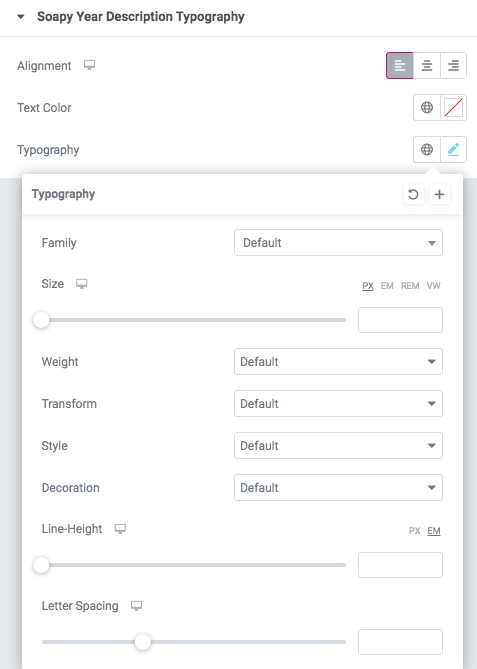
- Family - Here you can select the typography for the description text.
- Size - Here you can set up the description text size.
- Weight - Please, select the weight for the description text.
- Transform - This option allows to change the case of the description text.
- Style - Please, select text style for the description text.
- Decoration - Please, select a style for the description text decoration.
- Line-Height - Here you can enter a line height for the description text.
- Letter Spacing - Here you can enter a letter spacing for the description text.
Features Single 53 Style:

Content Settings:

- Use the custom font for heading? - Turn on the switcher if you want to customize heading typography.
- Use custom font for description? - Turn on the switcher if you want to customize the font for the description text.
- Title - Here you can add the title to the current item.
- Description - Here you can add the description for the current item.
- Image - Choose an image for the current slide here.
Heading Typography:
- Family - Select the typography fof the heading.
- Size - Set up the heading size.
- Weight - Select the weight of the heading.
- Transform - Change the case of the text.
- Style - Select text style for the heading.
- Decoration - Select a style for the title decoration.
- Line-Height - Enter a line-height of the heading.
- Letter Spacing - Enter a letter spacing of the heading.
Description Typography:
If you turn on the switcher "Use custom font for description?" in Content Settings you can customize font for the description.
Alignment - - Here you can select the description alignment.
Text Color - Here you can select description color from the palette.
Typography - Select the typography for the heading.
- Family - Here you can select the typography for the description text.
- Size - Here you can set up the description text size.
- Weight - Please, select the weight for the description text.
- Transform - This option allows to change the case of the description text.
- Style - Please, select text style for the description text.
- Decoration - Please, select a style for the description text decoration.
- Line-Height - Here you can enter a line height for the description text.
- Letter Spacing - Here you can enter a letter spacing for the description text.
Features Single 54 Style:

Content Settings:

- Image - Here you can add the image to this section
- Heading - Here you can add the text for the heading.
- Description - Please, enter your description text.
Button Settings

- Add button? - Turn on the switcher to add the button for the current slide. If you turn on the switcher, there are the next items.
Button items:
- Layout - Please, select the button layout.
- Name - Please, enter the button text.
- Link - Please, add a URL to the button.
- Style - Here you can select the button style (dark or light).
- Size - Here you can select button size (small or large).
- Type - Here you can select the button type (reverse or transparent).
- Box shadow - This option allows you to add the box-shadow to the button. It only works if the box-shadow is specified in the skin generator.
- Enable Full width - Turn on the switcher if you want to enable full width to the current button.
Images size:
Image original size - Select the image size.
Features Single 54 Style:

Content Settings:

- Image - Here you can add the image to this section
- Heading - Here you can add the text for the heading.
- Description - Please, enter your description text.
- Icon - Please add an image for the icon
Images size:
Image original size - Select the image size.
Sterling Features Single:

Content Settings:
- Image - Here you can add the image to this section
- Heading - Here you can add the text for the heading.
- Description - Please, enter your description text.
Button Settings
- Add button? - Turn on the switcher to add the button for the current slide. If you turn on the switcher, there are the next items.
Button items:
- Layout - Please, select the button layout.
- Name - Please, enter the button text.
- Link - Please, add a URL to the button.
- Style - Here you can select the button style (dark or light).
- Size - Here you can select button size (small or large).
- Type - Here you can select the button type (reverse or transparent).
- Box shadow - This option allows you to add the box-shadow to the button. It only works if the box-shadow is specified in the skin generator.
- Enable Full width - Turn on the switcher if you want to enable full width to the current button.
Images size:
Image original size - Select the image size.
Sterling Features Single left:

Content Settings:
- Image - Here you can add the image to this section
- Heading - Here you can add the text for the heading.
- Description - Please, enter your description text.
Button Settings
- Add button? - Turn on the switcher to add the button for the current slide. If you turn on the switcher, there are the next items.
Button items:
- Layout - Please, select the button layout.
- Name - Please, enter the button text.
- Link - Please, add a URL to the button.
- Style - Here you can select the button style (dark or light).
- Size - Here you can select button size (small or large).
- Type - Here you can select the button type (reverse or transparent).
- Box shadow - This option allows you to add the box-shadow to the button. It only works if the box-shadow is specified in the skin generator.
- Enable Full width - Turn on the switcher if you want to enable full width to the current button.
Images size:
Image original size - Select the image size.
Sterling features single hover

Content Settings:
- Image - Here you can add the image to this section
- Heading - Here you can add the text for the heading.
- Description - Please, enter your description text.
Button Settings
- Add button? - Turn on the switcher to add the button for the current slide. If you turn on the switcher, there are the next items.
Button items:
- Layout - Please, select the button layout.
- Name - Please, enter the button text.
- Link - Please, add a URL to the button.
- Style - Here you can select the button style (dark or light).
- Size - Here you can select button size (small or large).
- Type - Here you can select the button type (reverse or transparent).
- Box shadow - This option allows you to add the box-shadow to the button. It only works if the box-shadow is specified in the skin generator.
- Enable Full width - Turn on the switcher if you want to enable full width to the current button.
Sterling features single scale

Content Settings:

- Image - Here you can add the image to this section
- Heading - Here you can add the text for the heading.
- Description - Please, enter your description text.
Button Settings
- Add button? - Turn on the switcher to add the button for the current slide. If you turn on the switcher, there are the next items.
Button items:
- Layout - Please, select the button layout.
- Name - Please, enter the button text.
- Link - Please, add a URL to the button.
- Style - Here you can select the button style (dark or light).
- Size - Here you can select button size (small or large).
- Type - Here you can select the button type (reverse or transparent).
- Box shadow - This option allows you to add the box-shadow to the button. It only works if the box-shadow is specified in the skin generator.
- Enable Full width - Turn on the switcher if you want to enable full width to the current button.
Sterling features single animate
 Content Settings:
- Image - Here you can add the image to this section
- Heading - Here you can add the text for the heading.
- Description - Please, enter your description text.
Button Settings
- Add button? - Turn on the switcher to add the button for the current slide. If you turn on the switcher, there are the next items.
Button items:
- Layout - Please, select the button layout.
- Name - Please, enter the button text.
- Link - Please, add a URL to the button.
- Style - Here you can select the button style (dark or light).
- Size - Here you can select button size (small or large).
- Type - Here you can select the button type (reverse or transparent).
- Box shadow - This option allows you to add the box-shadow to the button. It only works if the box-shadow is specified in the skin generator.
- Enable Full width - Turn on the switcher if you want to enable full width to the current button.
Images size:
Image original size - Select the image size.