Features Timeline (Sterling)
Features Timeline shortcode:
Timeline:

Content:

- Heading - Here you can add the text for the heading.
- Description - Please, enter your description text.
- Display Image - Click on the button to add a new image.
- Time - Add time to the block.
Use the custom font for heading? - Turn on the switcher if you want to customize heading typography.
Use the custom font for description? - Turn on the switcher if you want to customize description typography.
Heading Typography:

- Family - Select the typography fof the heading.
- Size - Set up the heading size.
- Weight - Select the weight of the heading.
- Transform - Change the case of the text.
- Style - Select text style for the heading.
- Decoration - Select a style for the title decoration.
- Line-Height - Enter a line-height of the heading.
- Letter Spacing - Enter a letter spacing of the heading.
Description Typography: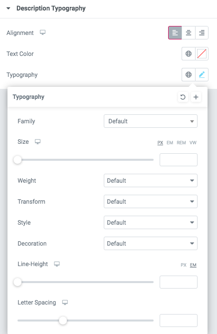
If you turn on the switcher "Use custom font for description?" in Content Settings you can customize font for the description.
Alignment - - Here you can select the description alignment.
Text Color - Here you can select description color from the palette.
- Typography - Select the typography for the heading.
- Family - Select the typography fof the heading.
- Size - Set up the heading size.
- Weight - Select the weight of the heading.
- Transform - Change the case of the text.
- Style - Select text style for the heading.
- Decoration - Select a style for the title decoration.
- Line-Height - Enter a line-height of the heading.
- Letter Spacing - Enter a letter spacing of the heading.
Images size:

Image original size - Select the image size.
Features Timeline 1

Content:


- Date - Add the date to the block.
- Title - Here you can add the title for contacts section.
- Content - Add the content to the block.
- Add Image - Here you can add the image to this section
Enable Dark version - Turn on the switch if you want to display the dark version for this shortcode.
Use custom font for timeline content title? - Turn on the switch to customize content title.
Use custom font for timeline content description? - Turn on the switch to customize content description.
Acacio Timeline Title Typography:

Alignment - - Here you can select the title alignment.
- Family - Here you can select the typography for the title;
- Size - Here you can set up the title size;
- Weight - Please, select the weight for the title;
- Transform - This option allows to change the case of the text;
- Style - Please, select text style for the title;
- Decoration - Please, select style for the title decoration;
- Line-Height - Here you can enter a line height for the title;
- Letter Spacing - Here you can enter a letter spacing for the title.
Acacio Timeline Description Typography:
Alignment - - Here you can select the title alignment.
- Family - Select the typography fof the heading.
- Size - Set up the heading size.
- Weight - Select the weight of the heading.
- Transform - Change the case of the text.
- Style - Select text style for the heading.
- Decoration - Select a style for the title decoration.
- Line-Height - Enter a line-height of the heading.
- Letter Spacing - Enter a letter spacing of the heading.
Images size for timeline image:
Image original size - Select the image size.
Features Timeline 2:

Content:

- Date - Add the date to the block.
- Title - Here you can add the title for contacts section.
- Content - Add the content to the block.
- Add Image - Here you can add the image to this section.

- Add button? - Turn on the switcher to add the button for the current slide. If you turn on the switcher, there are the next items.
Button items:
- Layout - Please, select the button layout.
- Name - Please, enter the button text.
- Link - Please, add a URL to the button.
- Style - Here you can select the button style (dark or light).
- Size - Here you can select button size (small or large).
- Type - Here you can select the button type (reverse or transparent).
- Box shadow - This option allows you to add the box-shadow to the button. It only works if the box-shadow is specified in the skin generator.
- Enable Full width - Turn on the switcher if you want to enable full width to the current button.
Add icon? - Turn on the switcher to add the icon for the current button.If you turn on the switcher, there are the next items:

- Icon library - Please, select the icon library.
- Icon font size - Enter icon font size with units. just use the number.
- Icon position - Please, select the icon alignment.
Enable dark version? - Turn on the switcher if you want to select dark version.
Use the custom font for highlight? - Turn on the switch if you want to customize highlight typography.
Use custom font for year? - Turn on the switcher if you want to customize year typography.
Famulus Highlight Typography:

If you turn on the switcher "Use custom font for highlight?" in Content Settings you can customize font for the highlight.
Text Color - Here you can select highlight color from the palette.
Typography items:
- Family - Here you can select the typography for the highlight.
- Size - Here you can set up the highlight size.
- Weight - Please, select the weight for the highlight.
- Transform - This option allows to change the case of the text.
- Style - Please, select text style for the highlight.
- Decoration - Please, select style for the highlight decoration.
- Line-Height - Here you can enter a line height for the highlight.
- Letter Spacing - Here you can enter a letter spacing for the highlight.
Famulus Year Typography:

Text Color - Here you can select a content color from the palette.
- Family - Here you can select the typography for the text;
- Size - Here you can set up the text size;
- Weight - Please, select the weight for the text;
- Transform - This option allows to change the case of the text;
- Style - Please, select text style for the text;
- Decoration - Please, select a style for the text-decoration;
- Line-Height - Here you can enter a line height for the text;
- Letter Spacing - Here you can enter a letter spacing for the text.
Features Timeline 3:
Content:

- Date - Add the date to the block.
- Title - Here you can add the title for contacts section.
- Content - Add the content to the block.
- Add Image - Here you can add the image to this section.
Add button? - Turn on the switcher to add the button for the current slide. If you turn on the switcher, there are the next items.
Button items:
- Layout - Please, select the button layout.
- Name - Please, enter the button text.
- Link - Please, add a URL to the button.
- Style - Here you can select the button style (dark or light).
- Size - Here you can select button size (small or large).
- Type - Here you can select the button type (reverse or transparent).
- Box shadow - This option allows you to add the box-shadow to the button. It only works if the box-shadow is specified in the skin generator.
- Enable Full width - Turn on the switcher if you want to enable full width to the current button.
Add icon? - Turn on the switcher to add the icon for the current button.If you turn on the switcher, there are the next items:
- Icon library - Please, select the icon library.
- Icon font size - Enter icon font size with units. just use the number.
- Icon position - Please, select the icon alignment.
Enable dark version? - Turn on the switcher if you want to select dark version.
Mooseom Date Typography

Text Color - Here you can select links color from the palette.
- Family - Here you can select the typography for the date.
- Size - Here you can set up the size of the date.
- Weight - Please, select the weight for the date.
- Transform - This option allows to change the case of the text of the date.
- Style - Please, select text style for the date.
- Decoration - Please, select a style for the date decoration.
- Line-Height - Here you can enter a line height for the date.
- Letter Spacing - Here you can enter a letter spacing for the date.
Mooseom Active Date Typography
Text Color - Here you can select links color from the palette.
- Family - Here you can select the typography for the active date.
- Size - Here you can set up the size of the active date.
- Weight - Please, select the weight for the active date.
- Transform - This option allows to change the case of the text of the active date.
- Style - Please, select text style for the active date.
- Decoration - Please, select a style for the date active decoration.
- Line-Height - Here you can enter a line height for the active date.
- Letter Spacing - Here you can enter a letter spacing for the active date.
Features Timeline 4:
Content:

Add Item - This option allows to add the new date to the timeline.
Item settings:
- Date - Here you can add the date.
- Title - Here you can enter the title for the date. To Highlight text insert text between: [[ Your Text Here ]]
- Use dot in the end title - Turn on the switch if you want to use the dot in the end of the titles.
- Color for dot - Please, select the dot color from the list.
- Content - Please, add some text for the content.
- Add image - Please, add image for this item.
- Image original size - Please, select the image size.
- Add button? - Turn on the switcher to add the button for the current slide. If you turn on the switcher, there are the next items.
Button items:
- Layout - Please, select the button layout.
- Name - Please, enter the button text.
- Link - Please, add a URL to the button.
- Style - Here you can select the button style (dark or light).
- Size - Here you can select button size (small or large).
- Type - Here you can select the button type (reverse or transparent).
- Box shadow - This option allows you to add the box-shadow to the button. It only works if the box-shadow is specified in the skin generator.
- Enable Full width - Turn on the switcher if you want to enable full width to the current button.
Add icon? - Turn on the switcher to add the icon for the current button.If you turn on the switcher, there are the next items:
- Icon library - Please, select the icon library.
- Icon font size - Enter icon font size with units. just use the number.
- Icon position - Please, select the icon alignment.
Images size:
Image original size - Select the image size.
Features Timeline 5:
Content:

Add Item - This option allows to add the new date to the timeline.
Item:
- Date - Here you can add the date.
- Title - Here you can enter the title for the date. To Highlight text insert text between: [[ Your Text Here ]]
- Use dot in the end title - Turn on the switch if you want to use the dot in the end of the titles.
- Color for dot - Please, select the dot color from the list.
- Content - Please, add some text for the content.
- Add image - Please, add image for this item.
- Add button? - Turn on the switch if you want to add the button to this item.
Button items:
- Layout - Please, select the button layout.
- Name - Please, enter the button text.
- Link - Please, add a URL to the button.
- Style - Here you can select the button style (dark or light).
- Size - Here you can select button size (small or large).
- Type - Here you can select the button type (reverse or transparent).
- Box shadow - This option allows you to add the box-shadow to the button. It only works if the box-shadow is specified in the skin generator.
- Enable Full width - Turn on the switcher if you want to enable full width to the current button.
Add icon? - Turn on the switcher to add the icon for the current button.If you turn on the switcher, there are the next items:
- Icon library - Please, select the icon library.
- Icon font size - Enter icon font size with units. just use the number.
- Icon position - Please, select the icon alignment.
Enable Dark version - Turn on the switch if you want to display the dark version for this shortcode.
Images size:
Image original size - Select the image size.
Features Timeline 6:
Content:

Arrow size - Please enter size for arrow.
Item settings:
- Date - Here you can add the date.
- Title - Here you can enter the title for the date. To Highlight text insert text between: [[ Your Text Here ]]
- Content - Please, add some text for the content.
- Add image - Please, add image for this item.
- Add button? - Turn on the switch if you want to add the button to this item.
Button items:
- Layout - Please, select the button layout.
- Name - Please, enter the button text.
- Link - Please, add a URL to the button.
- Style - Here you can select the button style (dark or light).
- Size - Here you can select button size (small or large).
- Type - Here you can select the button type (reverse or transparent).
- Box shadow - This option allows you to add the box-shadow to the button. It only works if the box-shadow is specified in the skin generator.
- Enable Full width - Turn on the switcher if you want to enable full width to the current button.
Add icon? - Turn on the switcher to add the icon for the current button.If you turn on the switcher, there are the next items:
- Icon library - Please, select the icon library.
- Icon font size - Enter icon font size with units. just use the number.
- Icon position - Please, select the icon alignment.
Enable Dark version - Turn on the switch if you want to display the dark version for this shortcode.
Images size:
Image original size - Select the image size.
Features Timeline 7:
Content:

Item settings:
- Date in Timeline - Here you can add the date.
- Date in Article - Here you can add the date to article.
- Title - Here you can enter the title for the date. To Highlight text insert text between: [[ Your Text Here ]]
- Content - Please, add some text for the content.
- Add image - Please, add image for this item.
Use custom font for date? - Turn on the switch if you want to customize date typography.
Use custom font for title? - Turn on the switcher if you want to customize the font for the title text.
Use custom font for description? - Please, turn on the switch if you want to customize the description typography.
Images size:
Image original size - Select the image size.
Date Typography

Text Color - Here you can select links color from the palette.
- Family - Here you can select the typography for the date.
- Size - Here you can set up the size of the date.
- Weight - Please, select the weight for the date.
- Transform - This option allows to change the case of the text of the date.
- Style - Please, select text style for the date.
- Decoration - Please, select a style for the date decoration.
- Line-Height - Here you can enter a line height for the date.
- Letter Spacing - Here you can enter a letter spacing for the date.
Vestry Title Typography:
Alignment - - Here you can select the title alignment.
- Text Color - Here you can select title color from the palette.
- Family - Here you can select the typography for the title;
- Size - Here you can set up the title size;
- Weight - Please, select the weight for the title;
- Transform - This option allows to change the case of the text;
- Style - Please, select text style for the title;
- Decoration - Please, select style for the title decoration;
- Line-Height - Here you can enter a line height for the title;
- Letter Spacing - Here you can enter a letter spacing for the title.
Vestry Description Typography:
If you turn on the switcher "Use custom font for description?" in Content Settings you can customize font for the description.
Alignment - - Here you can select the description alignment.
Text Color - Here you can select description color from the palette.
- Typography - Select the typography for the heading.
- Family - Select the typography fof the heading.
- Size - Set up the heading size.
- Weight - Select the weight of the heading.
- Transform - Change the case of the text.
- Style - Select text style for the heading.
- Decoration - Select a style for the title decoration.
- Line-Height - Enter a line-height of the heading.
- Letter Spacing - Enter a letter spacing of the heading.
Sterling Modern:

Content:

Item settings:
- Date in Timeline - Here you can add the date.
- Date in Article - Here you can add the date to article.
- Title - Here you can enter the title for the date. To Highlight text insert text between: [[ Your Text Here ]]
- Content - Please, add some text for the content.
- Add image - Please, add image for this item.
Arrow size - Please enter size for arrow.
Add button? - Turn on the switch if you want to add the button to this item.
Button items:
- Layout - Please, select the button layout.
- Name - Please, enter the button text.
- Link - Please, add a URL to the button.
- Style - Here you can select the button style (dark or light).
- Size - Here you can select button size (small or large).
- Type - Here you can select the button type (reverse or transparent).
- Box shadow - This option allows you to add the box-shadow to the button. It only works if the box-shadow is specified in the skin generator.
- Enable Full width - Turn on the switcher if you want to enable full width to the current button.
Add icon? - Turn on the switcher to add the icon for the current button.If you turn on the switcher, there are the next items:
- Icon library - Please, select the icon library.
- Icon font size - Enter icon font size with units. just use the number.
- Icon position - Please, select the icon alignment.
Use custom font for Article Title? - Turn on the switch if you want to customize the article title.
Use custom font for description? - Turn on the switch if you want to customize the description typography.
Heading Typography:
- Family - Select the typography fof the heading.
- Size - Set up the heading size.
- Weight - Select the weight of the heading.
- Transform - Change the case of the text.
- Style - Select text style for the heading.
- Decoration - Select a style for the title decoration.
- Line-Height - Enter a line-height of the heading.
- Letter Spacing - Enter a letter spacing of the heading.
Description Typography:
If you turn on the switcher "Use custom font for description?" in Content Settings you can customize font for the description.
Alignment - - Here you can select the description alignment.
Text Color - Here you can select description color from the palette.
- Typography - Select the typography for the heading.
- Family - Select the typography fof the heading.
- Size - Set up the heading size.
- Weight - Select the weight of the heading.
- Transform - Change the case of the text.
- Style - Select text style for the heading.
- Decoration - Select a style for the title decoration.
- Line-Height - Enter a line-height of the heading.
- Letter Spacing - Enter a letter spacing of the heading.
Images size:
Image original size - Select the image size.