Features Tabs (Sterling)
Classic:

Content

Features Tabs
- Add item - This option allows to add the new tabs item.
- Icon - Here you can select the icon from the list.
- Main Heading - Please, enter the text for the heading.
- Reverse content? - Turn on the switch to reverse the content.
- Content Title - Please, enter the text for the Content title.
- Content Title tag - Please, select the tag for the content title
- Description - Here you can add the description text.
- Image - Here you can upload the image for this item.
- Add button? - Turn on the switch if you want to add the button to this item.
- Add aditional button? - Turn on the switch if you want to add the additional button to this item.

Button items:
- Layout - Please, select the button layout.
- Name - Please, enter the button text.
- Link - Please, add a URL to the button.
- Style - Here you can select the button style (dark or light).
- Size - Here you can select button size (small or large).
- Type - Here you can select the button type (reverse or transparent).
- Box shadow - This option allows you to add the box-shadow to the button. It only works if the box-shadow is specified in the skin generator.
- Enable Full width - Turn on the switcher if you want to enable full width to the current button.

Use custom font for description? - Please, turn on the switch if you want to customize the description typography.
Main Heading Typography:

- Family - Select the typography fof the heading.
- Size - Set up the heading size.
- Weight - Select the weight of the heading.
- Transform - Change the case of the text.
- Style - Select text style for the heading.
- Decoration - Select a style for the title decoration.
- Line-Height - Enter a line-height of the heading.
- Letter Spacing - Enter a letter spacing of the heading.
Title Typography:

Alignment - - Here you can select the title alignment.
- Family - Here you can select the typography for the title;
- Size - Here you can set up the title size;
- Weight - Please, select the weight for the title;
- Transform - This option allows to change the case of the text;
- Style - Please, select text style for the title;
- Decoration - Please, select style for the title decoration;
- Line-Height - Here you can enter a line height for the title;
- Letter Spacing - Here you can enter a letter spacing for the title.
Description Typography:
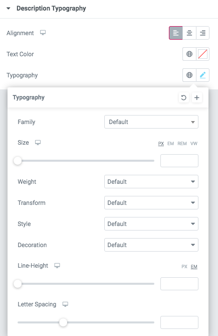 If you turn on the switcher "Use custom font for description?" in Content Settings you can customize font for the description.
Alignment - - Here you can select the description alignment.
Text Color - Here you can select description color from the palette.
Typography - Select the typography for the heading.
- Family - Here you can select the typography for the description text.
- Size - Here you can set up the description text size.
- Weight - Please, select the weight for the description text.
- Transform - This option allows to change the case of the description text.
- Style - Please, select text style for the description text.
- Decoration - Please, select a style for the description text decoration.
- Line-Height - Here you can enter a line height for the description text.
- Letter Spacing - Here you can enter a letter spacing for the description text.
Images size:

Image original size - Select the image size.
Features Tabs 1

Content

Button items:
- Layout - Please, select the button layout.
- Name - Please, enter the button text.
- Link - Please, add a URL to the button.
- Style - Here you can select the button style (dark or light).
- Size - Here you can select button size (small or large).
- Type - Here you can select the button type (reverse or transparent).
- Box shadow - This option allows you to add the box-shadow to the button. It only works if the box-shadow is specified in the skin generator.
- Enable Full width - Turn on the switcher if you want to enable full width to the current button.
Description Typography:
If you turn on the switcher "Use custom font for description?" in Content Settings you can customize font for the description.
Alignment - - Here you can select the description alignment.
Text Color - Here you can select description color from the palette.
Typography - Select the typography for the heading.
- Family - Here you can select the typography for the description text.
- Size - Here you can set up the description text size.
- Weight - Please, select the weight for the description text.
- Transform - This option allows to change the case of the description text.
- Style - Please, select text style for the description text.
- Decoration - Please, select a style for the description text decoration.
- Line-Height - Here you can enter a line height for the description text.
- Letter Spacing - Here you can enter a letter spacing for the description text.
Tab Link Typography

Text Color - Here you can select links color from the palette.
Alignment - Here you can select the alignment of the link.
- Family - Here you can select the typography for the links.
- Size - Here you can set up the size of the link.
- Weight - Please, select the weight for the links.
- Transform - This option allows to change the case of the text of the link.
- Style - Please, select text style for the links.
- Decoration - Please, select a style for the links decoration.
- Line-Height - Here you can enter a line height for the links.
- Letter Spacing - Here you can enter a letter spacing for the links.
Features Tabs 2

Content

Use custom font for link? - Please, turn on the switch if you want to customize the link typography.
Use custom font for description? - Please, turn on the switch if you want to customize the description typography.
Use custom font for date? - Please, turn on the switch if you want to customize the date typography.
Use custom font for subtitle? - Please, turn on the switch if you want to customize the subtitle typography.
Use custom font for arrow? - Please, turn on the switch if you want to customize the arrow typography.
Features Tabs:
- Main Heading - Here you can add an Event title
- Event-1 Image - Please add event`s image. You can choose an image from the media library or upload a new one.The Event will not show unless an image is added
- Event-1 Subtitle - Here you can add event subtitle
- Event-1 Subtitle tag - Please select the subtitle tag
- Event-1 Content Title - Here you can add content title
- Event-1 Content Title tag - Please select content title tag
- Event-1 Additional info(under title) - Here you can add additional text
- Event-1 Description - Please add description text
- Event-1 Link Title - Please enter link text
- Event-1 Link URL - Here you can add event URL
Title Typography:
Alignment - - Here you can select the title alignment.
- Family - Here you can select the typography for the title;
- Size - Here you can set up the title size;
- Weight - Please, select the weight for the title;
- Transform - This option allows to change the case of the text;
- Style - Please, select text style for the title;
- Decoration - Please, select style for the title decoration;
- Line-Height - Here you can enter a line height for the title;
- Letter Spacing - Here you can enter a letter spacing for the title.
Description Typography:
If you turn on the switcher "Use custom font for description?" in Content Settings you can customize font for the description.
Alignment - - Here you can select the description alignment.
Text Color - Here you can select description color from the palette.
Typography - Select the typography for the heading.
- Family - Here you can select the typography for the description text.
- Size - Here you can set up the description text size.
- Weight - Please, select the weight for the description text.
- Transform - This option allows to change the case of the description text.
- Style - Please, select text style for the description text.
- Decoration - Please, select a style for the description text decoration.
- Line-Height - Here you can enter a line height for the description text.
- Letter Spacing - Here you can enter a letter spacing for the description text.
Link Typography

If you turn on the switcher "Use custom font for link arrow?" in Content Settings you can customize font for the link text.
Text Color - Here you can select link arrow text color from the palette.
Typography items:
- Family - Here you can select the typography for the link text.
- Size - Here you can set up the link text size.
- Weight - Please, select the weight for the link text.
- Transform - This option allows to change the case of the text.
- Style - Please, select a text style for the link text.
- Decoration - Please, select a style for the link text decoration.
- Line-Height - Here you can enter a line height for the link text.
- Letter Spacing - Here you can enter a letter spacing for the link text
Date Typography

Text Color - Here you can select links color from the palette.
Alignment - Here you can select the alignment of the date.
Typography items:
- Family - Here you can select the typography for the date.
- Size - Here you can set up the size of the date.
- Weight - Please, select the weight for the date.
- Transform - This option allows to change the case of the text of the date.
- Style - Please, select text style for the date.
- Decoration - Please, select a style for the date decoration.
- Line-Height - Here you can enter a line height for the date.
- Letter Spacing - Here you can enter a letter spacing for the date.
Subtitle Typography
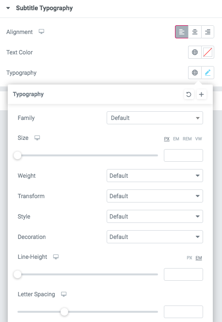
If you turn on the switcher "Use custom font for subtitle?" in Content Settings you can customize font for the subtitle.
Alignment - - Here you can select the content alignment.
Text Color - Here you can select the subtitle color from the palette.
Typography items:
- Family - Here you can select the typography for the subtitle.
- Size - Here you can set up the subtitle size.
- Weight - Please, select the weight for the subtitle.
- Transform - This option allows to change the case of the text.
- Style - Please, select the subtitle style for the highlight.
- Decoration - Please, select a style for the subtitle decoration.
- Line-Height - Here you can enter a line height for the subtitle.
- Letter Spacing - Here you can enter a letter spacing for the subtitle.
Arrow Typography

Text Color - Here you can select arrow color from the palette.
Typography item:
- Family - Here you can select the typography for the arrow.
- Size - Here you can set up the arrow size.
- Weight - Please, select the weight for the arrow.
- Transform - This option allows to change the case of the text.
- Style - Please, select text style for the title.
- Decoration - Please, select a style for the title decoration.
- Line-Height - Here you can enter a line height for the title.
- Letter Spacing - Here you can enter a letter spacing for the title.
Features Tabs 3

Content

Tab title - Please enter tab title
Hryzantema Tab Link Typography

Text Color - Here you can select links color from the palette.
Alignment - Here you can select the alignment of the link.
- Family - Here you can select the typography for the links.
- Size - Here you can set up the size of the link.
- Weight - Please, select the weight for the links.
- Transform - This option allows to change the case of the text of the link.
- Style - Please, select text style for the links.
- Decoration - Please, select a style for the links decoration.
- Line-Height - Here you can enter a line height for the links.
- Letter Spacing - Here you can enter a letter spacing for the links.
Features Tabs 4

Content

- Tab heading - Please enter tab heading
- Reverse content? - Turn on the switch to reverse the content.
- Hide divider? - Turn on the switch if you want to hide divider
- Hide overlay? - Turn on the switch if you want to hide overlay effect
- Content Title - Please enter title for content
- Content Title tag - Please select content title tag
- Background bg - Here you can add the background image
- Add button? - Turn on the switch if you want to add the button
- Add additional button? - Turn on the switch if you want to add an additional button
Button items:
- Layout - Please, select the button layout.
- Name - Please, enter the button text.
- Link - Please, add a URL to the button.
- Style - Here you can select the button style (dark or light).
- Size - Here you can select button size (small or large).
- Type - Here you can select the button type (reverse or transparent).
- Box shadow - This option allows you to add the box-shadow to the button. It only works if the box-shadow is specified in the skin generator.
- Enable Full width - Turn on the switcher if you want to enable full width to the current button.
Use custom font for Title text? - Turn on the switch if you want to customize Title text.
Title Typography:
Alignment - - Here you can select the title alignment.
- Family - Here you can select the typography for the title;
- Size - Here you can set up the title size;
- Weight - Please, select the weight for the title;
- Transform - This option allows to change the case of the text;
- Style - Please, select text style for the title;
- Decoration - Please, select style for the title decoration;
- Line-Height - Here you can enter a line height for the title;
- Letter Spacing - Here you can enter a letter spacing for the title.
Features Tabs 5

Content
