Features Slider (Sterling)
Here you can choose Features Slider template
Simple Slider

Swiper:

Change swiper options? - Turn on switcher if you want to change the following swiper options:
- Arrows - Turn on the switcher to display swiper in arrows style.
- Pagination - Turn on the switcher to display pagination.
- Effect Type - Here you can select from the list the effect type for swiper (Slide, Fade, Cube, Flip, Coverflow).
- Loop - Turn on the switcher to display the loop effect.
- Simulate Touch - Turn on the switcher to add the simulate touch.
- Autoplay - Please, enter autoplay speed(in ms). 0 - autoplay off.
- Speed - Please, enter speed(in ms).
- Lazy load image - Amount of next/prev slides to preload lazy images in. (if 0 - lazy load off).
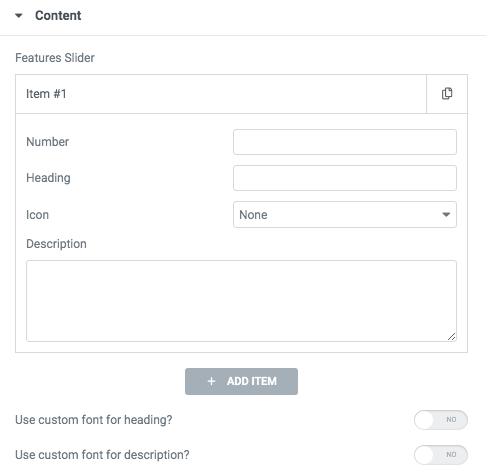
- Number - Here you can enter the number for this item.
- Heading - Please, enter the text for the heading.
- Icon - Here you can select the icon from the list.
- Description - Here you can add the description text.
Use custom font for description? - Please, turn on the switch if you want to customize the description typography.

- Subtitle - Add the subtitle text to the box-section.
- Title - Here you can add the title to the current item.
- Link title - Please, add the title text of the link.
- Link Url - Please, add the url for the link.
- Description - Here you can add the description for the current item.
- Image - Choose an image for the current slide here.
Heading Typography:

- Family - Select the typography fof the heading.
- Size - Set up the heading size.
- Weight - Select the weight of the heading.
- Transform - Change the case of the text.
- Style - Select text style for the heading.
- Decoration - Select a style for the title decoration.
- Line-Height - Enter a line-height of the heading.
- Letter Spacing - Enter a letter spacing of the heading.
Description Typography: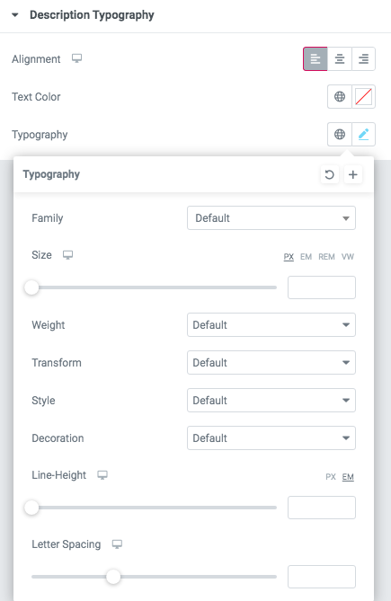 If you turn on the switcher "Use custom font for description?" in Content Settings, you can customize font for the description.
Alignment - - Here you can select the description alignment.
Text Color - Here you can select description color from the palette.
Typography - Select the typography for the heading.
- Family - Here you can select the typography for the description text.
- Size - Here you can set up the description text size.
- Weight - Please, select the weight for the description text.
- Transform - This option allows to change the case of the description text.
- Style - Please, select text style for the description text.
- Decoration - Please, select a style for the description text decoration.
- Line-Height - Here you can enter a line height for the description text.
- Letter Spacing - Here you can enter a letter spacing for the description text.
Feature Slider 1

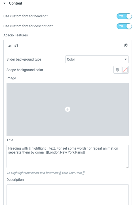
Use custom font for description? - Please, turn on the switch if you want to customize the description typography.
- Slider background type - Here you can choose the background type (image or text)
- Shape background color - Please, select the color from the palette
- Image - Here you can add the image
- Title - Please, enter the text for title. Heading with [[ hightlight ]] text.
- Description - Here you can add the text for the description
Add button? - Turn on the switcher to add the button for the current slide. If you turn on the switcher, there are the next items.

Button items:
- Layout - Please, select the button layout.
- Name - Please, enter the button text.
- Link - Please, add a URL to the button.
- Style - Here you can select the button style (dark or light).
- Size - Here you can select button size (small or large).
- Type - Here you can select the button type (reverse or transparent).
- Box shadow - This option allows you to add the box-shadow to the button. It only works if the box-shadow is specified in the skin generator.
- Enable Full width - Turn on the switcher if you want to enable full width to the current button.

- Hide swiper pagination on desktop? - Turn on the switcher if you want to hide swiper pagination
- Additional Image - Here you can add an additional image to this section
- Subtitle - Add the subtitle text to the box-section.
- Title - Here you can add the title to the current item.
- Link title - Please, add the title text of the link.
- Link Url - Please, add the url for the link.
- Description - Here you can add the description for the current item.
- Image - Choose an image for the current slide here.
Heading Typography:
- Family - Select the typography fof the heading.
- Size - Set up the heading size.
- Weight - Select the weight of the heading.
- Transform - Change the case of the text.
- Style - Select text style for the heading.
- Decoration - Select a style for the title decoration.
- Line-Height - Enter a line-height of the heading.
- Letter Spacing - Enter a letter spacing of the heading.
Description Typography:If you turn on the switcher "Use custom font for description?" in Content Settings, you can customize font for the description.
Alignment - - Here you can select the description alignment.
Text Color - Here you can select description color from the palette.
Typography - Select the typography for the heading.
- Family - Here you can select the typography for the description text.
- Size - Here you can set up the description text size.
- Weight - Please, select the weight for the description text.
- Transform - This option allows to change the case of the description text.
- Style - Please, select text style for the description text.
- Decoration - Please, select a style for the description text decoration.
- Line-Height - Here you can enter a line height for the description text.
- Letter Spacing - Here you can enter a letter spacing for the description text.
Images size for team photos:

Image original size - Select the image size.
Feature Slider 2

Content:

Use custom font for main heading? - Please, turn on the switch if you want to customize the main heading typography.
- Subtitle - Add the subtitle text to the box-section.
- Title - Here you can add the title to the current item.
- Link title - Please, add the title text of the link.
- Link Url - Please, add the url for the link.
- Description - Here you can add the description for the current item.
- Image - Choose an image for the current slide here.
Use custom font for Subtitle? - Please, turn on the switch if you want to customize the subtitle typography
Use custom font for description? - Please, turn on the switch if you want to customize the description typography.
Use custom font for pagination? - Turn on the switcher if you want to customize pagination typography.
Use the custom font for Link? - Turn on the switcher if you want to customize link typography.
Heading Typography:
- Family - Select the typography fof the heading.
- Size - Set up the heading size.
- Weight - Select the weight of the heading.
- Transform - Change the case of the text.
- Style - Select text style for the heading.
- Decoration - Select a style for the title decoration.
- Line-Height - Enter a line-height of the heading.
- Letter Spacing - Enter a letter spacing of the heading.
Funero Subtitle Typography
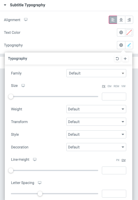
Alignment - - Here you can select the content alignment.
Text Color - Here you can select the subtitle color from the palette.
Typography items:
- Family - Here you can select the typography for the subtitle.
- Size - Here you can set up the subtitle size.
- Weight - Please, select the weight for the subtitle.
- Transform - This option allows to change the case of the text.
- Style - Please, select the subtitle style for the highlight.
- Decoration - Please, select a style for the subtitle decoration.
- Line-Height - Here you can enter a line height for the subtitle.
- Letter Spacing - Here you can enter a letter spacing for the subtitle.
Funero Description Typography:If you turn on the switcher "Use custom font for description?" in Content Settings you can customize font for the description.
Alignment - - Here you can select the description alignment.
Text Color - Here you can select description color from the palette.
Typography - Select the typography for the heading.
- Family - Here you can select the typography for the description text.
- Size - Here you can set up the description text size.
- Weight - Please, select the weight for the description text.
- Transform - This option allows to change the case of the description text.
- Style - Please, select text style for the description text.
- Decoration - Please, select a style for the description text decoration.
- Line-Height - Here you can enter a line height for the description text.
- Letter Spacing - Here you can enter a letter spacing for the description text.
Funero Pagination Typography

Text Color - Here you can select links color from the palette.
Alignment - Here you can select the alignment of the duration.
- Family - Here you can select the typography for the pagination.
- Size - Here you can set up the size of the pagination.
- Weight - Please, select the weight for the pagination.
- Transform - This option allows to change the case of the text of the pagination.
- Style - Please, select text style for the pagination.
- Decoration - Please, select a style for the pagination decoration.
- Line-Height - Here you can enter a line height for the pagination.
- Letter Spacing - Here you can enter a letter spacing for the pagination.
Funero Link Typography

Text Color - Here you can select links color from the palette.
Alignment - Here you can select the alignment of the link.
- Family - Here you can select the typography for the links.
- Size - Here you can set up the size of the link.
- Weight - Please, select the weight for the links.
- Transform - This option allows to change the case of the text of the link.
- Style - Please, select text style for the links.
- Decoration - Please, select a style for the links decoration.
- Line-Height - Here you can enter a line height for the links.
- Letter Spacing - Here you can enter a letter spacing for the links.
Funero Image:

Image original size - Select the image size.
Funero Swiper:

- Change swiper settings? - Turn on the switch if you want to change the slider settings.
- Pagination - Turn on the switch to add pagination.
- Arrows - Turn on the switch if you want the arrows to be displayed.
- Loop - Turn on the switch to display the loop effect.
- Simulate Touch - Turn on the switch if you want to display a simulation touch.
- AutoPlay - Here you can enter the auto play rate (in ms). 0 - automatic shutdown.
- Speed - Here you can enter the speed (in ms).
- Number of slides - here you can enter the number of slides by default.
- Number of slides (lg) - Here you can enter the number of default slides on devices width <1200px.
- Slide count (md) - Here you can enter the default slider count for devices with a width of <991px.
- Number of slides (cm) - Here you can enter the default number of slides on devices with a width of <768px.
- Number of slides (xs) - Here you can enter the default number of slides on devices with a width of <480px.
- Slide spaces - Here you can enter the spaces between the default slides.
- Spaces (lg) - Here you can enter spaces between slides on devices with a width of <1200px.
- Spaces (md) - Here you can enter spaces between slides on devices with a width of <991px.
- Spaces (cm) - Here you can enter spaces between slides on devices with a width of <768px.
- Spaces (xs) - Here you can enter slides between devices on widths <480px.
Feature Slider 3

Content:
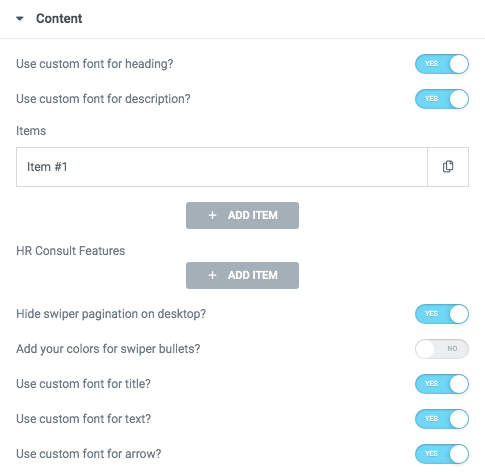
Use custom font for description? - Please, turn on the switch if you want to customize the description typography.
- Subtitle - Add the subtitle text to the box-section.
- Title - Here you can add the title to the current item.
- Link title - Please, add the title text of the link.
- Link Url - Please, add the url for the link.
- Description - Here you can add the description for the current item.
- Image - Choose an image for the current slide here.
Hide swiper pagination on desktop? - Turn on the switcher if you want to hide swiper pagination.
Add your colors for swiper bullets? - Turn on the switcher to add colors.
Use custom font for title? - Turn on the switcher if you want to customize the font for the title text.
Use custom font for text? - Turn on the switcher if you want to customize the font for text.
Use custom font for arrow? - Please, turn on the switch if you want to customize the arrow typography.
Heading Typography:
- Family - Select the typography fof the heading.
- Size - Set up the heading size.
- Weight - Select the weight of the heading.
- Transform - Change the case of the text.
- Style - Select text style for the heading.
- Decoration - Select a style for the title decoration.
- Line-Height - Enter a line-height of the heading.
- Letter Spacing - Enter a letter spacing of the heading.
Description Typography:If you turn on the switcher "Use custom font for description?" in Content Settings, you can customize font for the description.
Alignment - - Here you can select the description alignment.
Text Color - Here you can select description color from the palette.
Typography - Select the typography for the heading.
- Family - Here you can select the typography for the description text.
- Size - Here you can set up the description text size.
- Weight - Please, select the weight for the description text.
- Transform - This option allows to change the case of the description text.
- Style - Please, select text style for the description text.
- Decoration - Please, select a style for the description text decoration.
- Line-Height - Here you can enter a line height for the description text.
- Letter Spacing - Here you can enter a letter spacing for the description text.
Hryzantema Title Typography:

Alignment - - Here you can select the title alignment.
- Family - Here you can select the typography for the title;
- Size - Here you can set up the title size;
- Weight - Please, select the weight for the title;
- Transform - This option allows to change the case of the text;
- Style - Please, select text style for the title;
- Decoration - Please, select style for the title decoration;
- Line-Height - Here you can enter a line height for the title;
- Letter Spacing - Here you can enter a letter spacing for the title.
Hryzantema Text Typography:

Alignment - - Here you can select the title alignment.
- Family - Here you can select the typography for the text;
- Size - Here you can set up the text size;
- Weight - Please, select the weight for the text;
- Transform - This option allows to change the case of the text;
- Style - Please, select text style for the text;
- Decoration - Please, select style for the text decoration;
- Line-Height - Here you can enter a line height for the text;
- Letter Spacing - Here you can enter a letter spacing for the text.
Hryzantema Arrow Typography:
 If you turn on the switcher "Use custom font for link arrow?" in Content Settings you can customize font for the link arrow text.
Text Color - Here you can select link arrow text color from the palette.
Typography items:
- Family - Here you can select the typography for the link arrow text.
- Size - Here you can set up the arrow text size.
- Weight - Please, select the weight for the link arrow text.
- Transform - This option allows to change the case of the text.
- Style - Please, select a text style for the arrow text.
- Decoration - Please, select a style for the arrow text decoration.
- Line-Height - Here you can enter a line height for the arrow text.
- Letter Spacing - Here you can enter a letter spacing for the arrow text.
Hryzantema Swiper:

Change swiper options? - Turn on switcher if you want to change the following swiper options:
- Arrows - Turn on the switcher to display swiper in arrows style.
- Pagination - Turn on the switcher to display pagination.
- Effect Type - Here you can select from the list the effect type for swiper (Slide, Fade, Cube, Flip, Coverflow).
- Loop - Turn on the switcher to display the loop effect.
- Simulate Touch - Turn on the switcher to add the simulate touch.
- Autoplay - Please, enter autoplay speed(in ms). 0 - autoplay off.
- Speed - Please, enter speed(in ms).
Feature Slider 4

Content:

Use custom font for description? - Please, turn on the switch if you want to customize the description typography.
- Subtitle - Add the subtitle text to the box-section.
- Title - Here you can add the title to the current item.
- Link title - Please, add the title text of the link.
- Link Url - Please, add the url for the link.
- Description - Here you can add the description for the current item.
- Image - Choose an image for the current slide here.
Use custom font for link text? - Please, turn on the switch if you want to customize the link text.
Heading Typography:
- Family - Select the typography fof the heading.
- Size - Set up the heading size.
- Weight - Select the weight of the heading.
- Transform - Change the case of the text.
- Style - Select text style for the heading.
- Decoration - Select a style for the title decoration.
- Line-Height - Enter a line-height of the heading.
- Letter Spacing - Enter a letter spacing of the heading.
Description Typography:If you turn on the switcher "Use custom font for description?" in Content Settings, you can customize font for the description.
Alignment - - Here you can select the description alignment.
Text Color - Here you can select description color from the palette.
Typography - Select the typography for the heading.
- Family - Here you can select the typography for the description text.
- Size - Here you can set up the description text size.
- Weight - Please, select the weight for the description text.
- Transform - This option allows to change the case of the description text.
- Style - Please, select text style for the description text.
- Decoration - Please, select a style for the description text decoration.
- Line-Height - Here you can enter a line height for the description text.
- Letter Spacing - Here you can enter a letter spacing for the description text.
Link Typography

Text Color - Here you can select links color from the palette.
Alignment - Here you can select the alignment of the link.
- Family - Here you can select the typography for the links.
- Size - Here you can set up the size of the link.
- Weight - Please, select the weight for the links.
- Transform - This option allows to change the case of the text of the link.
- Style - Please, select text style for the links.
- Decoration - Please, select a style for the links decoration.
- Line-Height - Here you can enter a line height for the links.
- Letter Spacing - Here you can enter a letter spacing for the links.
Number Typography

Text Color - Here you can select title color from the palette.
Alignment - Here you can select the number alignment.
- Family - Here you can select the typography for the number .
- Size - Here you can set up the number size.
- Weight - Please, select the weight for the number .
- Transform - This option allows to change the case of the text.
- Style - Please, select text style for the number .
- Decoration - Please, select a style for the number decoration.
- Line-Height - Here you can enter a line height for the number .
Karma Construction Swiper:
- Change swiper settings? - Turn on the switch if you want to change the slider settings.
- Pagination - Turn on the switch to add pagination.
- Arrows - Turn on the switch if you want the arrows to be displayed.
- Loop - Turn on the switch to display the loop effect.
- Simulate Touch - Turn on the switch if you want to display a simulation touch.
- AutoPlay - Here you can enter the auto play rate (in ms). 0 - automatic shutdown.
- Speed - Here you can enter the speed (in ms).
- Number of slides - here you can enter the number of slides by default.
- Number of slides (lg) - Here you can enter the number of default slides on devices width <1200px.
- Slide count (md) - Here you can enter the default slider count for devices with a width of <991px.
- Number of slides (cm) - Here you can enter the default number of slides on devices with a width of <768px.
- Number of slides (xs) - Here you can enter the default number of slides on devices with a width of <480px.
- Slide spaces - Here you can enter the spaces between the default slides.
- Spaces (lg) - Here you can enter spaces between slides on devices with a width of <1200px.
- Spaces (md) - Here you can enter spaces between slides on devices with a width of <991px.
- Spaces (cm) - Here you can enter spaces between slides on devices with a width of <768px.
- Spaces (xs) - Here you can enter slides between devices on widths <480px.
Feature Slider 5

Content
Use custom font for description? - Please, turn on the switch if you want to customize the description typography.
- Subtitle - Add the subtitle text to the box-section.
- Title - Here you can add the title to the current item.
- Link title - Please, add the title text of the link.
- Link Url - Please, add the url for the link.
- Description - Here you can add the description for the current item.
- Image - Choose an image for the current slide here.
Use custom font for link text? - Please, turn on the switch if you want to customize the link text.
Heading Typography:
- Family - Select the typography fof the heading.
- Size - Set up the heading size.
- Weight - Select the weight of the heading.
- Transform - Change the case of the text.
- Style - Select text style for the heading.
- Decoration - Select a style for the title decoration.
- Line-Height - Enter a line-height of the heading.
- Letter Spacing - Enter a letter spacing of the heading.
Description Typography:If you turn on the switcher "Use custom font for description?" in Content Settings, you can customize font for the description.
Alignment - - Here you can select the description alignment.
Text Color - Here you can select description color from the palette.
Typography - Select the typography for the heading.
- Family - Here you can select the typography for the description text.
- Size - Here you can set up the description text size.
- Weight - Please, select the weight for the description text.
- Transform - This option allows to change the case of the description text.
- Style - Please, select text style for the description text.
- Decoration - Please, select a style for the description text decoration.
- Line-Height - Here you can enter a line height for the description text.
- Letter Spacing - Here you can enter a letter spacing for the description text.
Number Typography
Text Color - Here you can select title color from the palette.
Alignment - Here you can select the number alignment.
- Family - Here you can select the typography for the number .
- Size - Here you can set up the number size.
- Weight - Please, select the weight for the number .
- Transform - This option allows to change the case of the text.
- Style - Please, select text style for the number .
- Decoration - Please, select a style for the number decoration.
- Line-Height - Here you can enter a line height for the number .
Karma Construction Swiper:
- Change swiper settings? - Turn on the switch if you want to change the slider settings.
- Pagination - Turn on the switch to add pagination.
- Arrows - Turn on the switch if you want the arrows to be displayed.
- Loop - Turn on the switch to display the loop effect.
- Simulate Touch - Turn on the switch if you want to display a simulation touch.
- AutoPlay - Here you can enter the auto play rate (in ms). 0 - automatic shutdown.
- Speed - Here you can enter the speed (in ms).
- Number of slides - here you can enter the number of slides by default.
- Number of slides (lg) - Here you can enter the number of default slides on devices width <1200px.
- Slide count (md) - Here you can enter the default slider count for devices with a width of <991px.
- Number of slides (cm) - Here you can enter the default number of slides on devices with a width of <768px.
- Number of slides (xs) - Here you can enter the default number of slides on devices with a width of <480px.
- Slide spaces - Here you can enter the spaces between the default slides.
- Spaces (lg) - Here you can enter spaces between slides on devices with a width of <1200px.
- Spaces (md) - Here you can enter spaces between slides on devices with a width of <991px.
- Spaces (cm) - Here you can enter spaces between slides on devices with a width of <768px.
- Spaces (xs) - Here you can enter slides between devices on widths <480px.
Time Typography

Text Color - Here you can select time color from the palette.
Alignment - Here you can select the time alignment.
Typography items:
- Family - Here you can select the typography for the time.
- Size - Here you can set up the time size.
- Weight - Please, select the weight for the time.
- Transform - This option allows to change the case of the text.
- Style - Please, select a text style for the time.
- Decoration - Please, select a style for the time decoration.
- Line-Height - Here you can enter a line height for the time.
- Letter Spacing - Here you can enter a letter spacing for the time.
Karma SASS Layout 1

Content

- Subtitle - Add the subtitle text to the box-section.
- Title - Here you can add the title to the current item.
- Link title - Please, add the title text of the link.
- Link Url - Please, add the url for the link.
- Description - Here you can add the description for the current item.
- Image - Choose an image for the current slide here.
Image For Active Slide -
- Choose an image for the current slide here.
Karma Swiper:
- Change swiper settings? - Turn on the switch if you want to change the slider settings.
- Pagination - Turn on the switch to add pagination.
- Arrows - Turn on the switch if you want the arrows to be displayed.
- Loop - Turn on the switch to display the loop effect.
- Simulate Touch - Turn on the switch if you want to display a simulation touch.
- AutoPlay - Here you can enter the auto play rate (in ms). 0 - automatic shutdown.
- Speed - Here you can enter the speed (in ms).
- Number of slides - here you can enter the number of slides by default.
- Number of slides (lg) - Here you can enter the number of default slides on devices width <1200px.
- Slide count (md) - Here you can enter the default slider count for devices with a width of <991px.
- Number of slides (cm) - Here you can enter the default number of slides on devices with a width of <768px.
- Number of slides (xs) - Here you can enter the default number of slides on devices with a width of <480px.
- Slide spaces - Here you can enter the spaces between the default slides.
- Spaces (lg) - Here you can enter spaces between slides on devices with a width of <1200px.
- Spaces (md) - Here you can enter spaces between slides on devices with a width of <991px.
- Spaces (cm) - Here you can enter spaces between slides on devices with a width of <768px.
- Spaces (xs) - Here you can enter slides between devices on widths <480px.
Feature Slider 6

Content:

Use custom font for heading? - Please, turn on the switch if you want to customize the main heading typography.
- Subtitle - Add the subtitle text to the box-section.
- Title - Here you can add the title to the current item.
- Link title - Please, add the title text of the link.
- Link Url - Please, add the url for the link.
- Description - Here you can add the description for the current item.
- Image - Choose an image for the current slide here.
Heading Typography:
- Family - Select the typography fof the heading.
- Size - Set up the heading size.
- Weight - Select the weight of the heading.
- Transform - Change the case of the text.
- Style - Select text style for the heading.
- Decoration - Select a style for the title decoration.
- Line-Height - Enter a line-height of the heading.
- Letter Spacing - Enter a letter spacing of the heading.
Karma Shop Swiper:
- Change swiper settings? - Turn on the switch if you want to change the slider settings.
- Pagination - Turn on the switch to add pagination.
- Arrows - Turn on the switch if you want the arrows to be displayed.
- Loop - Turn on the switch to display the loop effect.
- Simulate Touch - Turn on the switch if you want to display a simulation touch.
- AutoPlay - Here you can enter the auto play rate (in ms). 0 - automatic shutdown.
- Speed - Here you can enter the speed (in ms).
- Number of slides - here you can enter the number of slides by default.
- Number of slides (lg) - Here you can enter the number of default slides on devices width <1200px.
- Slide count (md) - Here you can enter the default slider count for devices with a width of <991px.
- Number of slides (cm) - Here you can enter the default number of slides on devices with a width of <768px.
- Number of slides (xs) - Here you can enter the default number of slides on devices with a width of <480px.
- Slide spaces - Here you can enter the spaces between the default slides.
- Spaces (lg) - Here you can enter spaces between slides on devices with a width of <1200px.
- Spaces (md) - Here you can enter spaces between slides on devices with a width of <991px.
- Spaces (cm) - Here you can enter spaces between slides on devices with a width of <768px.
- Spaces (xs) - Here you can enter slides between devices on widths <480px.
Karma Travel Layout 1

Content:

Use custom font for heading? - Please, turn on the switch if you want to customize the main heading typography.
- Subtitle - Add the subtitle text to the box-section.
- Title - Here you can add the title to the current item.
- Link title - Please, add the title text of the link.
- Link Url - Please, add the url for the link.
- Description - Here you can add the description for the current item.
- Image - Choose an image for the current slide here.
Use the custom font for description? - Turn on the switcher if you want to customize description typography.
Heading Typography:
- Family - Select the typography fof the heading.
- Size - Set up the heading size.
- Weight - Select the weight of the heading.
- Transform - Change the case of the text.
- Style - Select text style for the heading.
- Decoration - Select a style for the title decoration.
- Line-Height - Enter a line-height of the heading.
- Letter Spacing - Enter a letter spacing of the heading.
Karma Description Typography:If you turn on the switcher "Use custom font for description?" in Content Settings, you can customize font for the description.
Alignment - - Here you can select the description alignment.
Text Color - Here you can select description color from the palette.
Typography - Select the typography for the heading.
- Family - Here you can select the typography for the description text.
- Size - Here you can set up the description text size.
- Weight - Please, select the weight for the description text.
- Transform - This option allows to change the case of the description text.
- Style - Please, select text style for the description text.
- Decoration - Please, select a style for the description text decoration.
- Line-Height - Here you can enter a line height for the description text.
- Letter Spacing - Here you can enter a letter spacing for the description text.
Karma Label Typography

Text Color - Here you can select time color from the palette.
Alignment - Here you can select the time alignment.
Typography items:
- Family - Here you can select the typography for the label.
- Size - Here you can set up the label size.
- Weight - Please, select the weight for the label.
- Transform - This option allows to change the case of the text.
- Style - Please, select a text style for the label.
- Decoration - Please, select a style for the label decoration.
- Line-Height - Here you can enter a line height for the label.
- Letter Spacing - Here you can enter a letter spacing for the label.
Karma Travel Swiper:
- Change swiper settings? - Turn on the switch if you want to change the slider settings.
- Pagination - Turn on the switch to add pagination.
- Arrows - Turn on the switch if you want the arrows to be displayed.
- Loop - Turn on the switch to display the loop effect.
- Simulate Touch - Turn on the switch if you want to display a simulation touch.
- AutoPlay - Here you can enter the auto play rate (in ms). 0 - automatic shutdown.
- Speed - Here you can enter the speed (in ms).
- Number of slides - here you can enter the number of slides by default.
- Number of slides (lg) - Here you can enter the number of default slides on devices width <1200px.
- Slide count (md) - Here you can enter the default slider count for devices with a width of <991px.
- Number of slides (cm) - Here you can enter the default number of slides on devices with a width of <768px.
- Number of slides (xs) - Here you can enter the default number of slides on devices with a width of <480px.
- Slide spaces - Here you can enter the spaces between the default slides.
- Spaces (lg) - Here you can enter spaces between slides on devices with a width of <1200px.
- Spaces (md) - Here you can enter spaces between slides on devices with a width of <991px.
- Spaces (cm) - Here you can enter spaces between slides on devices with a width of <768px.
- Spaces (xs) - Here you can enter slides between devices on widths <480px.
Karma Travel Layout 2

Content

Use custom font for heading? - Please, turn on the switch if you want to customize the main heading typography.
- Subtitle - Add the subtitle text to the box-section.
- Title - Here you can add the title to the current item.
- Link title - Please, add the title text of the link.
- Link Url - Please, add the url for the link.
- Description - Here you can add the description for the current item.
- Image - Choose an image for the current slide here.
Use the custom font for description? - Turn on the switcher if you want to customize description typography.
Heading Typography:
- Family - Select the typography fof the heading.
- Size - Set up the heading size.
- Weight - Select the weight of the heading.
- Transform - Change the case of the text.
- Style - Select text style for the heading.
- Decoration - Select a style for the title decoration.
- Line-Height - Enter a line-height of the heading.
- Letter Spacing - Enter a letter spacing of the heading.
Karma Description Typography:If you turn on the switcher "Use custom font for description?" in Content Settings, you can customize font for the description.
Alignment - - Here you can select the description alignment.
Text Color - Here you can select description color from the palette.
Typography - Select the typography for the heading.
- Family - Here you can select the typography for the description text.
- Size - Here you can set up the description text size.
- Weight - Please, select the weight for the description text.
- Transform - This option allows to change the case of the description text.
- Style - Please, select text style for the description text.
- Decoration - Please, select a style for the description text decoration.
- Line-Height - Here you can enter a line height for the description text.
- Letter Spacing - Here you can enter a letter spacing for the description text.
Karma Travel Swiper:
- Change swiper settings? - Turn on the switch if you want to change the slider settings.
- Pagination - Turn on the switch to add pagination.
- Arrows - Turn on the switch if you want the arrows to be displayed.
- Loop - Turn on the switch to display the loop effect.
- Simulate Touch - Turn on the switch if you want to display a simulation touch.
- AutoPlay - Here you can enter the auto play rate (in ms). 0 - automatic shutdown.
- Speed - Here you can enter the speed (in ms).
- Number of slides - here you can enter the number of slides by default.
- Number of slides (lg) - Here you can enter the number of default slides on devices width <1200px.
- Slide count (md) - Here you can enter the default slider count for devices with a width of <991px.
- Number of slides (cm) - Here you can enter the default number of slides on devices with a width of <768px.
- Number of slides (xs) - Here you can enter the default number of slides on devices with a width of <480px.
- Slide spaces - Here you can enter the spaces between the default slides.
- Spaces (lg) - Here you can enter spaces between slides on devices with a width of <1200px.
- Spaces (md) - Here you can enter spaces between slides on devices with a width of <991px.
- Spaces (cm) - Here you can enter spaces between slides on devices with a width of <768px.
- Spaces (xs) - Here you can enter slides between devices on widths <480px.
Karma Labels Typography
If you turn on the switcher "Use custom font for label?" in Content Settings, you can customize font for the description.
Text Color - Here you can select time color from the palette.
Alignment - Here you can select the time alignment.
Typography items:
- Family - Here you can select the typography for the label.
- Size - Here you can set up the label size.
- Weight - Please, select the weight for the label.
- Transform - This option allows to change the case of the text.
- Style - Please, select a text style for the label.
- Decoration - Please, select a style for the label decoration.
- Line-Height - Here you can enter a line height for the label.
- Letter Spacing - Here you can enter a letter spacing for the label.
Karma Star Typography

If you turn on the switcher "Use custom font for star?" in Content Settings, you can customize font for the description.
Text Color - Here you can select time color from the palette.
Alignment - Here you can select the time alignment.
Typography items:
- Family - Here you can select the typography for the star.
- Size - Here you can set up the star size.
- Weight - Please, select the weight for the star.
- Transform - This option allows to change the case of the text.
- Style - Please, select a text style for the star.
- Decoration - Please, select a style for the star decoration.
- Line-Height - Here you can enter a line height for the star.
- Letter Spacing - Here you can enter a letter spacing for the star.
Karma Rating Typography

If you turn on the switcher "Use custom font for rating?" in Content Settings, you can customize font for the description.
Text Color - Here you can select time color from the palette.
Alignment - Here you can select the time alignment.
Typography items:
- Family - Here you can select the typography for the rating.
- Size - Here you can set up the rating size.
- Weight - Please, select the weight for the star.
- Transform - This option allows to change the case of the text.
- Style - Please, select a text style for the rating.
- Decoration - Please, select a style for the rating decoration.
- Line-Height - Here you can enter a line height for the rating.
- Letter Spacing - Here you can enter a letter spacing for the rating.
Karma Icon Typography

Text Color - Here you can select social icon color from the palette.
Typography items:
- Family - Here you can select the typography for the icons.
- Size - Here you can set up the size of the icons.
- Weight - Please, select the weight for the icons.
- Transform - This option allows to change the case of the icons text.
- Style - Please, select text style for the icons.
- Decoration - Please, select a style for the decoration.
- Line-Height - Here you can enter a line height for the icons.
- Letter Spacing - Here you can enter a letter spacing for the icons.
Karma Price Typography

Text Color - Here you can select price color from the palette.
Typography items:
- Family - Here you can select the typography for the price.
- Size - Here you can set up the price size.
- Weight - Please, select the weight for the price.
- Transform - This option allows to change the case of the text.
- Style - Please, select text style for the price.
- Decoration - Please, select style for the price decoration.
- Line-Height - Here you can enter a line height for the price.
- Letter Spacing - Here you can enter a letter spacing for the price.
Karma Price Text Typography

Text Color - Here you can select price color from the palette.
Typography items:
- Family - Here you can select the typography for the price text.
- Size - Here you can set up the price text size.
- Weight - Please, select the weight for the price text.
- Transform - This option allows to change the case of the price text.
- Style - Please, select text style for the price text.
- Decoration - Please, select style for the price text decoration.
- Line-Height - Here you can enter a line height for the price text.
- Letter Spacing - Here you can enter a letter spacing for the price text.
Karma Travel Layout 3

Content

Use custom font for heading? - Please, turn on the switch if you want to customize the main heading typography.
- Subtitle - Add the subtitle text to the box-section.
- Title - Here you can add the title to the current item.
- Link title - Please, add the title text of the link.
- Link Url - Please, add the url for the link.
- Description - Here you can add the description for the current item.
- Image - Choose an image for the current slide here.
Use the custom font for description? - Turn on the switcher if you want to customize description typography.