Banner Slider (Sterling)
Banner Slider shortcode
This shortcode allows creating good looking banner sliders on your pages
Content Settings:
Templates - Here you can choose template style for your banner slider (Sterling Banner)
Simple Layout:

Content Settings


- Background Image (+) - Add the image for the banner slide
- Title - Add the title to the current banner slide.
- Subtitle - Add the subtitle to the current banner slide.
- Element tag for Title - Select a title tag.
- Element tag for Description-
- Description - Add the description to the current banner slide.
- Align - Select the content alignment.
- Buttons direction - Select horizontal or vertical buttons direction.
- Add video Button- Decide whether or not to add the video button to the current banner slide.
- Add dark overlay? - Turn on the switcher to add the dark overlay to the current banner.
- Add button? - Turn on the switcher to add the button to the current banner slide.

- Layout - Select the button layout.
- Name - Enter the button text.
- Link - Add a URL to the button.
- Style - Elect the video button style
- Size - Select the video button size
- Type - Select the button type (reverse or transparent)
- Box shadow - This option allows you to add the box-shadow to the button. It only works if the box-shadow is specified in the skin generator.
- Enable Full width - Turn on the switcher if you want to enable full width to the current button.

- Layout - Select the button layout.
- Name - Enter the button text.
- Link - Add a URL to the button.
- Style - Select the button style (dark or light).
- Size - Select button size (small or large).
- Type - Select the button type (reverse or transparent).
- Box shadow - Add the box-shadow to the button. It only works if the box-shadow is specified in the skin generator.
- Enable Full width - Turn on the switcher if you want to enable full width to the current button
Heading Typography:

- Family - Select the typography fof the heading.
- Size - Set up the heading size.
- Weight - Select the weight of the heading.
- Transform - Change the case of the text.
- Style - Select text style for the heading.
- Decoration - Select a style for the title decoration.
- Line-Height - Enter a line-height of the heading.
- Letter Spacing - Enter a letter spacing of the heading.
Swiper Settings:

Change swiper options? - Turn on switcher if you want to change the following swiper options:

Image original size - Select the image size.
Banner Slider 1 Layout


- Background image - Add the image of the background.
- Element Tag for Title - Select a title tag.
- Title - Add the title to the current banner slide.
- Description - Add the description for the current banner slide.
- Align - Select the content align.
- Buttons direction - Select horizontal or vertical buttons direction.
- Add button? - Turn on the switcher to add the button for the current banner slide. If you turn on the switcher, there are the next items.

- Layout - Select the button layout.
- Name - Enter the button text.
- Link - Add a URL to the button.
- Style - Elect the video button style
- Size - Select the video button size
- Type - Select the button type (reverse or transparent)
- Box shadow - This option allows you to add the box-shadow to the button. It only works if the box-shadow is specified in the skin generator.
- Enable Full width - Turn on the switcher if you want to enable full width to the current button.

- Layout - Select the button layout.
- Name - Enter the button text.
- Link - Add a URL to the button.
- Style - Select the button style (dark or light).
- Size - Select button size (small or large).
- Type - Select the button type (reverse or transparent).
- Box shadow - Add the box-shadow to the button. It only works if the box-shadow is specified in the skin generator.
- Enable Full width - Turn on the switcher if you want to enable full width to the current button.

- Add your colors for swiper bullets? - Turn on the switcher if you want to add your colors for swiper bullets. If you turn on the switcher, there are the next items.
- Swiper bullet color - Choose the color from the color palette.
- Swiper bullet active color - Choose the color from the color palette.
Heading Typography

Text Color - Select heading color from the palette.
Typography item:
- Family - Select the typography of the heading.
- Size - Set up the heading size.
- Weight - Select the weight of the heading.
- Transform - Change the case of the text.
- Style - Select text style for the heading.
- Decoration - Select a style for the title decoration.
- Line-Height - Enter a line-height of the heading.
- Letter Spacing - Enter a letter spacing of the heading.
Swiper Settings

Arrows - Turn on the switcher to display swiper in arrows style.
Pagination - Turn on the switcher to display the sliders pagination.
Loop - Turn on the switcher to display the loop effect.
Simulate Touch - Turn on the switcher to display the simulate touch.
Autoplay - Enter autoplay speed(in ms). 0 - autoplay off.
Speed - Enter speed(in ms).
Slides count - Enter the number of slides by default. Slides count (lg) - Enter the number of default slides on devices width <1200px.
Slides count(md) - Enter the default slider count for devices with a width of <991px.
Slides count(xs) - Enter slides between devices on widths <480px.
Slides count(sm) - Enter spaces between slides on devices with a width of <768px.
BANNER SLIDER 2 LAYOUT


Use custom font for heading? - Turn on the switch if you want to customize the heading typography.
Item Settings:
- Image - Add the image for the background.
- Enable overlay for a background image? - Turn on the switcher if you want to enable overlay for the background image.
- Subtitle - Enter the text for the subtitle.
- Title - Enter the text for the title.
- Align - Select the content align.
- Element tag for Title - Select the tag for the title.
- Add button? - Turn on the switcher to add the button for the current banner slide. If you turn on the switcher, there are the next items.

- Name - Enter the button text.
- Link - Add a URL to the button.
- Style - Select the button style (dark or light).
- Size - Select button size (small or large).
- Type - Select the button type (reverse or transparent).
- Box shadow - Add the box-shadow to the button. It only works if the box-shadow is specified in skin generator.
- Enable Full width - Turn on the switcher if you want to enable full width to the current button.
Heading Typography:
- Family - Select the typography for the heading.
- Size - Set up the heading size.
- Weight - Select the weight for the heading.
- Transform - Change the case of the text.
- Style - Select text style for the heading.
- Decoration - Select a style for the heading decoration.
- Line-Height - Enter a line height for the heading.
- Letter Spacing - Enter a letter spacing for the heading.
Swiper:

Change swiper options? - Turn on switcher in order to change the following swiper options:
- Arrows - Turn on the switcher to display swiper in arrows style.
- Effect Type - Select from the list the effect type for swiper (Slide, Fade, Cube, Flip, Coverflow).
- Loop - Turn on the switcher to display the loop effect.
- Simulate Touch - Turn on the switcher to add the simulate touch.
- Autoplay - Enter autoplay speed(in ms). 0 - autoplay off.
- Speed - Enter speed(in ms).
- Lazy load image - Amount of next/prev slides to preload lazy images in. (if 0 - lazy load off)
Banner Subtitle Typography:

If you turn on the switcher "Use custom font for Subtitle?" in Content Settings you can customize font for the subtitle.
Alignment - Select the subtitle alignment.
Text Color - Select subtitle color from the palette.
Typography items:
- Family - Select the typography for the subtitle.
- Size - Set up the subtitle size.
- Weight - Select the weight for the subtitle.
- Transform -Change the case of the text.
- Style - Select text style for the subtitle.
- Decoration - Select a style for the subtitle decoration.
- Line-Height - Enter a line height for the subtitle.
- Letter Spacing - Enter a letter spacing for the subtitle.
Banner Slider 3 Layout

Content Settings:

Item Settings:
- Image (+) - Add the image for the background.
- Enable overlay for a background image? - Turn on the switcher if you want to enable overlay for the background image.
- Subtitle - Enter the text for the subtitle.
- Title - Enter the text for the title.
- Align - Select the content align.
- Element tag for Title - Select the tag for the title.
- Add video? - Turn on the switcher to add the video.

- Video link - Add a URL to the video.
- Style - Select the style (Primary/Dark/Light)
- Size - Set up the size (Standart/Small/Large)Heading Typography:
Heading Typography

Family - Select the typography for the heading.
Size - Set up the heading size.
Weight - Select the weight for the heading.
Transform - Change the case of the text.
Style - Select text style for the heading.
Decoration - Select a style for the heading decoration.
Line-Height - Enter a line height for the heading.
Letter Spacing - Enter a letter spacing for the heading.
Swiper Settings:

- Arrows - Turn on the switcher to display swiper in arrows style.
- Effect Type - Select from the list the effect type for swiper (Slide, Fade, Cube, Flip, Coverflow).
- Loop - Turn on the switcher to display the loop effect.
- Simulate Touch - Turn on the switcher to add the simulate touch.
- Autoplay - Enter autoplay speed(in ms). 0 - autoplay off.
- Speed - Enter speed(in ms).
- Lazy load image - Amount of next/prev slides to preload lazy images in. (if 0 - lazy load off)
Banner Subtitle Typography:

If you turn on the switcher "Use custom font for Subtitle?" in Content Settings you can customize font for the subtitle. Alignment - Here you can select the subtitle alignment. Text Color - Here you can select subtitle color from the palette. Typography items:
- Family - Select the typography for the subtitle.
- Size - Set up the subtitle size.
- Weight - Select the weight for the subtitle.
- Transform -Change the case of the text.
- Style - Select text style for the subtitle.
- Decoration - Select a style for the subtitle decoration.
- Line-Height - Enter a line height for the subtitle.
- Letter Spacing - Enter a letter spacing for the subtitle.
BANNER SLIDER 4 Layout


Use custom font for heading? - Turn on the switcher in order to customize font for the heading.
Use glitch effect for heading? - Turn on the switcher in order to use a glitch effect for the heading.
Use custom font for description? - Turn on the switcher in order to customize font for the description.
Add item - Add the item to create and edit the slide.
- Image -Add the image for the background.
- Enable overlay for a background image? - Turn on the switcher in order to enable overlay for the background image.
- Heading - Enter the text for the heading.
- Description - Add the description for the current banner slide.
- Align - Select the content align.
- Use background for Video Button? - Turn on the switcher in order to use the background for Video Button and add the image.
- Add Video button? - Turn on the switcher to add the video button for current banner slide.

- Name - Enter the button text.Video link - Add a URL to the button.
- Style - Select the button style (dark or light).Size - Select button size (small or large).
- Type - Select the button type (reverse or transparent).
- Box shadow - Add the box-shadow to the button. It only works if the box-shadow is specified in skin generator.Enable Full width - Turn on the switcher to enable full width to the current button.
- Additional button items:
- Layout - Select the button layout.
- Name - Enter the button text.
- Link - Add a URL to the button.
- Style - Select the button style (dark or light).
- Size - Select button size (small or large).
- Type - Select the button type (reverse or transparent).
- Box shadow - Add the box-shadow to the button. It only works if the box-shadow is specified in skin generator.
- Enable Full width - Turn on the switcher in order to enable full width to the current button.
Heading Typography:

Alignment - Select the heading alignment.
Text Color - Select heading color from the palette
Typography item:
- Family - Select the typography for the heading
- Size - Set up the heading size
- Weight - Select the weight for the heading
- Transform - Allows to change the case of the text.
- Style - Select text style for the heading
- Decoration - Select style for the heading decoration
- Line-Height - Enter a line height for the heading
- Letter Spacing - Enter a letter spacing for the heading\
Swiper:
- Arrows - Turn on the switcher to display swiper in arrows style
- Effect Type - Select from the list the effect type for swiper (Slide, Fade, Cube, Flip, Coverflow)
- Loop - Turn on the switcher to display the loop effect.
- Simulate Touch - Turn on the switcher to add the simulate touch.
- Autoplay - Please, enter autoplay speed(in ms). 0 - autoplay off.
- Speed - Please, enter speed(in ms).
- Lazy load image - Amount of next/prev slides to preload lazy images in. (if 0 - lazy load off)EWO Description Typography
Ewo Description Typography

- Typography items
- Family - Select the typography for the description.
- Size - Set up the description size.
- Weight - Select the weight for the description.
- Transform - Change the case of the text.
- Style - Select text style for the description.
- Decoration - Select a style for the description decoration.
- Line-Height - Enter a line height for the description.
- Letter Spacing - Enter a letter spacing for the description.
Banner Slider 5:


- Image - Add the image for the background.
- Title - Add the title for current banner slide. To Hightlight text insert text between: <i> Your Text Here </i>, To Hightlight text with color insert text between: [[ Your Text Here ]], For text in new line use <br>
- Element Tag for Title - Select a title tag.
- Element tag for Description - Select a description tag.
- Description - Add the description for the current banner slide.
- Align - Select the content align.
- Tablet Align- Select the align on tablets.
- Buttons direction - Select horizontal or vertical buttons direction.
- Add Video Button? - Turn on the switcher to add the video button to the current banner slide.
- Add dark overlay? - Turn on the switcher to add a dark overlay to the current banner slide.
- Add button? - Turn on the switcher to add the button to the current banner slide. If you turn on the switcher, there are the next items.
 Button items:
- Layout - Select the button layout.
- Name - Enter the button text.
- Link - Add a URL to the button.
- Style - Select the button style (dark or light).
- Size - Select button size (small or large).
- Type - Select the button type (reverse or transparent).
- Box shadow - Add the box-shadow to the button. It only works if the box-shadow is specified in skin generator.
- Enable Full width - Turn on the switcher if you want to enable full width to the current button.
- Add additional button? - Turn on the switcher to add the additional button to the current banner slide. If you turn on the switcher, there are the next items.
 Additional button items:
- Layout - Select the button layout.
- Name - Enter the button text.
- Link - Add a URL to the button.
- Style - Select the button style (dark or light).
- Size - Select button size (small or large).
- Type - Select the button type (reverse or transparent).
- Box shadow - Add the box-shadow to the button. It only works if the box-shadow is specified in the skin generator.
- Enable Full width - Turn on the switcher if you want to enable full width to the current button.Heading Typography:

Alignment - Here you can select the heading alignment.
Text Color - Here you can select heading color from the palette. Typography items:
- Family -Select the typography for the heading.
- Size - Set up the heading size.
- Weight - Select the weight for the heading.
- Transform - This option allows to change the case of the text.
- Style - Select text style for the heading.
- Decoration - Select style for the heading decoration.
- Line-Height - Enter a line height for the heading.
- Letter Spacing - Enter a letter spacing for the heading.
Swiper:
- Arrows - Turn on the switcher to display swiper in arrows style .
- Pagination - Turn on the switcher to display the sliders pagination.
- Effect Type - Here you can select from the list the effect type for swiper (Slide, Fade, Cube, Flip, Coverflow).
- Loop - Turn on the switcher to display the loop effect.
- Autoplay - Enter autoplay speed(in ms). 0 - autoplay off.
- Speed - Enter speed (in ms)
Banner Highlight Typography:

Text Color - Here you can select banner highlight color from the palette.
Typography:
- Family - Select the typography for the banner highlight.
- Size - Set up the banner highlight size.
- Weight - Select the weight for the banner highlight.
- Transform - Change the case of the text.
- Style - Select text style for the banner highlight.
- Decoration - Select style for the banner highlight decoration.
- Line-Height - Enter a line height for the banner highlight.
- Letter Spacing - Enter a letter spacing for the banner highlight.Famulus Description Typography:
Famulus Description Typography:

If you turn on the switcher "Use custom font for Description?" in Content Settings you can customize font for the description.
Text Color - Here you can select description color from the palette.
Typography:
- Family - Select the typography for the description.
- Size - Set up the description size.
- Weight - Select the weight for the description.
- Transform - Change the case of the text.
- Style - Select text style for the description.
- Decoration - Select style for the description decoration.
- Line-Height - Enter a line height for the description.
- Letter Spacing - Enter a letter spacing for the description.
Video Link Typography:

Text Color - Here you can select video link color from the palette.
Typography:
- Family - Select the typography for the video link.
- Size - Set up the video link size.
- Weight - Select the weight for the video link.
- Transform - Change the case of the text.
- Style - Select text style for the video link.
- Decoration - Select style for the video link decoration.
- Line-Height - Enter a line height for the video link.
- Letter Spacing - Enter a letter spacing for the video link.
Banner Slider 6


- Image - Choose an image to the current banner here.
- Title - Add the title to the current banner.
- Add overlay to image? - Turn on the switcher if you want to add an overlay to the image.
- White text? - Turn on the switcher if you want to make the text white.
- Use the custom font for Link? - Turn on the switcher if you want to customize link typography.
Breadcrumbs Links Typography:

Text Color - Here you can select links color from the palette.
Typography:
- Family - Select the typography for the links.
- Size - Set up the link size.
- Weight - Select the weight for the links.
- Transform - Change the case of the text.
- Style - Select text style for the links.
- Decoration - Select a style for the links decoration.
- Line-Height - Enter a line height for the links.
- Letter Spacing - Enter a letter spacing for the links.
Banner Slider 7
Content Settings:

- Image - Please, choose an image to the current banner here.
- Title - Add the title to the current banner.
- Add overlay to image? - Turn on the switcher if you want to add an overlay to the image.
- White text? - Turn on the switcher if you want to make the text white.
- Use the custom font for Link? - Turn on the switcher if you want to customize link typography.
Breadcrumbs Links Typography:
Text Color - Here you can select links color from the palette.
Typography:
- Family - Select the typography for the links.
- Size - Set up the link size.
- Weight - Select the weight for the links.
- Transform - Change the case of the text.
- Style - Select text style for the links.
- Decoration - Select a style for the links decoration.
- Line-Height - Enter a line height for the links.
- Letter Spacing - Enter a letter spacing for the links.
Banner Slider 8 
Content:

Item Settings:
- Background image - Add the image for the background.
- Element tag for title - Select the tag for the title.
- Subtitle - Add the text for the subtitle.
- Title - Add the title for current banner slide. To Hightlight text insert text between: <i> Your Text Here </i>, To Hightlight text with color insert text between: [[ Your Text Here ]], For text in new line use <br>
- Description - Add the description for the current banner slide.
- Align - Select the content align.
- Buttons direction - Select horizontal or vertical buttons direction.
- Add button? - Turn on the switcher to add the button to the current banner slide.

Button items:
- Layout - Select the button layout.
- Name - Enter the button text.
- Link - Add a URL to the button.
- Style - Select the button style (dark or light).
- Size - Select button size (small or large).
- Type - Select the button type (reverse or transparent).
- Box shadow - Add the box-shadow to the button. It only works if the box-shadow is specified in skin generator.
- Enable Full width - Turn on the switcher in order to enable full width to the current button.
- Add additional button? - Turn on the switcher to add the additional button for the current banner slide.

- Additional button items:
- Layout - Select the button layout.
- Name - Enter the button text.
- Link - Please, add a URL to the button.
- Style - Select the button style (dark or light).
- Size - Select button size (small or large).
- Type - Select the button type (reverse or transparent).
- Box shadow - Add the box-shadow to the button. It only works if the box-shadow is specified in skin generator.
- Enable Full width - Turn on the switcher to enable full width to the current button.
Heading Typography:
Alignment - Here you can select the heading alignment.
Text Color - Here you can select heading color from the palette.
Typography:
- Family- Select the typography for the heading.
- Size - Set up the heading size.
- Weight - Select the weight for the heading.
- Transform - This option allows to change the case of the text.
- Style - Select text style for the heading.
- Decoration - Select style for the heading decoration.
- Line-Height - Enter a line height for the heading.
- Letter Spacing - Enter a letter spacing for the heading.
Hryzantema Subtitle Typography

Text Color - Select subtitle color from the palette.
Typography :
- Family - Select the typography for the subtitle.
- Size - Set up the subtitle size.
- Weight - Select the weight for the subtitle.
- Transform - Change the case of the text.
- Style - Select text style for the subtitle.
- Decoration - Select a style for the subtitle decoration.
- Line-Height - Enter a line height for the subtitle.
- Letter Spacing - Enter a letter spacing for the subtitle.
Hryzantema Description Typography:
Text Color - Select the title color from the palette.
Typography items:
- Family - Here you can select the typography for the description text.
- Size - Here you can set up the description text size.
- Weight - Please, select the weight for the description text.
- Transform - This option allows to change the case of the description text.
- Style - Please, select text style for the description text.
- Decoration - Please, select a style for the description text decoration.
- Line-Height - Here you can enter a line height for the description text.
- Letter Spacing - Here you can enter a letter spacing for the description text.
Swiper

Alignment - Select the title alignment.
Text Color - Select a description color from the palette.
Typography
- Family - Select the typography for the description.
- Size - Set up the description size.
- Weight - Select the weight for the description.
- Transform - Change the case of the text.
- Style - Select text style for the description.
- Decoration - Select a style for the description decoration.
- Line-Height - Enter a line height for the description.
- Letter Spacing - Enter a letter spacing for the description.
Hryzantema Swiper:
- Arrows - Turn on the switcher to display swiper in arrows style.
- Pagination - Turn on the switcher to display pagination.
- Effect Type - Select from the list the effect type for swiper (Slide, Fade, Cube, Flip, Coverflow).
- Loop - Turn on the switcher to display the loop effect.
- Simulate Touch - Turn on the switcher to add the simulate touch.
- Autoplay - Enter autoplay speed(in ms). 0 - autoplay off.
- Speed - Eter speed(in ms).
- Lazy load image - Amount of next/prev slides to preload lazy images in. (if 0 - lazy load off).
Famulus Simple:

Content Settings:

- Image - Add the image for the background.
- Title - Add the title for current banner slide.
- Date - Put the date to the current slide.
- Place - Put the place to the current slide.
- Align - Select the content align.
- Buttons direction - Select horizontal or vertical buttons direction.
- Add social icons? - Add social media icons to the current slide.
- Add button? - Turn on the switcher to add the button for the current banner slide.

- Layout - Select the button layout.
- Name - Enter the button text.
- Link - Add a URL to the button.
- Style - Select the button style (dark or light).
- Size - Select button size (small or large).
- Type - Select the button type (reverse or transparent).
- Box shadow - Add the box-shadow to the button. It only works if the box-shadow is specified in skin generator.
- Enable Full width - Turn on the switcher if you want to enable full width to the current button.
- Add icon? - Add additional icons.
- Add additional button? - Turn on the switcher to add the additional button for the current banner slide.

- Layout - Select the button layout.
- Name - Enter the button text.
- Link - Add a URL to the button.
- Style - Select the button style (dark or light).
- Size - Select button size (small or large).
- Type - Select the button type (reverse or transparent).
- Box shadow - Add the box-shadow to the button. It only works if the box-shadow is specified in skin generator.
- Enable Full width - Turn on the switcher if you want to enable full width to the current button.
- Add icon? - Add additional icons.

- Enable overlay image for slider? - Turn on the switcher if you want to enable overlay image to a slider.
- Change arrows position? - This option allows to change the position.
- Use custom font for contact? - Customize font for the contacts.
Heading Typography:
Alignment - Select the heading alignment.
Text Color - Select heading color from the palette.
Typography items:
- Family - Select the typography for the heading.
- Size - Set up the heading size.
- Weight - Select the weight for the heading.
- Transform - Change the case of the text.
- Style - Select text style for the heading.
- Decoration - Select a style for the heading decoration.
- Line-Height - Enter a line height for the heading.
- Letter Spacing - Enter a letter spacing for the heading.
Swiper Settings:

Change swiper options? - Turn on switcher if you want to change the following swiper options:
- Arrows - Turn on the switcher to display swiper in arrows style .
- Effect Type - Select from the list the effect type for swiper (Slide, Fade, Cube, Flip, Coverflow).
- Loop - Turn on the switcher to display the loop effect.
- Autoplay - Enter autoplay speed(in ms). 0 - autoplay off.
- Speed - Enter speed (in ms).
Karma Contact Typography:
Typography:
- Family - Select the typography for the heading.
- Size - Set up the heading size.
- Weight - Select the weight for the heading.
- Transform - Change the case of the text.
- Style - Select text style for the heading.
- Decoration - Select a style for the heading decoration.
- Line-Height - Enter a line height for the heading.
- Letter Spacing - Enter a letter spacing for the heading.
Travel Banner-Slider
Content Settings:

- Background Image - Add the image for the banner slide.
- Subtitle - Add the subtitle for current banner slide.
Add button? - Turn on the switcher to add the button for the current slide. If you turn on the switcher, there are the next items.

Button items:
- Layout - Please, select the button layout.
- Name - Please, enter the button text.
- Link - Please, add a URL to the button.
- Style - Here you can select the button style (dark or light).
- Size - Here you can select button size (small or large).
- Type - Here you can select the button type (reverse or transparent).
- Box shadow - This option allows you to add the box-shadow to the button. It only works if the box-shadow is specified in the skin generator.
- Enable Full width - Turn on the switcher if you want to enable full width to the current button.
Swiper Settings:

Change swiper options? - Turn on switcher if you want to change the following swiper options:
- Effect Type - Select from the list the effect type for swiper (Slide, Fade, Cube, Flip, Coverflow).
- Loop - Turn on the switcher to display the loop effect.
- Simulate Touch - Turn on the switcher to add the simulate touch.
- Autoplay - Enter autoplay speed(in ms). 0 - autoplay off.
- Speed - Enter speed (in ms).
- Lazy load image - Amount of next/prev slides to preload lazy images in. (if 0 - lazy load off).
Karma Title Typography:

Alignment - - Here you can select the title alignment.
- Family - Here you can select the typography for the title;
- Size - Here you can set up the title size;
- Weight - Please, select the weight for the title;
- Transform - This option allows to change the case of the text;
- Style - Please, select text style for the title;
- Decoration - Please, select style for the title decoration;
- Line-Height - Here you can enter a line height for the title;
- Letter Spacing - Here you can enter a letter spacing for the title.
Karma Subtitle Typography
If you turn on the switcher "Use custom font for subtitle?" in Content Settings you can customize font for the subtitle.
Alignment - - Here you can select the content alignment.
Text Color - Here you can select the subtitle color from the palette.
Typography items:
- Family - Here you can select the typography for the subtitle.
- Size - Here you can set up the subtitle size.
- Weight - Please, select the weight for the subtitle.
- Transform - This option allows to change the case of the text.
- Style - Please, select the subtitle style for the highlight.
- Decoration - Please, select a style for the subtitle decoration.
- Line-Height - Here you can enter a line height for the subtitle.
- Letter Spacing - Here you can enter a letter spacing for the subtitle.
Karma Label Typography

If you turn on the switcher "Use custom font for label?" in Content Settings you can customize font for the label.
Text Color - Here you can select time color from the palette.
Alignment - Here you can select the time alignment.
Typography items:
- Family - Here you can select the typography for the label.
- Size - Here you can set up the label size.
- Weight - Please, select the weight for the label.
- Transform - This option allows to change the case of the text.
- Style - Please, select a text style for the label.
- Decoration - Please, select a style for the label decoration.
- Line-Height - Here you can enter a line height for the label.
- Letter Spacing - Here you can enter a letter spacing for the label.
Banner Slider 9 Content Settings:


When arrow On, typography?- Turn on the switch if you want to customize font for the arrows.
Use custom font for subtitle?- Turn on the switch if you want to customize font for the subtitle.
Add item - Add the item to create and edit the slide.
- Background Image - Add the image for the banner slide.
- Title - Add the title for current banner slide.
- Subtitle - Add the subtitle for current banner slide.
- Description - Here you can add the description for the current banner slide.
- Align - Select the content align.
- Buttons direction - Select horizontal or vertical buttons direction.
- Add button? - Turn on the switcher to add the button for the current banner slide. If you turn on the switcher, there are the next items.


Button items:
- Layout - Select the button layout.
- Name - Enter the button text.
- Link - Add a URL to the button.
- Style - Select the button style (dark or light).
- Size - Select button size (small or large).
- Type - Select the button type (reverse or transparent).
- Box shadow - Add the box-shadow to the button. It only works if the box-shadow is specified in skin generator.
- Enable Full width - Turn on the switcher if you want to enable full width to the current button.
- Add additional button? - Turn on the switcher to add the additional button for the current banner slide.

- Layout - Select the button layout.
- Name - Enter the button text.
- Link -Add a URL to the button.
- Style - Select the button style (dark or light).
- Size - Select button size (small or large).
- Type - Select the button type (reverse or transparent).
- Box shadow - Add the box-shadow to the button. It only works if the box-shadow is specified in skin generator.
- Enable Full width - Turn on the switcher if you want to enable full width to the current button.
Use custom font for description?- Turn on the switch if you want to customize font for the description.
Use custom font for arrows text?- Turn on the switch if you want to customize font for the arrows text.
Heading Typography:
Alignment - Here you can select the heading alignment.
Text Color - Here you can select heading color from the palette
Typography item:
- Family - Slect the typography for the heading
- Size - Set up the heading size
- Weight - Select the weight for the heading
- Transform - Change the case of the text.
- Style - Select text style for the heading
- Decoration - Select style for the heading decoration
- Line-Height - Enter a line height for the heading
- Letter Spacing - Enter a letter spacing for the heading
Swiper Settings:
- Arrows - Turn on the switcher to display swiper in arrows style.
- Pagination - Turn on the switcher to display the sliders pagination.
- Effect Type - Select from the list the effect type for swiper (Slide, Fade, Cube, Flip, Coverflow).
- Loop - Turn on the switcher to display the loop effect.
- Autoplay - Enter autoplay speed(in ms). 0 - autoplay off.
- Speed - Enter speed (in ms).
- Lazy load image - Enter the amount of next/prev slides to preload lazy images in (if 0 - a lazy load off).

Image original size - Select the image size.
Banner Slider 10 
Content Settings:
When arrow On, typography?- Turn on the switch if you want to customize font for the arrows.
Use custom font for subtitle?- Turn on the switch if you want to customize font for the subtitle.
Add item - Please, add the item to create and edit the slide.
- Background Image - Here you can add the image for the banner slide.
- Title - Here you can add the title for current banner slide.
- Subtitle - Here you can add the subtitle for current banner slide.
- Description - Here you can add the description for the current banner slide.
- Align - Here you can select the content align.
- Buttons direction - Please, select horizontal or vertical buttons direction.
- Add button? - Turn on the switcher to add the button for the current banner slide.
If you turn on the switcher, there are the next items.
- Layout - Select the button layout.
- Name - Enter the button text.
- Link - Add a URL to the button.
- Style - Eelect the button style (dark or light).
- Size - Select button size (small or large).
- Type - Select the button type (reverse or transparent).
- Box shadow - Add the box-shadow to the button. It only works if the box-shadow is specified in skin generator.
- Enable Full width - Turn on the switcher to enable full width to the current button.
- Add additional button? - Add the additional button for the current banner slide. If you turn on the switcher, there are the next items.

- Additional button items:
- Layout - Select the button layout.
- Name - Enter the button text.
- Link - Add a URL to the button.
- Style - Select the button style (dark or light).
- Size - Select button size (small or large).
- Type - Select the button type (reverse or transparent).
- Box shadow - Add the box-shadow to the button. It only works if the box-shadow is specified in skin generator.
- Enable Full width - Turn on the switcher if you want to enable full width to the current button.

Use custom font for description?- Turn on the switch to customize font for the description.
Use custom font for arrows text?- Turn on the switch to customize font for the arrows text.
Heading Typography:
Text Color - Select heading color from the palette.
Typography:
- Family - Select the typography fof the heading.
- Size - Set up the heading size.
- Weight - Select the weight of the heading.
- Transform - Change the case of the text.
- Style - Select text style for the heading.
- Decoration - Select a style for the title decoration.
- Line-Height - Enter a line-height of the heading.
- Letter Spacing - Enter a letter spacing of the heading.
Swiper Settings:

Change swiper options? - Turn on switcher in order to change the following swiper options:
- Arrows - Turn on the switcher to display swiper in arrows style.
- Effect Type - Select from the list the effect type for swiper (Slide, Fade, Cube, Flip, Coverflow).
- Loop - Turn on the switcher to display the loop effect.
- Simulate Touch - Turn on the switcher to add the simulate touch.
- Autoplay - Enter autoplay speed(in ms). 0 - autoplay off.
- Speed - Enter speed(in ms).
- Lazy load image - Amount of next/prev slides to preload lazy images in. (if 0 - lazy load off)
Arrows Typography:

If you turn on the switcher "Use custom font for arrows?" in Content Settings you can customize font for the arrows.
Text Color - Select description color from the palette.
Typography item:
- Family - Select the typography for the arrows.
- Size - Set up the arrows size.
- Weight - Select the weight for the arrows.
- Transform - Change the case of the text.
- Style - Select text style for the arrows.
- Decoration - Select style for the arrows decoration.
- Line-Height - Enter a line height for the arrows.
- Letter Spacing - Enter a letter spacing for the arrows.
Mooseoom Subtitle Typography:

Typography items:
- Family - Select the typography for the subtitle.
- Size - Set up the subtitle size.
- Weight - Select the weight for the subtitle.
- Transform - Change the case of the text.
- Style - Select text style for the subtitle.
- Decoration - Select a style for the title decoration.
- Line-Height - Enter a line height for the subtitle.
- Letter Spacing - Enter a letter spacing for the subtitle.
Mooseoom Description Typography:
Text Color - Select description color from the palette.
Typography item:
- Family - Select the typography for the description text.
- Size - Set up the description text size.
- Weight - Select the weight for the description text.
- Transform - Change the case of the description text.
- Style - Select text style for the description text.
- Decoration - Select a style for the description text decoration.
- Line-Height - Enter a line height for the description text.
- Letter Spacing - Enter a letter spacing for the description text.
Arrows text Typography:
Typography item:
- Family - Select the typography for the arrows text.
- Size - Set up the arrows text size.
- Weight - Select the weight for the arrows text.
- Transform - Change the case of the arrows text.
- Style - Select text style for the arrows text.
- Decoration - Select a style for the arrows text decoration.
- Line-Height - Enter a line height for the arrows text.
- Letter Spacing - Enter a letter spacing for the arrows text.
Images Size for additional image:
Banner Slider 11 
Content Settings:

- Background Image - Add the image for the background.
- Additional Image - Add the additional image.
- Title - Add the title for the current banner slide.
- Element tag for title- Select a title tag.
- Description - Add the description for the current banner slide.
- Align - Select the content align.
- Buttons direction - Select horizontal or vertical buttons direction.
- Add button? - Turn on the switcher to add the button to the current banner slide.

Button items:
- Name - Enter the button text.
- Link - Add a URL to the button.
- Style - Select the button style (dark or light).
- Size - Select button size (small or large).
- Type - Select the button type (reverse or transparent).
- Box shadow - Add the box-shadow to the button. It only works if the box-shadow is specified in skin generator.
- Enable Full width - Turn on the switcher if you want to enable full width to the current button.
- Add additional button? - Add the additional button for the current banner slide. If you turn on the switcher, there are the next items.

- Layout - Select the button layout.
- Name - Enter the button text.
- Link - Add a URL to the button.
- Style - Select the button style (dark or light).
- Size - Select button size (small or large).
- Type - Select the button type (reverse or transparent).
- Box shadow - Add the box-shadow to the button. It only works if the box-shadow is specified in skin generator.
- Enable Full width - Turn on the switcher if you want to enable full width to the current button.
Heading Typography:

Alignment - Select the heading alignment.
Text Color - Select heading color from the palette.
Typography item:
- Family - Select the typography for the heading.
- Size - Set up the heading size.
- Weight - Select the weight of the heading.
- Transform - Change the case of the text.
- Style - Select text style for the heading.
- Decoration - Select a style for the title decoration.
- Line-Height - Enter a line-height of the heading.
- Letter Spacing - Enter a letter spacing of the heading.
Swiper:

Change swiper options? - Turn on switcher if you want to change the following swiper options:
- Arrows - Turn on the switcher to display swiper in arrows style.
- Pagination - Turn on the switcher to display pagination.
- Effect Type - Here you can select from the list the effect type for swiper (Slide, Fade, Cube, Flip, Coverflow).
- Loop - Turn on the switcher to display the loop effect.
- Simulate Touch - Turn on the switcher to add the simulate touch.
- Autoplay - Please, enter autoplay speed(in ms). 0 - autoplay off.
- Speed - Please, enter speed(in ms).
- Lazy load image - Amount of next/prev slides to preload lazy images in. (if 0 - lazy load off).
Image Size:

Image original size - Select the image size.
Moovit Description Typography:
Typography items:
- Family - Select the typography for the description.
- Size - Set up the description size.
- Weight - Select the weight for the description.
- Transform - Change the case of the text.
- Style - Select text style for the description.
- Decoration - Select style for the description decoration.
- Line-Height - Enter a line height for the description.
- Letter Spacing - Enter a letter spacing for the description.
Banner Slider 12
Content Settings:
Background Image - Add the image for the background.
Additional Image - Add the additional image.
Title - Add the title for the current banner slide.
Element tag for title- Select a title tag.
Description - Add the description for the current banner slide.
Align - Select the content align.
Use dot in the end title? - Turn on the switcher if you want to add dot in the end of the title.
Color for dot - Please, select the color style of the dot
Buttons direction - Select horizontal or vertical buttons direction.
Add button? - Turn on the switcher to add the button to the current banner slide.

Button items:
- Name - Enter the button text.
- Link - Add a URL to the button.
- Style - Select the button style (dark or light).
- Size - Select button size (small or large).
- Type - Select the button type (reverse or transparent).
- Box shadow - Add the box-shadow to the button. It only works if the box-shadow is specified in skin generator.
- Enable Full width - Turn on the switcher if you want to enable full width to the current button.
Heading Typography:

Text Color - Select heading color from the palette.
Typography items:
- Family - Select the typography fof the heading.
- Size - Set up the heading size.
- Weight - Select the weight of the heading.
- Transform - Change the case of the text.
- Style - Select text style for the heading.
- Decoration - Select a style for the title decoration.
- Line-Height - Enter a line-height of the heading.
- Letter Spacing - Enter a letter spacing of the heading.
Swiper Settings:

Change swiper options? - Turn on switcher in order to change the following swiper options:
- Arrows - Turn on the switcher to display swiper in arrows style.
- Effect Type - Select from the list the effect type for swiper (Slide, Fade, Cube, Flip, Coverflow).
- Loop - Turn on the switcher to display the loop effect.
- Simulate Touch - Turn on the switcher to add the simulate touch.
- Autoplay - Enter autoplay speed(in ms). 0 - autoplay off.
- Speed - Enter speed(in ms).
- Lazy load image - Amount of next/prev slides to preload lazy images in. (if 0 - lazy load off)
Image size for additional image:
Banner Slider 13
Content Settings:


- Image - Add the image for the background.
- Element tag for Title - Select the tag for the title.
- Subtitle - Enter the text for the subtitle.
- Subtitle - Here enter the text for the subtitle.
- Heading - Enter the text for the heading.
- Description - Add the description for the current banner slide.
- Overlay Color - Choose the color for the overlay from the color palette.
- Align - Select the content align.
- Additional Image - Add the additional image.
Use custom font for heading?- Turn on the switch if you want to customize font for the heading.
Use custom font for description? - Turn on the switcher in order to customize font for the description.
Use custom font for subtitle? - Turn on the switcher if you want to customize font for the subtitle
Swiper Settings:
- Arrows - Turn on the switcher to display swiper in arrows style.
- Effect Type - Select from the list the effect type for swiper (Slide, Fade, Cube, Flip, Coverflow).
- Loop - Turn on the switcher to display the loop effect.
- Simulate Touch - Turn on the switcher to add the simulate touch.
- Autoplay - Enter autoplay speed(in ms). 0 - autoplay off.
- Speed - Enter speed(in ms).
- Lazy load image - Amount of next/prev slides to preload lazy images in. (if 0 - lazy load off)
Ninedok Heading Typography:
Alignment - Here you can select the subtitle alignment.
Typography items:
- Family - Select the typography fof the heading.
- Size - Set up the heading size.
- Weight - Select the weight of the heading.
- Transform - Change the case of the text.
- Style - Select text style for the heading.
- Decoration - Select a style for the title decoration.
- Line-Height - Enter a line-height of the heading.
- Letter Spacing - Enter a letter spacing of the heading.
Ninedok Description Typography:
Typography items:
- Family - Select the typography for the description.
- Size - Set up the description size.
- Weight - Select the weight for the description.
- Transform - Change the case of the text.
- Style - Select text style for the description.
- Decoration - Select style for the description decoration.
- Line-Height - Enter a line height for the description.
- Letter Spacing - Enter a letter spacing for the description.
Ninedok Subtitle Typography:
Typography items:
- Family - Select the typography for the subtitle.
- Size - Set up the subtitle size.
- Weight - Select the weight for the subtitle.
- Transform -Change the case of the text.
- Style - Select text style for the subtitle.
- Decoration - Select a style for the subtitle decoration.
- Line-Height - Enter a line height for the subtitle.
- Letter Spacing - Enter a letter spacing for the subtitle.
Size for additional image:
Banner Slider 14
Content Settings:


- Background Image - Add the image for the background.
- Element tag for Title - Select the tag for the title.
- Subtitle - Enter the text for the subtitle.
- Heading - Enter the text for the heading.
- Description - Add the description for the current banner slide.
- Overlay Color - Choose the color for the overlay from the color palette.
- Additional Image - Add the additional image.
Use custom font for heading?- Turn on the switch if you want to customize font for the heading.
Use custom font for description? - Turn on the switcher in order to customize font for the description.
Use custom font for subtitle? - Turn on the switcher if you want to customize font for the subtitle.
Swiper Settings:

- Change swiper options? - Turn on switcher in order to change the following swiper options:
- Arrows - Turn on the switcher to display swiper in arrows style.
- Effect Type - Select from the list the effect type for swiper (Slide, Fade, Cube, Flip, Coverflow).
- Loop - Turn on the switcher to display the loop effect.
- Simulate Touch - Turn on the switcher to add the simulate touch.
- Autoplay - Enter autoplay speed(in ms). 0 - autoplay off.
- Speed - Enter speed(in ms).
Ninedok Heading Typography:
Typography items:
- Family - Select the typography fof the heading.
- Size - Set up the heading size.
- Weight - Select the weight of the heading.
- Transform - Change the case of the text.
- Style - Select text style for the heading.
- Decoration - Select a style for the title decoration.
- Line-Height - Enter a line-height of the heading.
- Letter Spacing - Enter a letter spacing of the heading.
Ninedok Description Typography:
Typography items:
- Family - Select the typography for the description.
- Size - Set up the description size.
- Weight - Select the weight for the description.
- Transform - Change the case of the text.
- Style - Select text style for the description.
- Decoration - Select style for the description decoration.
- Line-Height - Enter a line height for the description.
- Letter Spacing - Enter a letter spacing for the description.
Ninedok Subtitle Typography:
Text Color - Select subtitle color from the palette.
Typography items:
- Family - Select the typography for the subtitle.
- Size - Set up the subtitle size.
- Weight - Select the weight for the subtitle.
- Transform -Change the case of the text.
- Style - Select text style for the subtitle.
- Decoration - Select a style for the subtitle decoration.
- Line-Height - Enter a line height for the subtitle.
- Letter Spacing - Enter a letter spacing for the subtitle.
Size for additional image:
Banner Slider 15
Content Settings: 

- Use custom font for heading?- Turn on the switch if you want to customize font for the heading.
- Background Image - Add the image for the background.
- Additional Image - Add the additional image.
- Enable overlay for a background image? - Turn on the switcher if you want to enable overlay for the background image.
- Overlay Color - Choose the color for the overlay from the color palette.
- Title - Add the title for the current banner slide.
- Use dot in the end title? - Turn on the switcher to add dot in the end of the title.
- Align - Select the content align.
- Buttons direction - Select horizontal or vertical buttons direction.
- Add button? - Turn on the switcher to add the button to the current banner slide.

- Name - Enter the button text.
- Link - Add a URL to the button.
- Style - Select the button style (dark or light).
- Size - Select button size (small or large).
- Type - Select the button type (reverse or transparent).
- Box shadow - Add the box-shadow to the button. It only works if the box-shadow is specified in skin generator.
- Enable Full width - Turn on the switcher if you want to enable full width to the current button.
Heading Typography:
Text Color - Select heading color from the palette.
Typography items:
- Family - Select the typography fof the heading.
- Size - Set up the heading size.
- Weight - Select the weight of the heading.
- Transform - Change the case of the text.
- Style - Select text style for the heading.
- Decoration - Select a style for the title decoration.
- Line-Height - Enter a line-height of the heading.
- Letter Spacing - Enter a letter spacing of the heading.
Swiper Settings:
- Arrows - Turn on the switcher to display swiper in arrows style.
- Effect Type - Select from the list the effect type for swiper (Slide, Fade, Cube, Flip, Coverflow).
- Loop - Turn on the switcher to display the loop effect.
- Simulate Touch - Turn on the switcher to add the simulate touch.
- Autoplay - Enter autoplay speed(in ms). 0 - autoplay off.
- Speed - Enter speed(in ms).
- Lazy load image - Amount of next/prev slides to preload lazy images in. (if 0 - lazy load off)
Image size:

Image original size - Select the image size.
Image size for additional image:

Outsourceo Description Typography:

Typography items:
- Family - Select the typography for the description.
- Size - Set up the description size.
- Weight - Select the weight for the description.
- Transform - Change the case of the text.
- Style - Select text style for the description.
- Decoration - Select style for the description decoration.
- Line-Height - Enter a line height for the description.
- Letter Spacing - Enter a letter spacing for the description.
Banner Slider 16
Content Settings:

Use custom font for description? - Turn on the switcher in order to customize font for the description.
- Background Image - Add the image for the background.
- Additional Image - Add the additional image.
- Title - Add the title for the current banner slide.
- Element tag for title- Select a title tag.
- Description - Add the description for the current banner slide.
- Align - Select the content align.
- Buttons direction - Select horizontal or vertical buttons direction.
- Overlay Color - Choose the color for the overlay from the color palette.
- Description Max width - Choose the width of the description here.
- Title Max width - Choose the width of the title here.
- Add button? - Turn on the switcher to add the button to the current banner slide.

Button items:
- Name - Enter the button text.
- Link - Add a URL to the button.
- Style - Select the button style (dark or light).
- Size - Select button size (small or large).
- Type - Select the button type (reverse or transparent).
- Box shadow - Add the box-shadow to the button. It only works if the box-shadow is specified in skin generator.
- Enable Full width - Turn on the switcher if you want to enable full width to the current button.
- Add additional button? - Add the additional button for the current banner slide. If you turn on the switcher, there are the next items.

Additional button items:
- Layout - Select the button layout.
- Name - Enter the button text.
- Link - Add a URL to the button.
- Style - Select the button style (dark or light).
- Size - Select button size (small or large).
- Type - Select the button type (reverse or transparent).
- Box shadow - Add the box-shadow to the button. It only works if the box-shadow is specified in skin generator.
- Enable Full width - Turn on the switcher if you want to enable full width to the current button.
Heading Typography:

Text Color - Select heading color from the palette.
Typography items:
- Family - Select the typography fof the heading.
- Size - Set up the heading size.
- Weight - Select the weight of the heading.
- Transform - Change the case of the text.
- Style - Select text style for the heading.
- Decoration - Select a style for the title decoration.
- Line-Height - Enter a line-height of the heading.
- Letter Spacing - Enter a letter spacing of the heading.
Swiper Settings:

- Change swiper options? - Turn on switcher in order to change the following swiper options:
- Arrows - Turn on the switcher to display swiper in arrows style.
- Effect Type - Select from the list the effect type for swiper (Slide, Fade, Cube, Flip, Coverflow).
- Loop - Turn on the switcher to display the loop effect.
- Simulate Touch - Turn on the switcher to add the simulate touch.
- Autoplay - Enter autoplay speed(in ms). 0 - autoplay off.
- Speed - Enter speed(in ms).
- Lazy load image - Amount of next/prev slides to preload lazy images in. (if 0 - lazy load off)
Rela Description Typography:

Text Color - Select description color from the palette.
Typography items:
- Family - Select the typography for the description.
- Size - Set up the description size.
- Weight - Select the weight for the description.
- Transform - Change the case of the text.
- Style - Select text style for the description.
- Decoration - Select style for the description decoration.
- Line-Height - Enter a line height for the description.
- Letter Spacing - Enter a letter spacing for the description.
Additional Image Size 
Banner Slider 17
Content Settings:
Add item - Add the item to create and edit the slide.
Swiper Settings:

- Arrows - Turn on the switcher to display swiper in arrows style.
- Pagination - Turn on the switcher to display the sliders pagination.
- Effect Type - Select from the list the effect type for swiper (Slide, Fade, Cube, Flip, Coverflow).
- Loop - Turn on the switcher to display the loop effect.
- Simulate Touch - Turn on the switcher to add the simulate touch.
- Autoplay - Enter autoplay speed(in ms). 0 - autoplay off.
- Speed - Enter speed(in ms).
- Lazy load image - Amount of next/prev slides to preload lazy images in. (if 0 - lazy load off).
Images size:
Pagination Typography:

Alignment - Select the pagination.
Typography items:
- Family - Select the typography for the pagination.
- Size - Set up the pagination size.
- Weight - Select the weight for the pagination.
- Transform - Change the case of the text.
- Style - Select text style for the pagination.
- Decoration - Select style for the pagination decoration.
- Line-Height - Enter a line height for the pagination.
- Letter Spacing - Enter a letter spacing for the pagination.
Snapster Modern Slider:
Content Settings:

- Title - Add the title for the current banner slide.
- Background Image - Add the image for the background.
- Subtitle - Enter the text for the subtitle.
- Add button? - Turn on the switcher to add the button to the current banner slide.

Button items:
- Name - Enter the button text.
- Link - Add a URL to the button.
- Style - Select the button style (dark or light).
- Size - Select button size (small or large).
- Type - Select the button type (reverse or transparent).
- Box shadow - Add the box-shadow to the button. It only works if the box-shadow is specified in skin generator.
- Enable Full width - Turn on the switcher if you want to enable full width to the current button.
Use custom font for Subtitle? - Turn on the switcher to customize font for the subtitle.
Use custom font for Title? - Turn on the switcher to customize font for the title.
Use custom font for Pre& Next Buttons? - Turn on the switcher to customize the font for buttons.
Use custom font for pagination? - Turn on the switcher to customize the font for pagination.
Snapster Subtitle Typography:

Typography items:
- Family - Select the typography for the subtitle.
- Size - Set up the subtitle size.
- Weight - Select the weight for the subtitle.
- Transform -Change the case of the text.
- Style - Select text style for the subtitle.
- Decoration - Select a style for the subtitle decoration.
- Line-Height - Enter a line height for the subtitle.
- Letter Spacing - Enter a letter spacing for the subtitle.
Snapster Title Typography:

Typography items:
- Family - Select the typography for the title.
- Size - Set up the title size.
- Weight - Select the weight for the title.
- Transform -Change the case of the text.
- Style - Select text style for the title.
- Decoration - Select a style for the title decoration.
- Line-Height - Enter a line height for the title.
- Letter Spacing - Enter a letter spacing for the title.
Snapster Pre& Next Buttons Typography:

Typography items:
- Family - Select the typography to the buttons.
- Size - Set up the title size.
- Weight - Select the weight for the buttons.
- Transform - Change the case of the buttons.
- Style - Select text style for the buttons.
- Decoration - Select a style for the title decoration.
- Line-Height - Enter a line height for the buttons.
- Letter Spacing - Enter a letter spacing for the buttons.
Snapster Pagination Typography:
Typography items:
- Family - Select the typography for the pagination.
- Size - Set up the pagination size.
- Weight - Select the weight for the pagination.
- Transform - Change the case of the text.
- Style - Select text style for the pagination.
- Decoration - Select style for the pagination decoration.
- Line-Height - Enter a line height for the pagination.
- Letter Spacing - Enter a letter spacing for the pagination.
Snapster Slider Options:

- Enable Loop? - Turn on the switcher to enable the loop effect.
- Enable Autoplay? - Turn on the switcher to enable the autoplay effect.
- Autoplay speed - Enter speed (in ms).
- Disable animation for Title?- Turn on the switcher to enable animation.
- Hide Pagination? -Turn on the switcher to hide pagination.
- Hide Buttons?- Turn on the switcher to hide buttons.
Snapster images size:

Banner Slider 18
Content Settings:


- Background Image - Add the image for the background to the current banner slide.
- Add border image? - Turn on the switcher to add a border-image.
- Image Before Subtitle - Add the image before subtitle to the current banner slide.
- Content Border Image - Add the image for the content border to the current banner slide.
- Subtitle - Add the subtitle for the current banner slide.
- Remove space under subtitle? - Turn on the switcher to remove space under subtitle.
- Subtitle Background - Add the image for the subtitle background to the current banner slide.
- Title - Add the title for the current banner slide.
- Element Tag for Title - Select a title tag.
- Overlay - Select the style of the overlay here.
- Add button? - Turn on the switcher to add the button for the current banner slide.

Button items:
- Name - Enter the button text.
- Link - Add a URL to the button.
- Style - Select the button style (dark or light).
- Size - Select button size (small or large).
- Type - Select the button type (reverse or transparent).
- Box shadow - Add the box-shadow to the button. It only works if the box-shadow is specified in skin generator.
- Enable Full width - Turn on the switcher if you want to enable full width to the current button.
- Add additional button? - Add the additional button for the current banner slide. If you turn on the switcher, there are the next items.
Use custom font for heading?- Turn on the switch if you want to customize font for the heading.
Use custom font for subtitle? - Turn on the switcher if you want to customize font for the subtitle.
Use custom font for arrow? - Turn on the switcher to customize the font for arrow.
Swiper Settings:

- Arrows - Turn on the switcher to display swiper in arrows style.
- Effect Type - Select from the list the effect type for swiper (Slide, Fade, Cube, Flip, Coverflow).
- Loop - Turn on the switcher to display the loop effect.
- Simulate Touch - Turn on the switcher to add the simulate touch.
- Autoplay - Enter autoplay speed(in ms). 0 - autoplay off.
- Speed - Enter speed(in ms).
Soapy Heading Typography:

Alignment - Here you can select the heading;
Text Color - Here you can select heading color from the palette.
Typography items:
- Family - Here you can select the typography for the heading.
- Size - Here you can set up the heading size.
- Weight - Please, select the weight for the heading.
- Transform - This option allows to change the case of the text.
- Style - Please, select text style for the heading.
- Decoration - Please, select style for the heading decoration.
- Line-Height - Here you can enter a line height for the heading.
- Letter Spacing - Here you can enter a letter spacing for the heading.
Soapy Subtitle Typography:

Alignment - Here you can select the subtitle.
Text Color - Here you can select subtitle color from the palette.
Typography items:
- Family - Here you can select the typography for the subtitle.
- Size - Here you can set up the subtitle size.
- Weight - Please, select the weight for the subtitle.
- Transform - This option allows to change the case of the text.
- Style - Please, select text style for the subtitle.
- Decoration - Please, select style for the subtitle decoration.
- Line-Height - Here you can enter a line height for the subtitle.
- Letter Spacing - Here you can enter a letter spacing for the subtitle.
Banner Slider 19
Content Settings:

- Background Image - Add the image for the background.
- Enable overlay for a background image? - Turn on the switcher if you want to enable overlay for the background image.
- Subtitle - Enter the text for the subtitle.
- Title - Add the title for the current banner slide.
- Description - Add the description for the current banner slide.
- Add video? - Turn on the switcher to add the video.

- Video link - Add a URL to the video.
- Style - Select the style (Primary/Dark/Light)
- Size - Set up the size (Standart/Small/Large)

Button items:
- Name - Enter the button text.
- Link - Add a URL to the button.
- Style - Select the button style (dark or light).
- Size - Select button size (small or large).
- Type - Select the button type (reverse or transparent).
- Box shadow - Add the box-shadow to the button. It only works if the box-shadow is specified in skin generator.
- Enable Full width - Turn on the switcher if you want to enable full width to the current button.
- Add additional button? - Add the additional button for the current banner slide. If you turn on the switcher, there are the next items.

Additional button items:
- Name - Enter the button text.
- Link - Add a URL to the button.
- Style - Select the button style (dark or light).
- Size - Select button size (small or large).
- Type - Select the button type (reverse or transparent).
- Box shadow - Add the box-shadow to the button. It only works if the box-shadow is specified in skin generator.
- Enable Full width - Turn on the switcher if you want to enable full width to the current button.

Use custom font for heading?- Turn on the switch if you want to customize font for the heading.
Use custom font for description? - Turn on the switcher in order to customize font for the description.
Swiper Settings:

- Pagination - Turn on the switcher to display the sliders pagination.
- Effect Type - Here you can select from the list the effect type for swiper (Slide, Fade, Cube, Flip, Coverflow).
- Loop - Turn on the switcher to display the loop effect.
- Autoplay - Enter autoplay speed(in ms). 0 - autoplay off.
- Speed - Enter speed (in ms).
- Lazy load image - Enter the amount of next/prev slides to preload lazy images in (if 0 - a lazy load off).
Vestry Subtitle Typography:

Text Color - Select subtitle color from the palette.
Typography items:
- Family - Select the typography for the subtitle.
- Size - Set up the subtitle size.
- Weight - Select the weight for the subtitle.
- Transform -Change the case of the text.
- Style - Select text style for the subtitle.
- Decoration - Select a style for the subtitle decoration.
- Line-Height - Enter a line height for the subtitle.
- Letter Spacing - Enter a letter spacing for the subtitle.
Vestry Heading Typography:

Typography items:
- Family - Here you can select the typography for the heading.
- Size - Here you can set up the heading size.
- Weight - Please, select the weight for the heading.
- Transform - This option allows to change the case of the text.
- Style - Please, select text style for the heading.
- Decoration - Please, select style for the heading decoration.
- Line-Height - Here you can enter a line height for the heading.
- Letter Spacing - Here you can enter a letter spacing for the heading.
Vestry Description Typography:

Typography items:
- Family - Here you can select the typography for the description.
- Size - Here you can set up the description size.
- Weight - Please, select the weight for the description.
- Transform - This option allows to change the case of the text.
- Style - Please, select text style for the description.
- Decoration - Please, select style for the description decoration.
- Line-Height - Here you can enter a line height for the description.
- Letter Spacing - Here you can enter a letter spacing for the description.
Sterling Banner 
Content Settings:

- Background Image - Add the image for the background.
- Enable overlay for a background image? - Turn on the switcher if you want to enable overlay for the background image.
- Subtitle - Enter the text for the subtitle.
- Title - Add the title for the current banner slide.
- Description - Add the description for the current banner slide.
- Add video? - Turn on the switcher to add the video.

- Video link - Add a URL to the video.
- Style - Select the style (Primary/Dark/Light)
- Size - Set up the size (Standart/Small/Large)

Button items:
- Name - Enter the button text.
- Link - Add a URL to the button.
- Style - Select the button style (dark or light).
- Size - Select button size (small or large).
- Type - Select the button type (reverse or transparent).
- Box shadow - Add the box-shadow to the button. It only works if the box-shadow is specified in skin generator.
- Enable Full width - Turn on the switcher if you want to enable full width to the current button.
- Add additional button? - Add the additional button to the current banner slide.

- Icon library - Select icon from library.
- Icon position - Choose icon’s position on banner.
- Icon font size - Enter icon font size with units.

Additional button items:
- Name - Enter the button text.
- Link - Add a URL to the button.
- Style - Select the button style (dark or light).
- Size - Select button size (small or large).
- Type - Select the button type (reverse or transparent).
- Box shadow - Add the box-shadow to the button. It only works if the box-shadow is specified in skin generator.
- Enable Full width - Turn on the switcher if you want to enable full width to the current button.
- Add Icon? - Add the additional icon to the current banner slide.
- Icon library - Select icon from library.
- Icon font size - Enter icon font size with units.
- Icon position - Choose icon’s position on banner.
Use custom font for subtitle? - Turn on the switcher if you want to customize font for the subtitle.
Use custom font for heading?- Turn on the switch if you want to customize font for the heading.
Use custom font for description? - Turn on the switcher in order to customize font for the description.
Swiper Settings:

- Change swiper options? - Turn on switcher in order to change the following swiper options:
- Effect Type - Select from the list the effect type for swiper (Slide, Fade, Cube, Flip, Coverflow).
- Loop - Turn on the switcher to display the loop effect.
- Simulate Touch - Turn on the switcher to add the simulate touch.
- Autoplay - Enter autoplay speed(in ms). 0 - autoplay off.
- Speed - Enter speed(in ms).
- Lazy load image - Amount of next/prev slides to preload lazy images in. (if 0 - lazy load off)
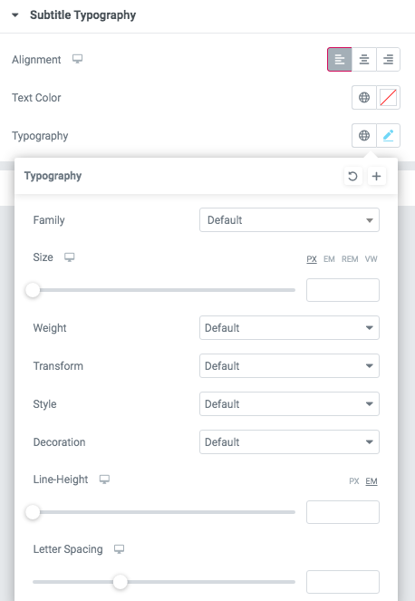
Subtitle Typography:

Text Color - Select subtitle color from the palette.
Typography items:
- Family - Select the typography for the subtitle.
- Size - Set up the subtitle size.
- Weight - Select the weight for the subtitle.
- Transform -Change the case of the text.
- Style - Select text style for the subtitle.
- Decoration - Select a style for the subtitle decoration.
- Line-Height - Enter a line height for the subtitle.
- Letter Spacing - Enter a letter spacing for the subtitle.
Title Typography:

Text Color - Select subtitle color from the palette.
Typography items:
- Family - Select the typography for the title.
- Size - Set up the title size.
- Weight - Select the weight for the title.
- Transform -Change the case of the text.
- Style - Select text style for the title.
- Decoration - Select a style for the title decoration.
- Line-Height - Enter a line height for the title.
- Letter Spacing - Enter a letter spacing for the title.
Description Typography:

Text Color - Select description color from the palette.
Typography items:
- Family - Select the typography for the description.
- Size - Set up the description size.
- Weight - Select the weight for the description.
- Transform - Change the case of the text.
- Style - Select text style for the description.
- Decoration - Select style for the description decoration.
- Line-Height - Enter a line height for the description.
- Letter Spacing - Enter a letter spacing for the description.