Progressbar
This widget allows the creation of an animated and interactive Progressbar that comes with multiple styles and customization features.

How To Add Progressbar Widget To Your Page
- Click the
icon to create a Section
- Set your Column structure
- Right-click to Edit, Duplicate, Copy, Delete, etc.
- Insert Widget using drag and drop inside your Columns.

5. Choose Widget style (Progressbar 16, Progressbar 2, or Progressbar 14) in the Layout section.
Progressbar 16 Layout:

Progressbar 2 Layout:
 Progressbar 14 Layout:

6. Customize widget and add content in Content Section. Here you can also customize content Typography.
Content Settings:
1. Progressbar 16 Layout

Counter value - Please, enter the counter value. Notice: For percentage, specify a value from 0 to 100.
Description - Here you can add the text for the description.
Use custom font for chart symbol? - Turn on the switcher if you want to customize the text typography for chart symbol.
Symbol before percent - Here you can add the symbol before percent.
Symbol after percent - Here you can add the symbol after percent.
Use dot at the end of the number? - This option allows adding the dot at the end of the number.
Use custom font for numbers? - Turn on the switcher if you want to customize the text typography for numbers.
Use custom font for description? - Turn on the switcher if you want to customize the description typography.
Align - Please, select the alignment for the counter value and description here.
How to customize typography you can check in Typography Settings Category:
2. Progressbar 14 Layout

Counter value - Please, enter the counter value. Notice: For percentage, specify a value from 0 to 100.
Heading - Here you can add the text for the heading.
Use custom font for chart symbol? - Turn on the switcher if you want to customize the text typography for chart symbol.
Element tag for the heading - Here you can select the heading tag.
Use custom font for heading? - Turn on the switcher if you want to customize the font for the heading.
Use custom font for percent? - Turn on the switcher if you want to customize the font for the percent.
Line color - Select the color of the line here from the color palette.
Active line color - Select the color of the active line here from the color palette.
How to customize typography you can check in Typography Settings Category:
3. Progressbar 2 Layout

Heading - Here you can add the text for the heading.
Element tag for the heading - Here you can select the heading tag.
Numbers - Here you can add the text for the number.
Use custom font for heading? - Turn on the switcher if you want to customize the font for the heading.
Use custom font for numbers? - Turn on the switcher if you want to customize the font for the numbers.
Use custom font for chart symbol? - Turn on the switcher if you want to customize the text typography for chart symbol.
How to customize typography you can check in Typography Settings Category:
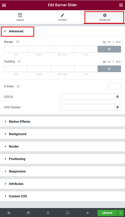
Advanced Settings:
- Margin: Set the section Margin.
- Padding: Set the section Padding.
- Z-index: Set the Z-Index.
- CSS ID: Set a CSS ID for your section.
- CSS Classes: Set CSS Classes for your section.
Motion Effects

- Sticky (Pro only): Set your section as Sticky, and choose between Top or Bottom.
- Scrolling Effects (Pro only): Set Scrolling Effects to On to choose from a variety of animations and interactions that can occur when the user scrolls through the page.
- Entrance Animation: Click the dropdown to choose an animation.
Background

The following options can be set independently for both the normal and hover states.
Border

The following options can be set independently for both the normal and hover states.
- Border Type: Select the type of border, choosing from none, solid, double, dotted, dashed, or grooved
- Border Radius: Set the border-radius to control corner roundness
- Box Shadow: Adjust box-shadow options
Positioning

- Width: Select the width of the element, choosing from Full Width (100%), Inline (auto), or Custom.
- Custom Width: Only available if Custom is chosen. Use the slider to adjust the width of the element within the column.
- Vertical Align: Only available if Full Width (100%) or Inline (auto) is chosen. Select to display the element at the Start, Center, or End.
- Position: Select the position of the element, choosing either Default, Absolute, Fixed, or Custom. Absolute positions an element absolutely to its first positioned parent. Fixed positions an element relative to the user’s viewport.
If either Absolute or Fixed is selected, the following options also become available.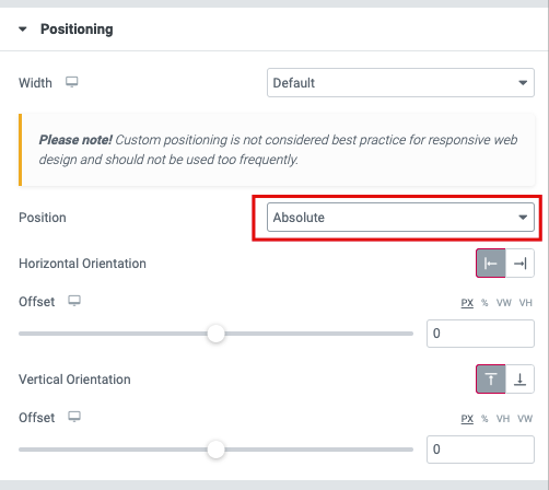
- Horizontal Orientation: Sets the horizontal reference point for the absolute positioning, with choices of either Start or End.
- Offset: Changes the horizontal reference point by the amount of the offset
- Vertical Orientation: Sets the vertical reference point for the absolute positioning, with choices of either Start or End.
- Offset: Changes the vertical reference point by the amount of the offset
Responsive

- Reverse Columns: Slide to reverse the order of your columns (Great for Mobile).
- Visibility: Show or Hide your section on Desktop, Tablet, or Mobile