Banner Slider
This shortcode allows creating awesome banner sliders on your pages.
Layouts:
Here you can choose template style for your banner slider (Moovit Creative, Famulus Simple, Acacio Modern, EWO Banner, Moovit Modern or Vestry Creative)
Moovit Creative Layout:
 Content settings:
 Use custom font for heading?- Turn on the switch if you want to customize the font for the heading.
Add item - Please, add the item to create and edit the slide.
Banners:
 Background Image - Here you can add the image for the background.
Additional Image - Here you can add the additional image.
Title - Here you can add the title for the current banner slide.
Align - Here you can select the content align.
Use dot in the end title? - Turn on the switcher if you want to add a dot at the end of the title.
Color for dot - Please, select the color style of the dot.
Add button? - Turn on the switcher to add the button for the current banner slide. If you turn on the switcher, there are the next items.
 Button items:
- Layout - Please, select the button layout.
- Name - Please, enter the button text.
- Link - Please, add a URL to the button.
- Style - Here you can select the button style (dark or light).
- Size - Here you can select button size (small or large).
- Type - Here you can select the button type (reverse or transparent).
- Box shadow - This option allows you to add the box-shadow to the button. It only works if the box-shadow is specified in skin generator.
- Enable Full width - Turn on the switcher if you want to enable full width to the current button.
Swiper Settings:
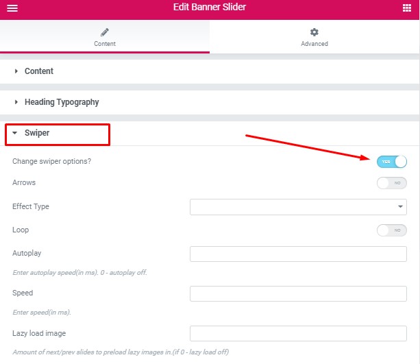 Change swiper options? - Turn on switcher if you want to change the following swiper options:
- Arrows - Turn on the switcher to display swiper in arrows style
- Effect Type - Here you can select from the list the effect type for swiper (Slide, Fade, Cube, Flip, Coverflow)
- Loop - Turn on the switcher to display the loop effect
- Autoplay - Please, enter autoplay speed(in ms). 0 - autoplay off.
- Speed - Please, enter speed(in ms).
- Lazy load image - Amount of next/prev slides to preload lazy images in. (if 0 - lazy load off)
Images size for additional image:
 Image original size - Select the image size here.
How to customize typography you can check in Typography Settings Category:
Famulus Simple Layout:

Content Settings:
 Banners:
Add item - Please, add the item to create and edit the slide.

- Image - Here you can add the image for the background.
- Title - Here you can add the title for current banner slide. To Hightlight text insert text between: <i> Your Text Here </i>, To Hightlight text with color insert text between: [[ Your Text Here ]], For text in new line use <br>
- Element Tag for Title - Select a title tag.
- Description - Here you can add the description for the current banner slide.
- Align - Here you can select the content align.
- Buttons direction - Please, select horizontal or vertical buttons direction.
- Video Title - Add the video title.
- Add dark overlay? - Turn on the switcher to add dark overlay for current banner slide.
- Add button? - Turn on the switcher to add the button for the current banner slide. If you turn on the switcher, there are the next items.

- Add additional button? - Turn on the switcher to add the additional button for the current banner slide. If you turn on the switcher, there are the next items.
 Additional button items:
- Layout - Please, select the button layout.
- Name - Please, enter the button text.
- Link - Please, add a URL to the button.
- Style - Here you can select the button style (dark or light).
- Size - Here you can select button size (small or large).
- Type - Here you can select the button type (reverse or transparent).
- Box shadow - This option allows you to add the box-shadow to the button. It only works if the box-shadow is specified in skin generator.
- Enable Full width - Turn on the switcher if you want to enable full width to the current button.
Use custom font for heading? - Turn on the switcher if you want to customize font for the heading.
Use custom font for Highlight? - Turn on the switcher if you want to customize font for the Highlight.
Use custom font for Description? - Turn on the switcher if you want to customize font for the description.
Enable overlay image for slider? - Turn on the switcher if you want to enable overlay image for slider. If you turn on the switcher, there is the next item: Overlay Image - Choose the overlay image.
Use custom font for Video Link? - Turn on the switcher if you want to customize the font for the video link.
Change arrows position? - Turn on the switcher if you want to change the position of the arrows. If you turn on the switcher, there is the next item:
- Arrow square style? - Turn on the switcher if you want to make square style for arrows.
Swiper Settings:
 Change swiper options? - Turn on switcher if you want to change the following swiper options:
- Arrows - Turn on the switcher to display swiper in arrows style .
- Pagination - Turn on the switcher to display the sliders pagination.
- Effect Type - Here you can select from the list the effect type for swiper (Slide, Fade, Cube, Flip, Coverflow).
- Loop - Turn on the switcher to display the loop effect.
- Autoplay - Please, enter autoplay speed(in ms). 0 - autoplay off.
- Speed - Please, enter speed (in ms).
How to customize typography you can check in Typography Settings Category:
Acacio Modern Layout:

Content Settings:
 Use custom font for heading? - Turn on the switcher if you want to customize the font for the heading.
Add item - Please, add the item to create and edit the slide.
 Items:
- Image - Here you can add the image for the background.
- Title - Here you can add the title for the current banner slide. To Hightlight text insert text between: <i> Your Text Here </i>, To Hightlight text with color insert text between: [[ Your Text Here ]], For text in new line use <br>.
- Element Tag for Title - Select a title tag.
- Description - Here you can add the description for the current banner slide.
- Align - Here you can select the content alignment.
- Tablet Align - Here you can select the content alignment on the tablet.
- Buttons direction - Please, select horizontal or vertical buttons direction.
- Add Video button? - Turn on the switcher to add the video button for the current banner slide. If you turn on the switcher, there are the next items.
Video Button Settings:
- Video Title - Add the text for the video title here.
- Video Link - Add the link here.
- Buttons Style - Please, select the style of the buttons.
- Add dark overlay? - Turn on the switcher if you want to add the dark overlay to the buttons.
- Add button? - Turn on the switcher to add the button for the current banner slide. If you turn on the switcher, there are the next items.
 Button items:
- Layout - Please, select the button layout.
- Name - Please, enter the button text.
- Link - Please, add a URL to the button.
- Style - Here you can select the button style (dark or light).
- Size - Here you can select button size (small or large).
- Type - Here you can select the button type (reverse or transparent).
- Box shadow - This option allows you to add the box-shadow to the button. It only works if the box-shadow is specified in skin generator.
- Enable Full width - Turn on the switcher if you want to enable full width to the current button.
- Add additional button? - Turn on the switcher to add the additional button for the current banner slide. If you turn on the switcher, there are the next items.
Additional button items:
- Layout - Please, select the button layout.
- Name - Please, enter the button text.
- Link - Please, add a URL to the button.
- Style - Here you can select the button style (dark or light).
- Size - Here you can select button size (small or large).
- Type - Here you can select the button type (reverse or transparent).
- Box shadow - This option allows you to add the box-shadow to the button. It only works if the box-shadow is specified in skin generator.
- Enable Full width - Turn on the switcher if you want to enable full width to the current button.
Add your colors for swiper bullets? - Turn on the switcher if you want to add your colors for swiper bullets. If you turn on the switcher, there are the next items.
 Swiper bullet items:
- Swiper bullet color - Choose the color from the color palette.
- Swiper bullet active color - Choose the color from the color palette.
Swiper Settings:

Change swiper options? - Turn on switcher if you want to change the following swiper options:
- Arrows - Turn on the switcher to display swiper in arrows style .
- Pagination - Turn on the switcher to display the sliders pagination.
- Loop - Turn on the switcher to display the loop effect.
- Simulate Touch - Turn on the switcher to display the simulate touch.
- Autoplay - Please, enter autoplay speed(in ms). 0 - autoplay off.
- Speed - Please, enter speed(in ms).
- Slides count - here you can enter the number of slides by default.
- Slides count (lg) - Here you can enter the number of default slides on devices width <1200px.
- Slide count (md) - Here you can enter the default slider count for devices with a width of <991px.
- Slides count (cm) - Here you can enter the default number of slides on devices with a width of <768px.
- Slides count (xs) - Here you can enter the default number of slides on devices with a width of <480px.
How to customize typography you can check in Typography Settings Category:
EWO Banner Layout:

Content Settings:

Use custom font for heading? - Turn on the switcher if you want to customize font for the heading.
Use glitch effect for heading? - Turn on the switcher if you want to use a glitch effect for the heading.
Use custom font for description? - Turn on the switcher if you want to customize font for the description.
Add item - Please, add the item to create and edit the slide.

- Image - Here you can add the image for the background.
- Enable overlay for background image? - Turn on the switcher if you want to enable overlay for the background image.
- Heading - Here enter the text for the heading.
- Description - Here you can add the description for the current banner slide.
- Align - Here you can select the content align.
- Use background for Video Button? - Turn on the switcher if you want to use the background for Video Button and add the image.
- Add Video button? - Turn on the switcher to add the video button for the current banner slide. If you turn on the switcher, there are the next items:
Video button items:

- Video Title - Add the video title.
- Video Link - Add the link to the video.
- Buttons Style - Select the button style.
- Add button? - Turn on the switcher to add the button for the current banner slide. If you turn on the switcher, there are the next items.
Button items:
- Layout - Please, select the button layout.
- Name - Please, enter the button text.
- Link - Please, add a URL to the button.
- Style - Here you can select the button style (dark or light).
- Size - Here you can select button size (small or large).
- Type - Here you can select the button type (reverse or transparent).
- Box shadow - This option allows you to add the box-shadow to the button. It only works if the box-shadow is specified in skin generator.
- Enable Full width - Turn on the switcher if you want to enable full width to the current button.
- Add additional button? - Turn on the switcher to add the additional button for the current banner slide. If you turn on the switcher, there are the next items.
 Additional button items:
- Layout - Please, select the button layout.
- Name - Please, enter the button text.
- Link - Please, add a URL to the button.
- Style - Here you can select the button style (dark or light).
- Size - Here you can select button size (small or large).
- Type - Here you can select the button type (reverse or transparent).
- Box shadow - This option allows you to add the box-shadow to the button. It only works if the box-shadow is specified in skin generator.
- Enable Full width - Turn on the switcher if you want to enable full width to the current button.
Swiper Settings:

Change swiper options? - Turn on switcher if you want to change the following swiper options:
- Arrows - Turn on the switcher to display swiper in arrows style.
- Effect Type - Here you can select from the list the effect type for swiper (Slide, Fade, Cube, Flip, Coverflow).
- Loop - Turn on the switcher to display the loop effect.
- Simulate Touch - Turn on the switcher to add the simulate touch.
- Autoplay - Please, enter autoplay speed(in ms). 0 - autoplay off.
- Speed - Please, enter speed(in ms).
- Lazy load image - Amount of next/prev slides to preload lazy images in. (if 0 - lazy load off).
How to customize typography you can check in Typography Settings Category:
Moovit Modern Layout:
 Content Settings:

Use custom font for heading?- Turn on the switch if you want to customize the font for the heading.
Add item - Please, add the item to create and edit the slide.
Banners:

- Background Image - Here you can add the image for the background.
- Additional Image - Here you can add the additional image.
- Title - Here you can add the title for the current banner slide.
- Description - Here you can add the description for the current banner slide.
- Align - Here you can select the content align.
- Buttons direction - Please, select horizontal or vertical buttons direction.
- Add button? - Turn on the switcher to add the button for the current banner slide. If you turn on the switcher, there are the next items.
Button items:
- Layout - Please, select the button layout.
- Name - Please, enter the button text.
- Link - Please, add a URL to the button.
- Style - Here you can select the button style (dark or light).
- Size - Here you can select button size (small or large).
- Type - Here you can select the button type (reverse or transparent).
- Box shadow - This option allows you to add the box-shadow to the button. It only works if the box-shadow is specified in skin generator.
- Enable Full width - Turn on the switcher if you want to enable full width to the current button.
- Add additional button? - Turn on the switcher to add the additional button for the current banner slide. If you turn on the switcher, there are the next items.
Additional button items:
- Layout - Please, select the button layout.
- Name - Please, enter the button text.
- Link - Please, add a URL to the button.
- Style - Here you can select the button style (dark or light).
- Size - Here you can select button size (small or large).
- Type - Here you can select the button type (reverse or transparent).
- Box shadow - This option allows you to add the box-shadow to the button. It only works if the box-shadow is specified in the skin generator.
- Enable Full width - Turn on the switcher if you want to enable full width to the current button.
Use custom font for description?- Turn on the switch if you want to customize the font for the description.
Swiper Settings:
Change swiper options? - Turn on switcher if you want to change the following swiper options:
- Arrows - Turn on the switcher to display swiper in arrows style
- Effect Type - Here you can select from the list the effect type for swiper (Slide, Fade, Cube, Flip, Coverflow)
- Loop - Turn on the switcher to display the loop effect
- Autoplay - Please, enter autoplay speed(in ms). 0 - autoplay off.
- Speed - Please, enter speed(in ms).
- Lazy load image - Amount of next/prev slides to preload lazy images in. (if 0 - lazy load off)
Images size for additional image:
Image original size - Select the image size here.
How to customize typography you can check in Typography Settings Category:
Vestry Creative Layout:

Content Settings:
Add item - Please, add the item to create and edit the slide.

Banners:

- Background Image - Here you can add the image for the banner slide.
- Enable overlay for background image? - Turn on the switcher if you want to add overlay color to the background image.
- Subtitle - Here you can add the subtitle for the current banner slide.
- Title - Here you can add the title for the current banner slide.
- Description - Here you can add the description for the current banner slide.
- Add video? - Turn on the switcher to add the video for the current banner slide. If you turn on the switcher, there are the next items:
Video items:

- Video Title - Add the video title.
- Video Link - Add the link to video.
- Buttons Style - Select the button style.
- Add button? - Turn on the switcher to add the button for the current banner slide. If you turn on the switcher, there are the next items:
Button items:
- Layout - Please, select the button layout.
- Name - Please, enter the button text.
- Link - Please, add a URL to the button.
- Style - Here you can select the button style (dark or light).
- Size - Here you can select button size (small or large).
- Type - Here you can select the button type (reverse or transparent).
- Box shadow - This option allows you to add the box-shadow to the button. It only works if the box-shadow is specified in skin generator.
- Enable Full width - Turn on the switcher if you want to enable full width to the current button.
- Add additional button? - Turn on the switcher to add the additional button for the current banner slide. If you turn on the switcher, there are the next items:
Additional button items:
- Layout - Please, select the button layout.
- Name - Please, enter the button text.
- Link - Please, add a URL to the button.
- Style - Here you can select the button style (dark or light).
- Size - Here you can select button size (small or large).
- Type - Here you can select the button type (reverse or transparent).
- Box shadow - This option allows you to add the box-shadow to the button. It only works if the box-shadow is specified in skin generator.
- Enable Full width - Turn on the switcher if you want to enable full width to the current button.
Use custom font for subtitle? - Turn on the switcher if you want to customize the font for subtitle.
Use custom font for heading? - Turn on the switcher if you want to customize the font for heading.
Use custom font for description? - Turn on the switcher if you want to customize the font for description.
Swiper Settings:

Change swiper options? - Turn on switcher if you want to change the following swiper options:
- Pagination - Turn on the switcher to display pagination.
- Effect Type - Here you can select from the list the effect type for swiper (Slide, Fade, Cube, Flip, Coverflow).
- Loop - Turn on the switcher to display the loop effect.
- Simulate Touch - Turn on the switcher to add the simulate touch.
- Autoplay - Please, enter autoplay speed(in ms). 0 - autoplay off.
- Speed - Please, enter speed(in ms).
- Lazy load image - Amount of next/prev slides to preload lazy images in. (if 0 - lazy load off).
Images size:
Image original size - Select the image size here.